🌪️ WICKED 3 🌪️
heeeey hey
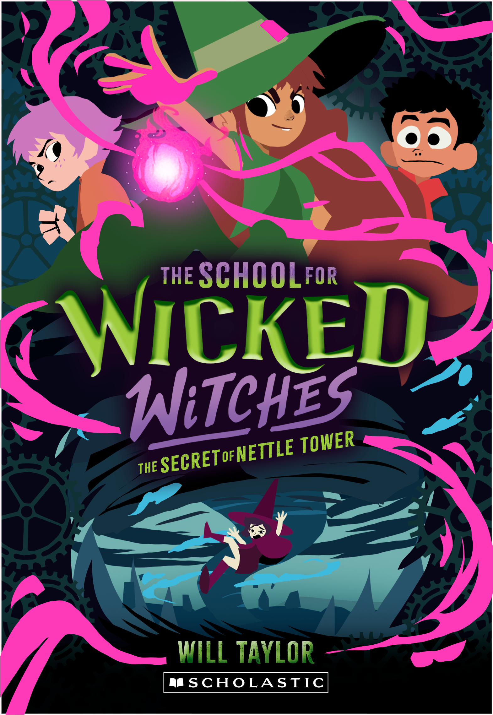
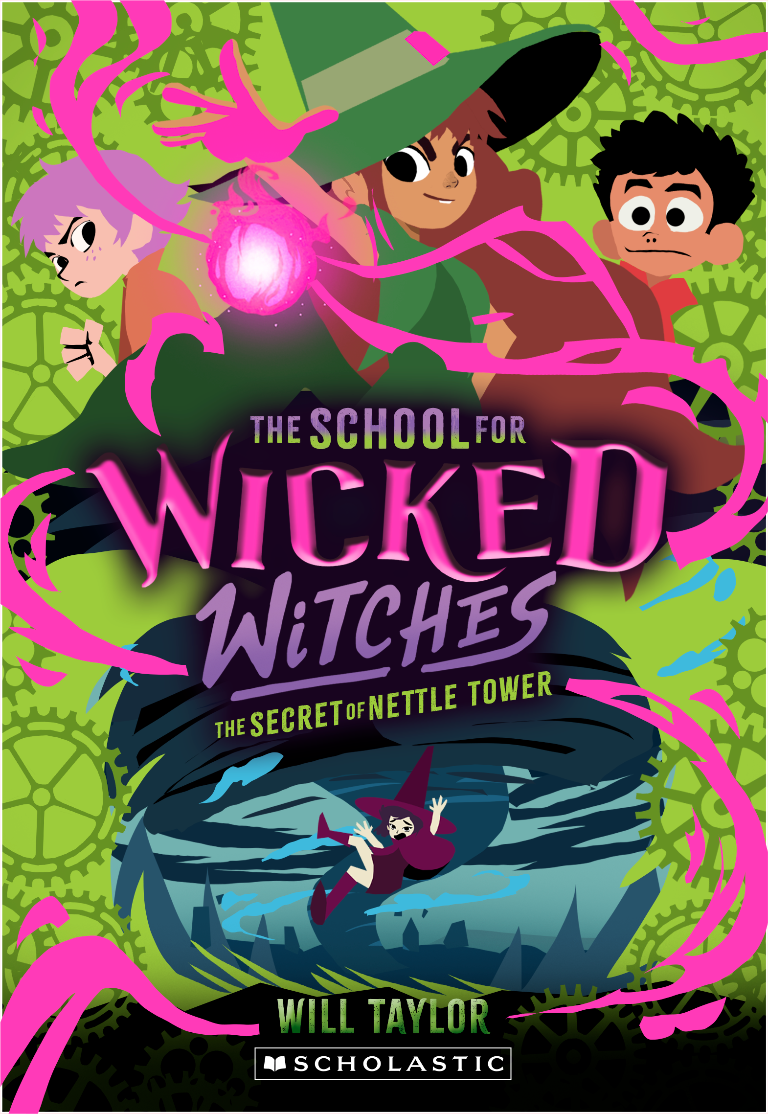
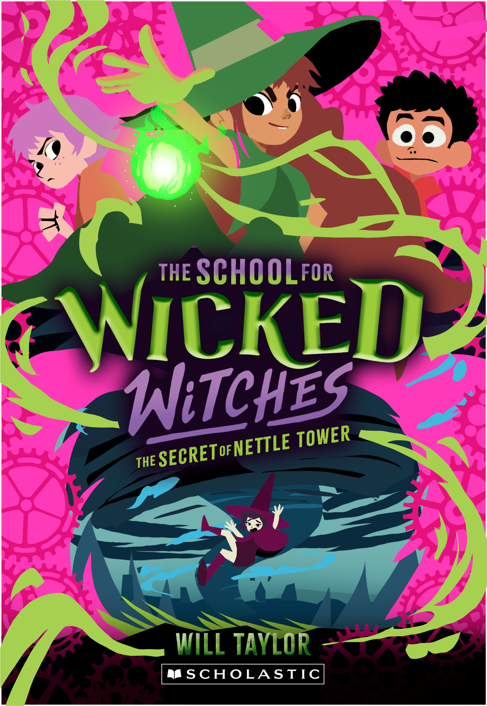
Here we go! wicked cover 3
and 4 versions this time :)
There are notes under each set:
Here we go! wicked cover 3
and 4 versions this time :)
There are notes under each set:
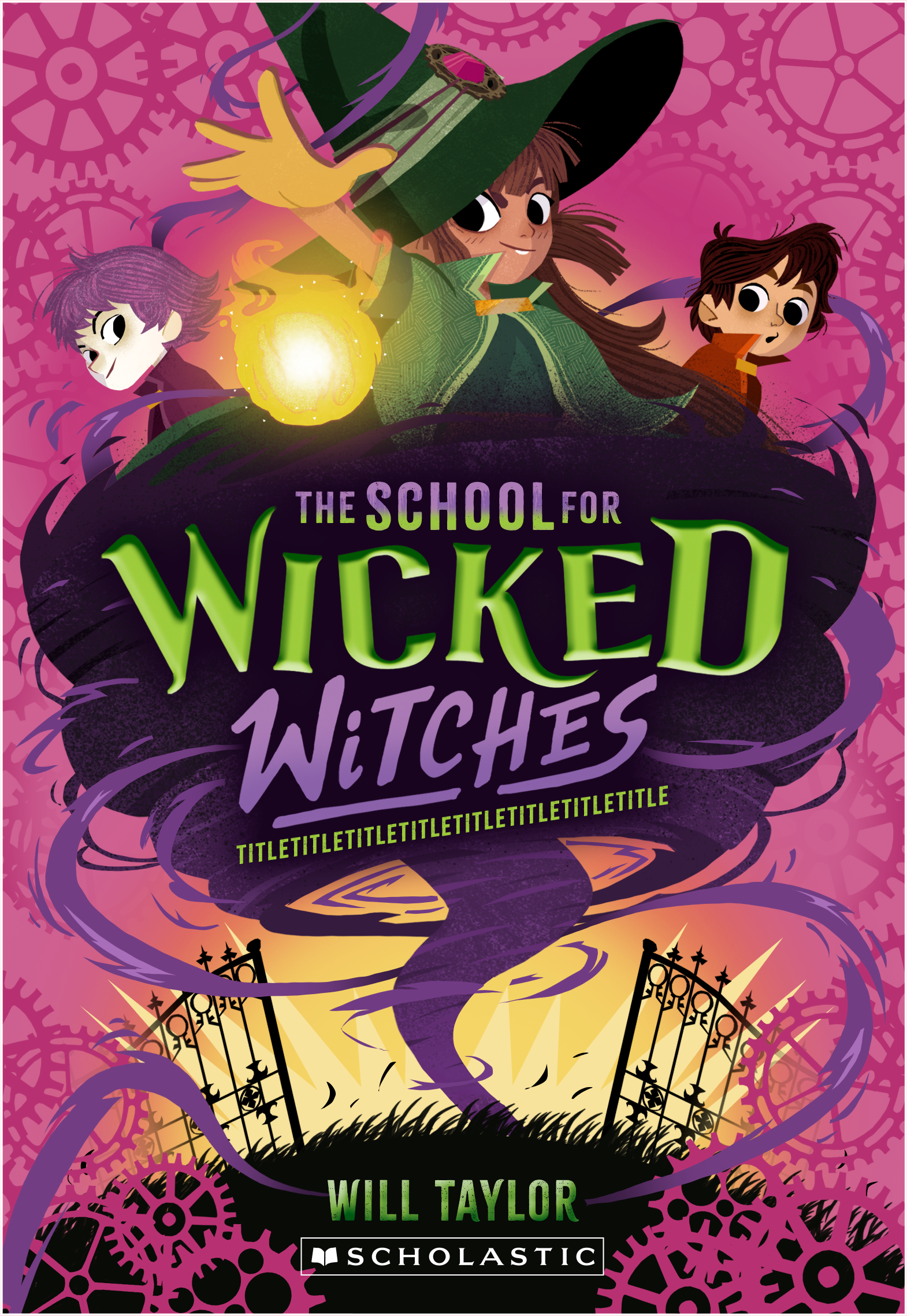

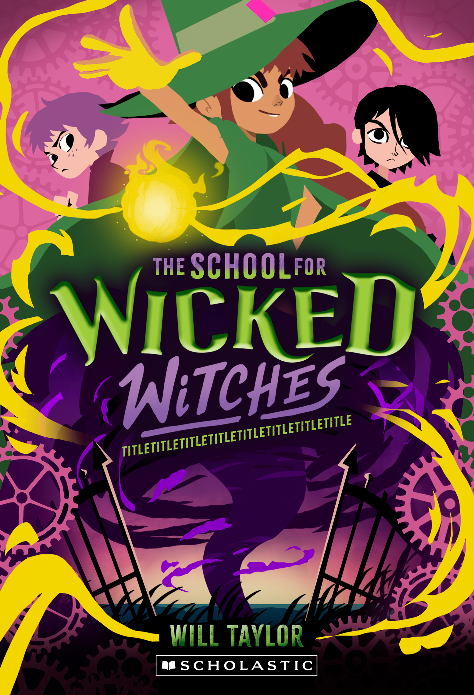
on the left is what you requested, which works but I still wanted to give the magic swirls a go. I think the yellow pops with the pink, and makes the whole thing a lot more dynamic.
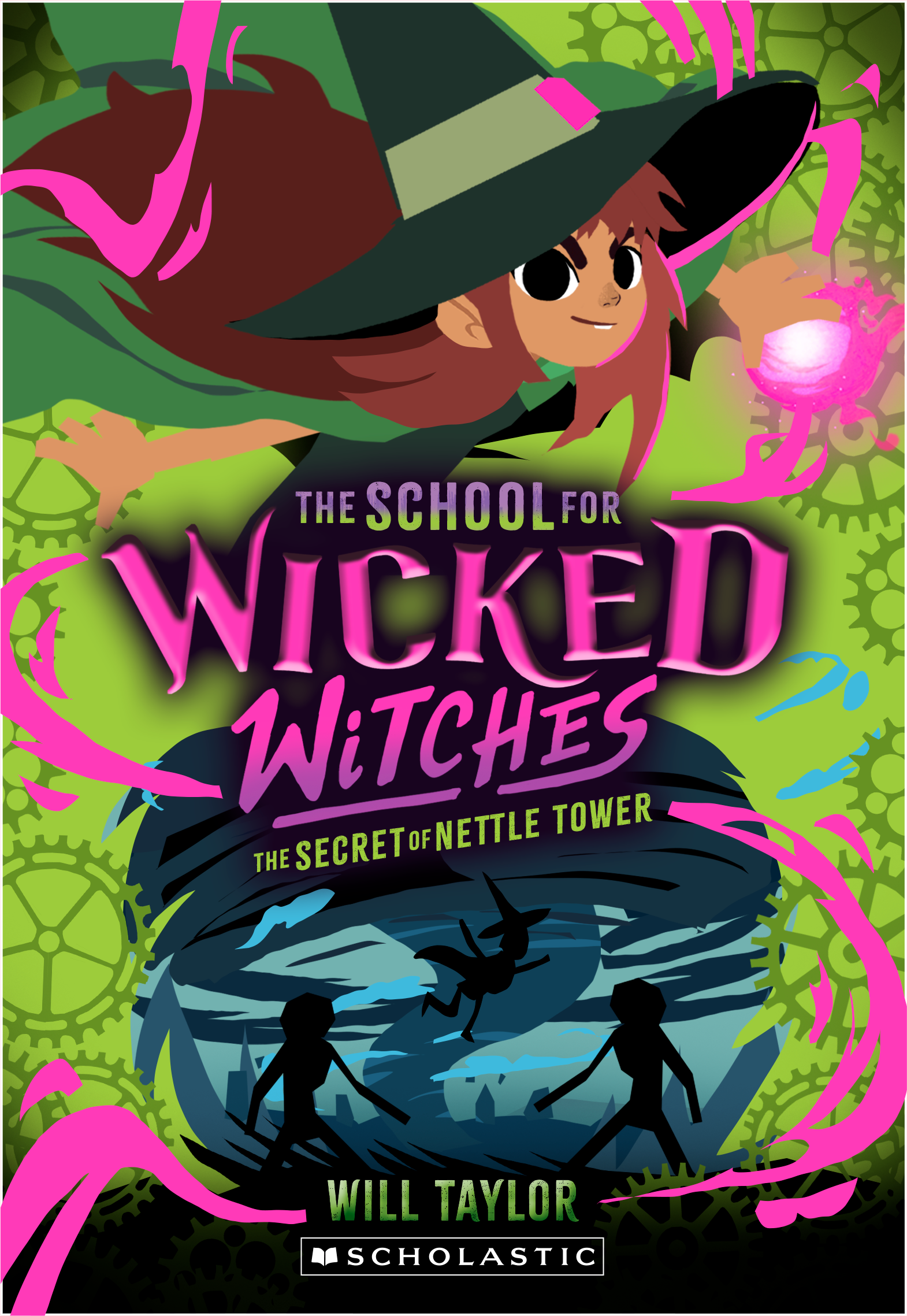
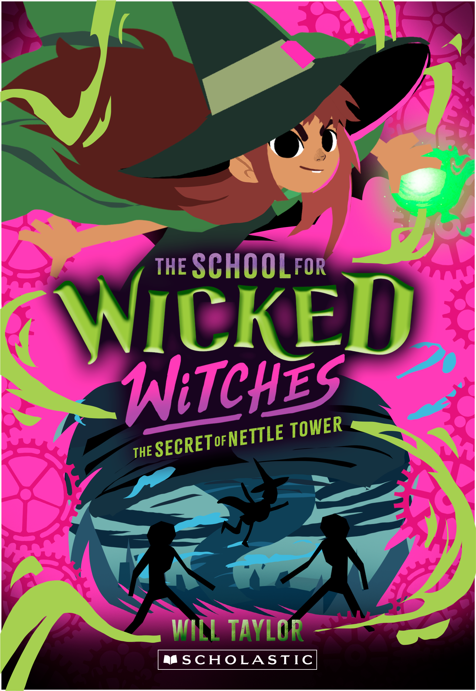
and here's a subtle color variation
and here's a subtle color variation


the background is a bit of a darker pink here and the cogs are a hotter pink. I personally prefer this, but I'll leave it up to you.
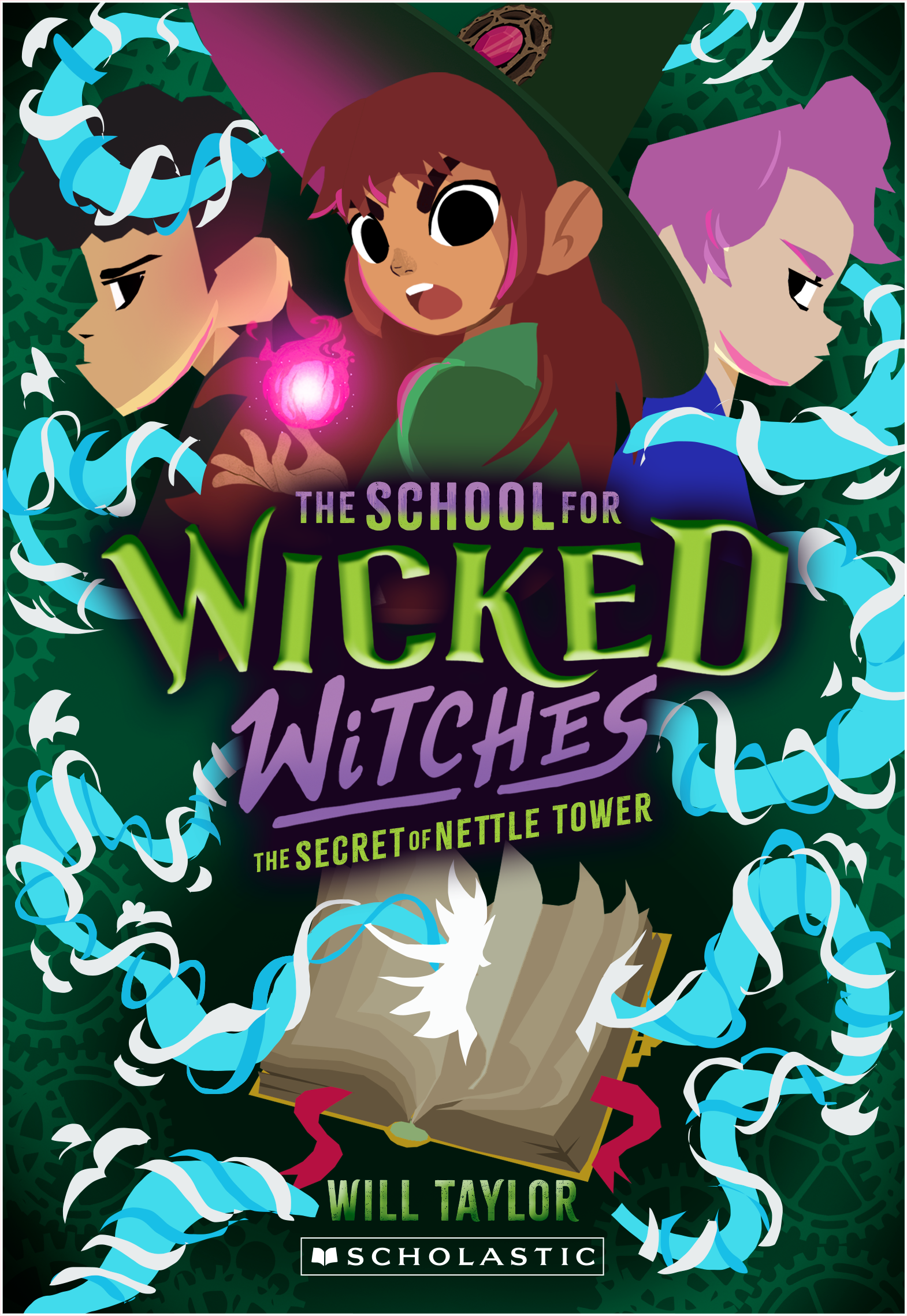
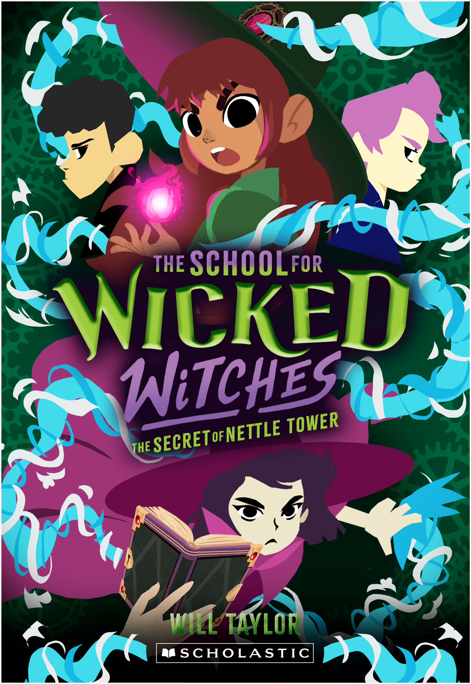
and here are the 4 images without the text (and with bleed)
and here are the 4 images without the text (and with bleed)
👉 DOWNLOAD 👈
👇 PREVIOUS UPDATES 👇
hey hey hey!
here's a revised sketch! I tried to incorporate all requests and still keep everything in line with the previous books.
there are some notes under the image:
here's a revised sketch! I tried to incorporate all requests and still keep everything in line with the previous books.
there are some notes under the image:
I had an extremely hard time making the pink work with all the rest of the colours, especially on the bottom. but I think this is a good compromise. just having the cogs pink in the bottom gives everything a bit more room to breathe, while still having the graphic effect.
about her magic: the requested purple will not work with the pink background and her green cape, I went for yellow here as it pops nice against the pink, but we can try different brighter colors if you want. The magic swooshes are a bit rough now, but I think they're necessary to keep everything in line with the previous books :)
the tornado will be more defined as I go to final, no worries there!
👇PREVIOUS UPDATES👇
hey hey hey!
2 new sketches and some (really not good looking) color variations!
here are the two new sketches:
2 new sketches and some (really not good looking) color variations!
here are the two new sketches:
It's difficult for me to choose a favorite, I love both of them!
I'll leave it up to you.
I also did the requested color variations but they really don't look good
I'll leave it up to you.
I also did the requested color variations but they really don't look good
I think we should keep the background a darker shade like on the previous 2 books. it makes the characters pop a lot more and isn't such an eyesore :D
having a hot pink background will also get us in trouble when it comes to ava's magic, as it's always been pink on the other covers.
having a hot pink background will also get us in trouble when it comes to ava's magic, as it's always been pink on the other covers.
👇 PREVIOUS UPDATES 👇
hey hey ! here we go again!
I've got 4 sketches for you. It's all still super rough, but I think you know how I sketch/work by now :)
general notes: The whirlwind thingies are very rough at the moment, but I'm confident I can make them look cool and whirly once I start rendering the image.
I've got 4 sketches for you. It's all still super rough, but I think you know how I sketch/work by now :)
general notes: The whirlwind thingies are very rough at the moment, but I'm confident I can make them look cool and whirly once I start rendering the image.
the 2 boys: I just freestyles their hairstyles and general look, if they have different haircuts or other facial features just let me know, it'll be easy to fix.
I took the title and subtitle from the previous book, so please ignore that, I used it to be sure everything is readable.
and surprisingly: I like all sketches and I think we can make any of them work!
here we go:
1 A & B

I think I slightly prefer version B, it feels a bit more balanced and I really like how there's a bit more focuses there on the whirlwind, almost as if she is engulfed by it.
2 A & B

I think adding Tinabella to the top will make everything too crowded and I think it's better not to put her there in any case, to avoid people mistaking it for book 2.
I really like both of these, it feels really dynamic. I think I prefer A over B, but if having the boys on the cover is a must I can make B work.
I really like both of these, it feels really dynamic. I think I prefer A over B, but if having the boys on the cover is a must I can make B work.
that's it for now! we can go back and forth like before to get everything right :)
quick question: on book 2 we had clocks instead of cogs, what do you want to have on the cover of book 3?
quick question: on book 2 we had clocks instead of cogs, what do you want to have on the cover of book 3?