🧙♀️ WICKED 2 🧙♀️
👇 PREVIOUS UPDATES 👇
hey hey!
the cover just keeps getting better and better :D
Initially I took the witch from Spirited Away as the inspiration, but I think you'll see she's mure Ursula (and fabulous) inspired now!
the cover just keeps getting better and better :D
Initially I took the witch from Spirited Away as the inspiration, but I think you'll see she's mure Ursula (and fabulous) inspired now!
I'll wait with uploading the final files until you've checked with the writer if this is more close to what he thinks she should look like!
👇 PREVIOUS UPDATES 👇
hey hey hey!
all easy fixes, so here you go! I adjusted the flames so they fall within the bleed (except the flame in the top left corner, not much I could do about that one, but I think it works fine.
I also added some extra shadow to the witch and made her face a tiny bit brighter so it's a bit more visible.
all easy fixes, so here you go! I adjusted the flames so they fall within the bleed (except the flame in the top left corner, not much I could do about that one, but I think it works fine.
I also added some extra shadow to the witch and made her face a tiny bit brighter so it's a bit more visible.
and here's the image with the bleed and margins, so you can easily check it it's to your liking :)
👇 PREVIOUS UPDATES 👇
hey hey hey!
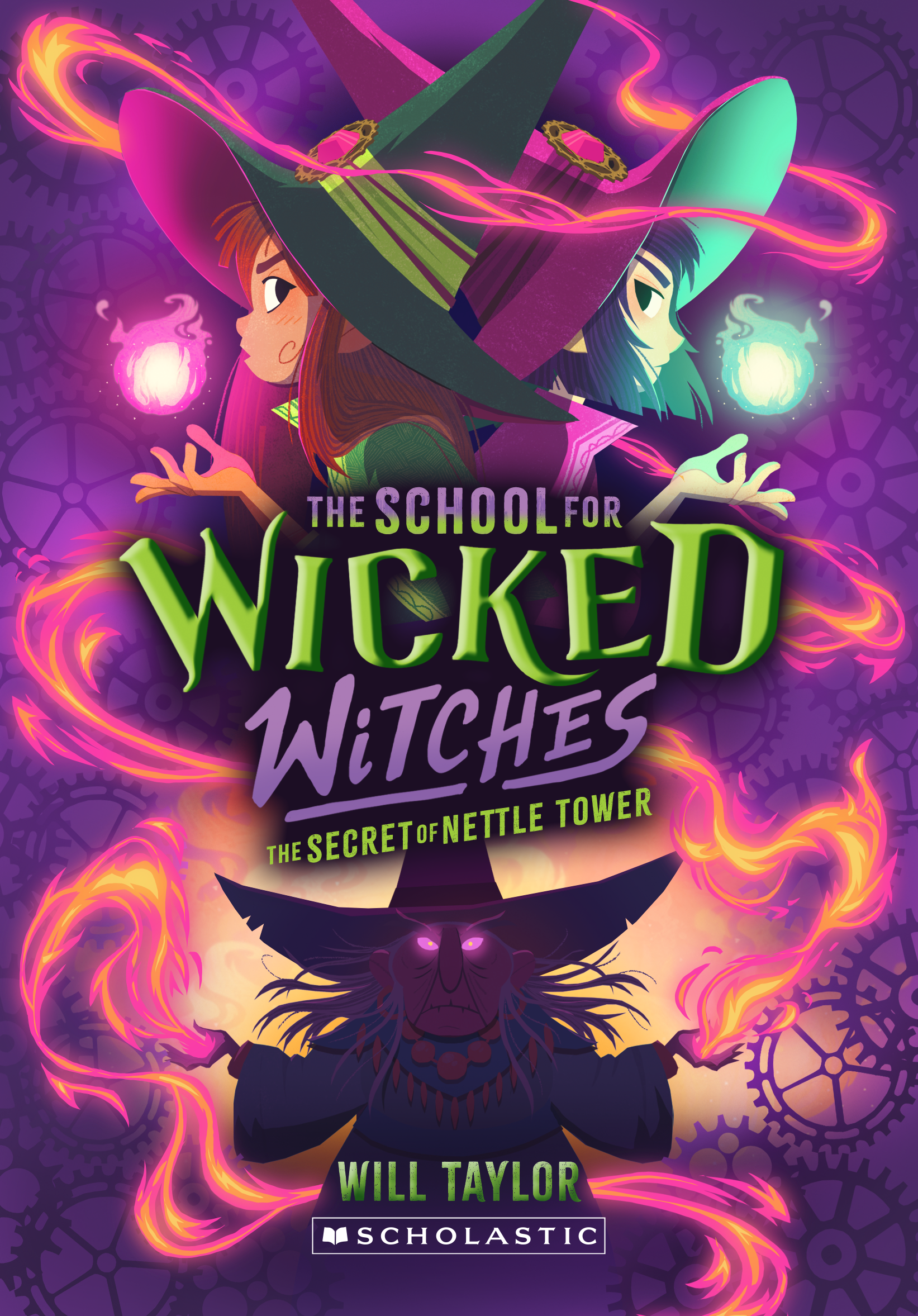
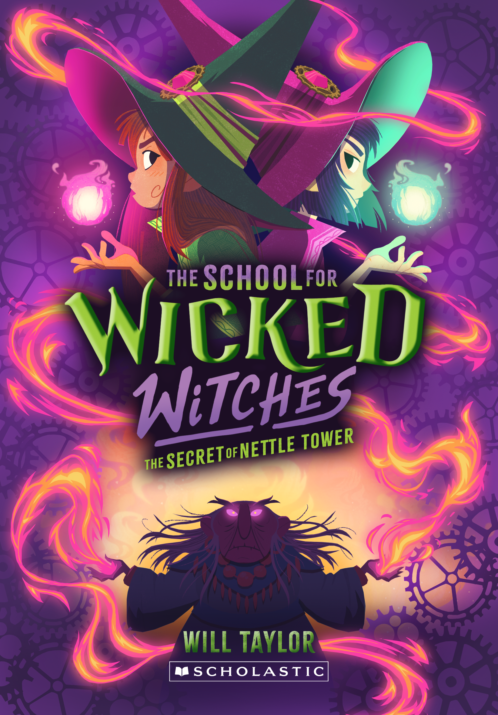
I've redone the cover, and I want to say that I'm super happy we changed the bottom part, I think it looks really awesome.
I have 2 versions for you, one where she's without her hat and one with.
I think I slightly prefer the one with the hat, but I think both work! I'll leave it up to you!
I've redone the cover, and I want to say that I'm super happy we changed the bottom part, I think it looks really awesome.
I have 2 versions for you, one where she's without her hat and one with.
I think I slightly prefer the one with the hat, but I think both work! I'll leave it up to you!
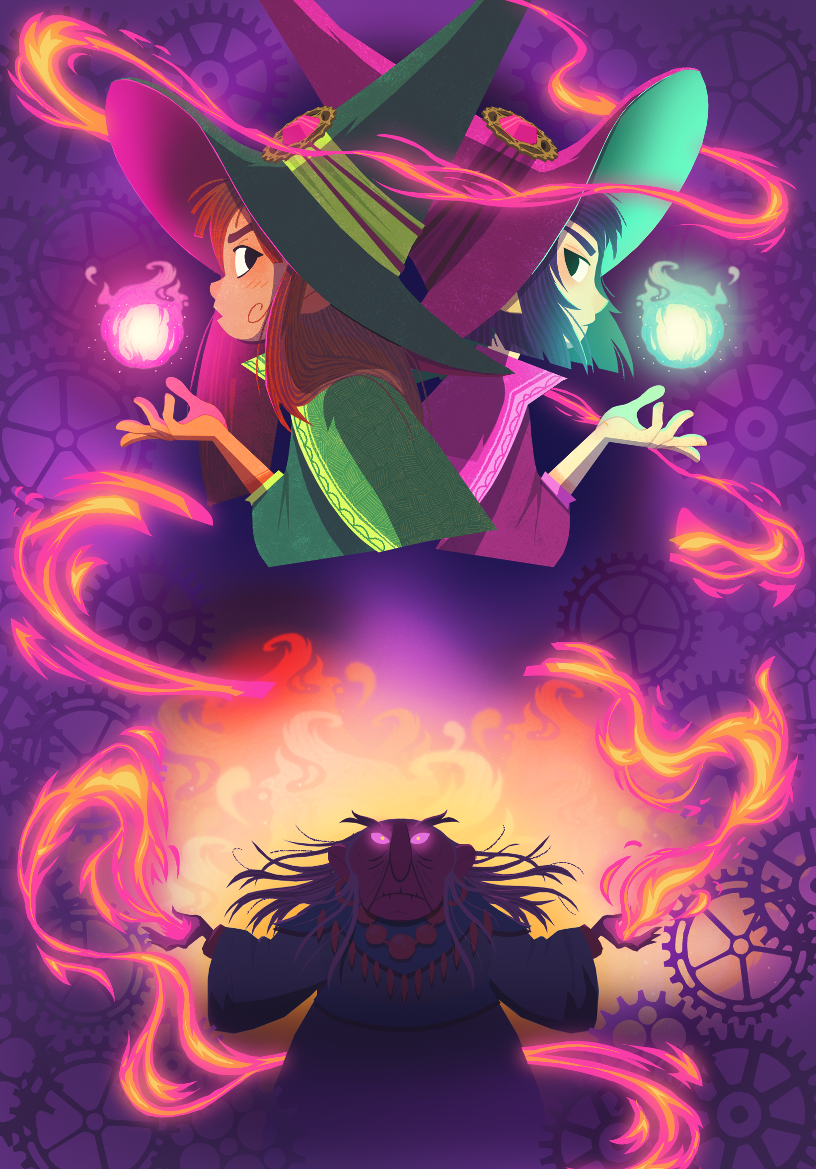
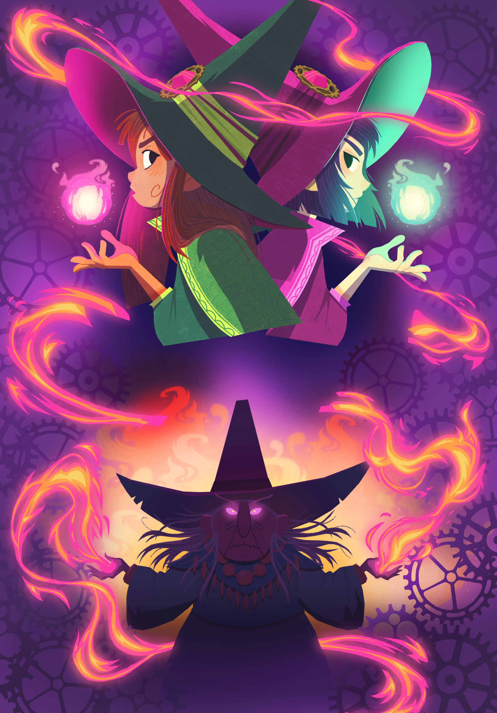
nd here are both versions without the text
👇PREVIOUS UPDATES👇
hey hey hey!
I figured I'd send over some sketches first, and as is customary a couple of different options!
I wasn't sure how menacing the witch should be, but I think a silhouette in front of a fire should be menacing (but we can change that easily)
I figured I'd send over some sketches first, and as is customary a couple of different options!
I wasn't sure how menacing the witch should be, but I think a silhouette in front of a fire should be menacing (but we can change that easily)
here we go
HATTED WITCH

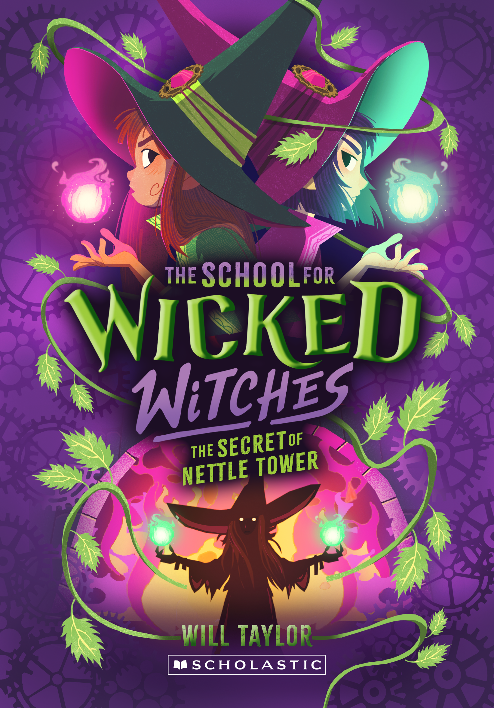

1 is just the witch
2 is the witch with some magic coming from her hands
3 is the witch with magic and a staff (feel free to tell me if the design should be different if she indeed does have a staff)
and here are 3 versions without her hat
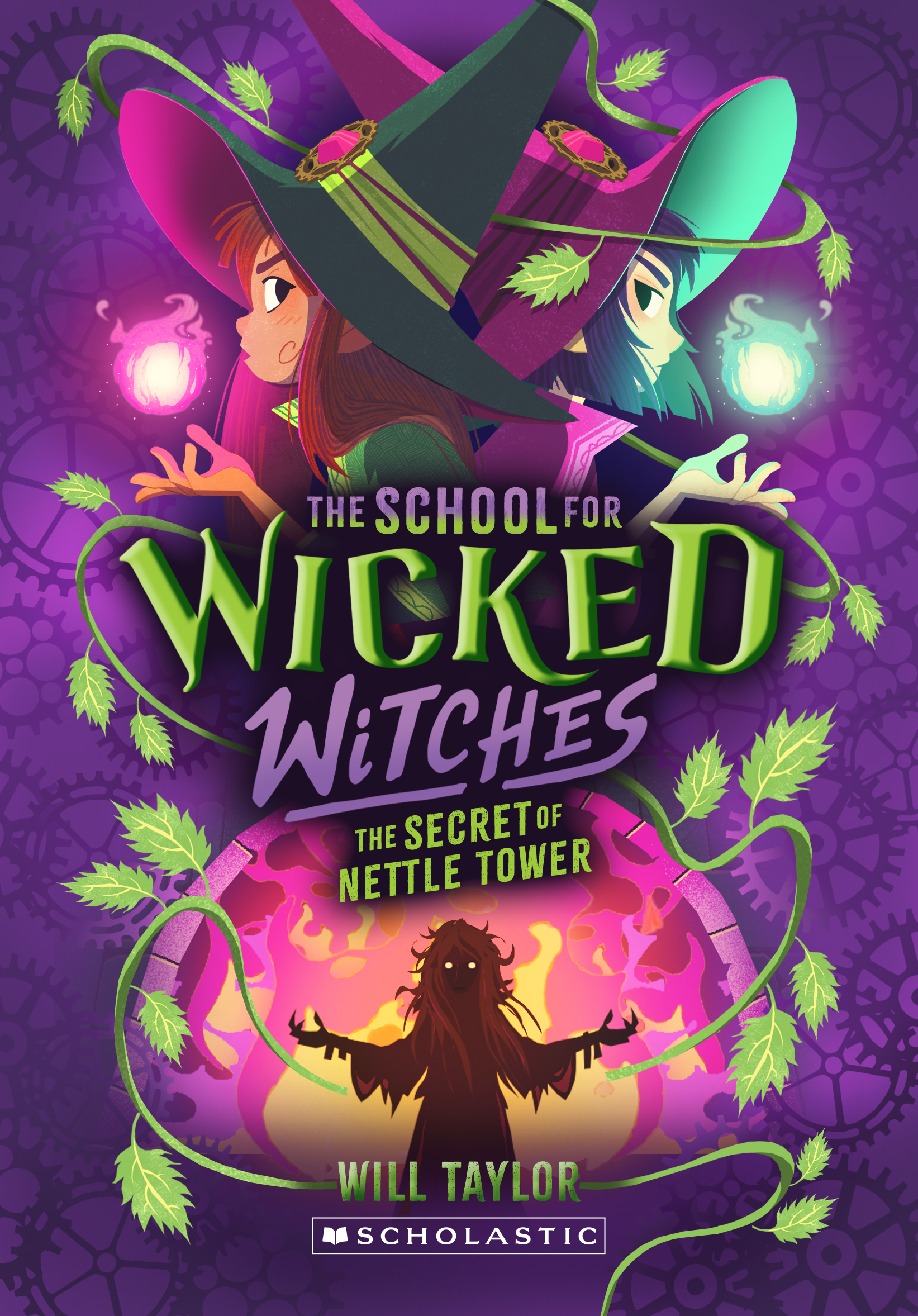


both versions work, but I think i slightly prefer the hatted version!
👇 PREVIOUS UPDATES 👇
hey hey hey!
I've finished the cover!
I've finished the cover!
I'm really pleased with it, I think i might like it even more than book one (which I also like a lot)
there are some notes under the image
here we go!
I think this is purple enough right? I opted to make the cogs a bit darker instead of lighter (compared to the purple bg). I also made the anvil and hammer on the bottom a little bit less pink-purplish so it's a bit more clearer what we're looking at.
I think it would look good if the text "the school for" and "witches" would be in a similar hue as the pink on the archway in the bottom part of the image, what do you think? I think it'll make it pop a bit more.
here is a version without all the text overlayed
here is a version without all the text overlayed
as always feel free to give me any notes you may have!
👇 PREVIOUS UPDATES 👇
hey hey hey!
I've got 4 different versions for you to look at :)
I've got 4 different versions for you to look at :)
I've changed everything you requested and have some of my own idea's added too.
there are notes under both sets of images.
there are notes under both sets of images.
01 A & B
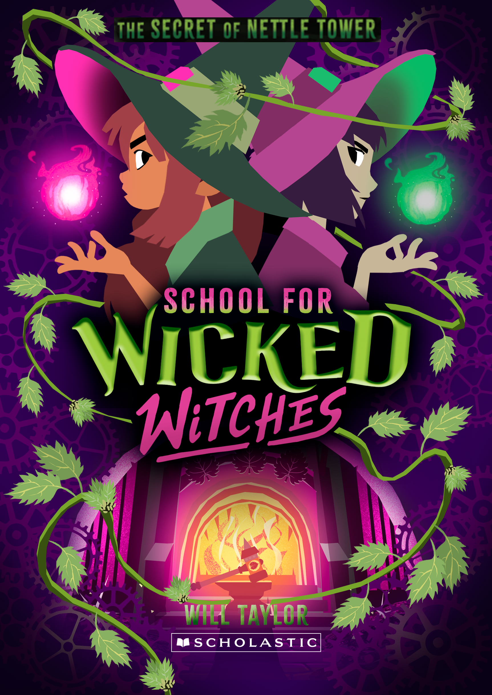
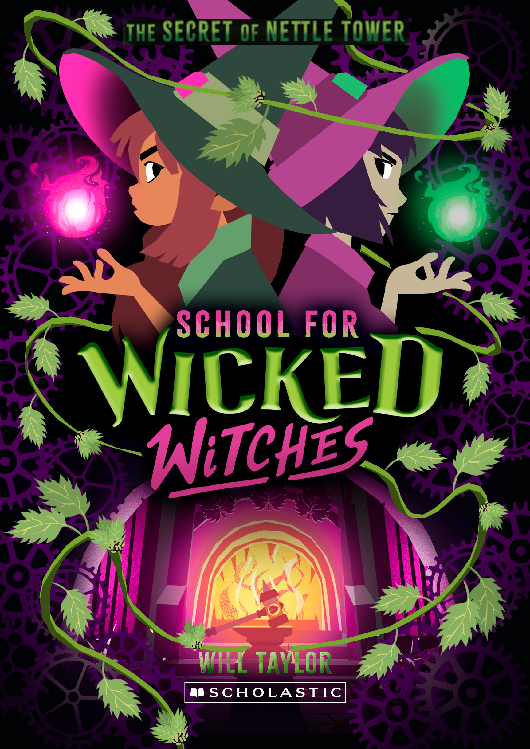
on the left is the version with all the requested changes, and on the right basically the same but with a black background. I think the darker background but keeping a bit of purple/pink on the cogs in the background works better and keeps it more in line with book 1.
however, I did feel that we're losing some of the cool magic vibes the previous sketch had, so I came up with an idea which I think works pretty well:
however, I did feel that we're losing some of the cool magic vibes the previous sketch had, so I came up with an idea which I think works pretty well:
02 A & B

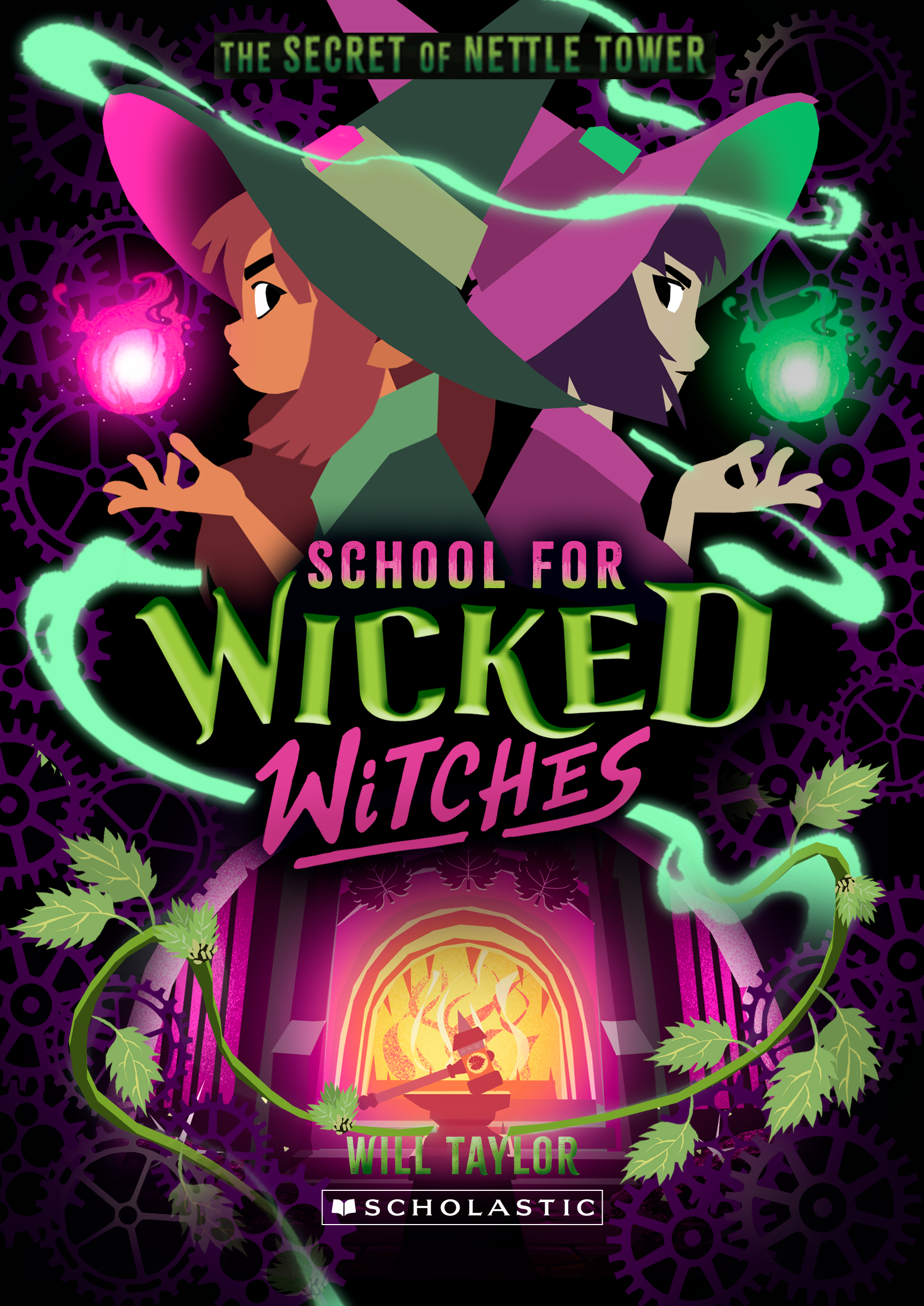
I thought it would be cool to show the nettles on the bottom of the image, which then morphs into a magic swirl. I feel this works especially well because it balances out the composition at the bottom a bit more.
I prefer version B with the black background, but i'll leave it up to you!
I prefer version B with the black background, but i'll leave it up to you!
👇
PREVIOUS UPDATES
👇
hey hey!
here we go, a bunch of fresh sets to look at :)
general note about the cogs/clocks/nettles: I think it's best to have another go at this once we decided the general direction of the cover, they're a minor detail but if i have to put all variations in each variation of the sketches you'll be looking at 20 to 30 images right now, which I don't think will help :D
one of the comments you had was about blending them in with the background like book one. no worries that will happen eventually :) it's just that for sketch purposes i haven't spent too much time on that part right now.
there are notes under each set of images
here we go!
01 A & B
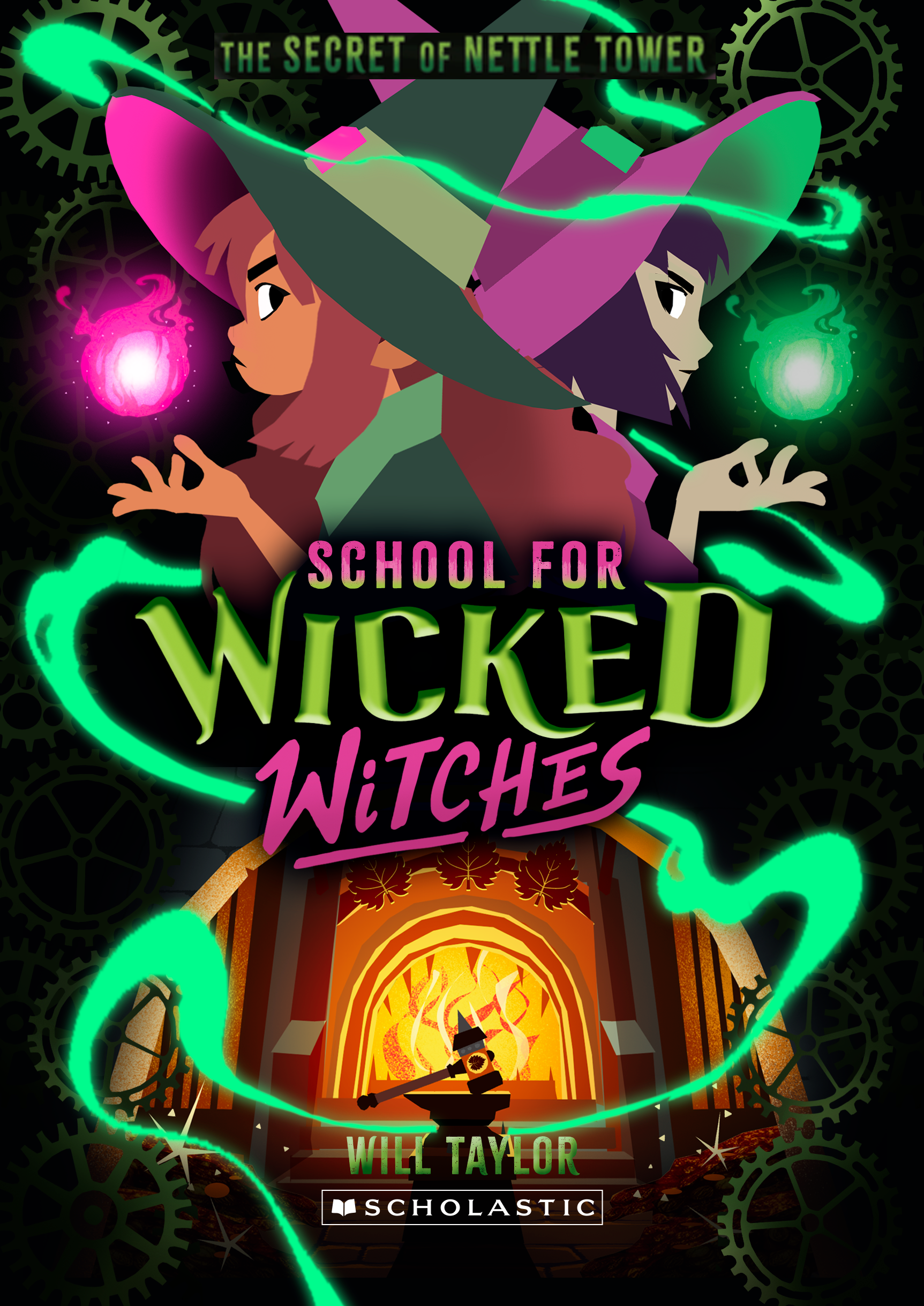
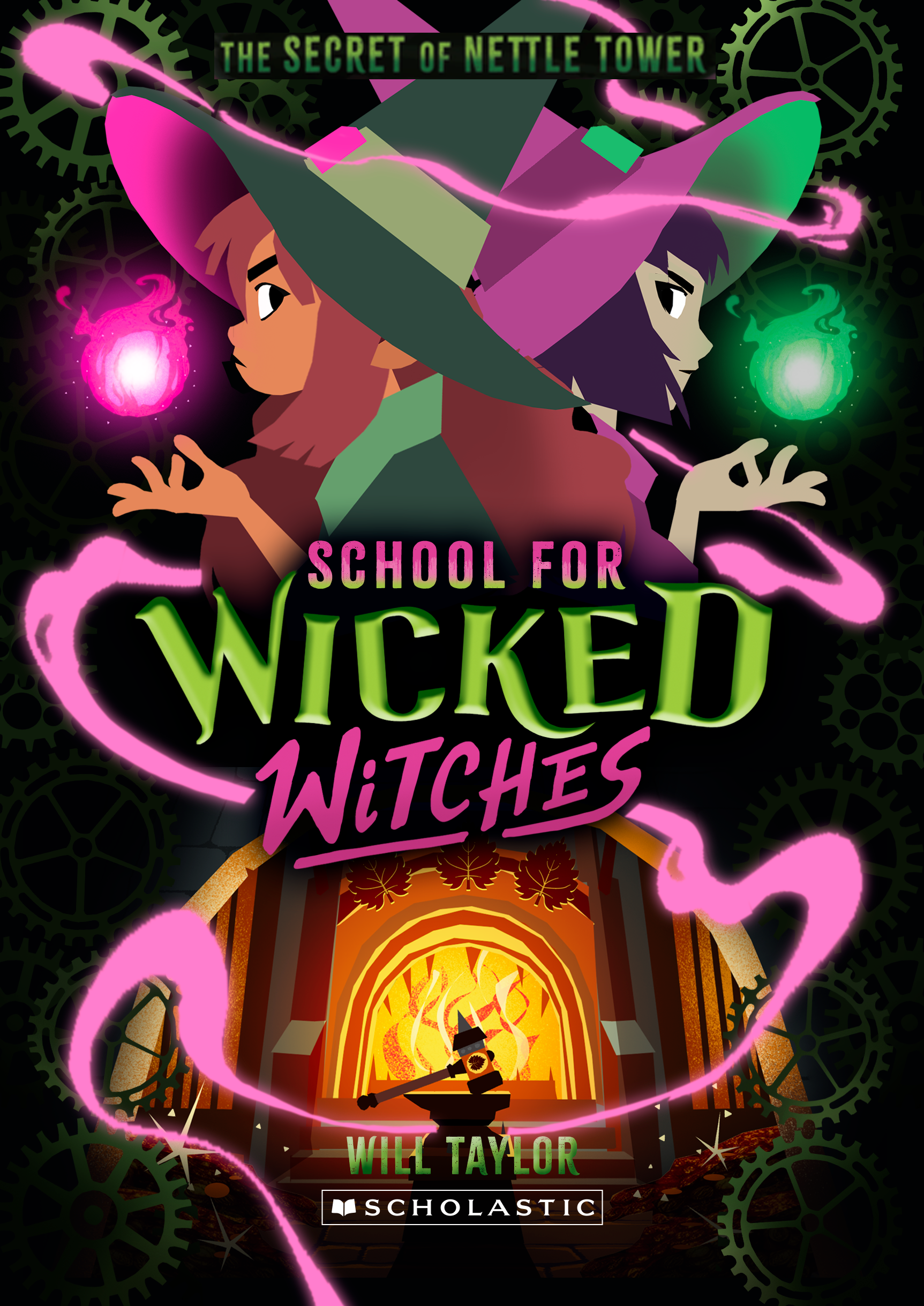
I think that this works pretty well! I think changing up the magic definitely helps separating it from book one. Both green and pink works equally well for me, but I think i have just a slight preference towards the green magic.
02 A & B


a different colored background, i'm not a big fan of this, though it does work nicely with the pink magic.
03 A & B
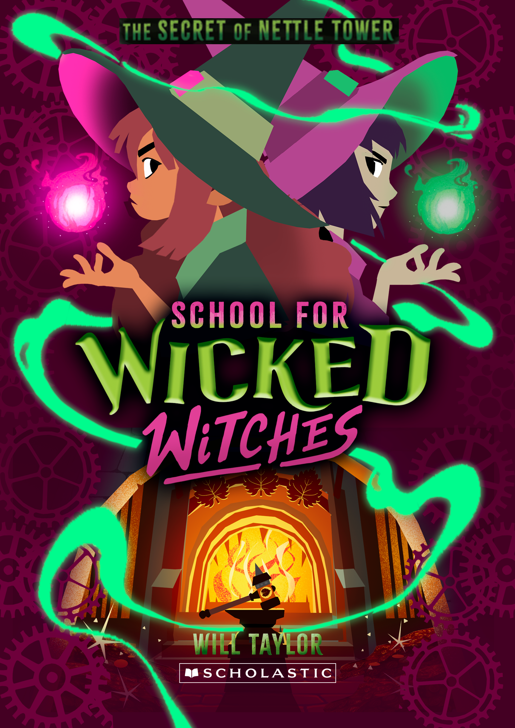

if you're dead set on having a different color background I think this color works best. I think both the green and the pink magic works equally well here.
04 A & B

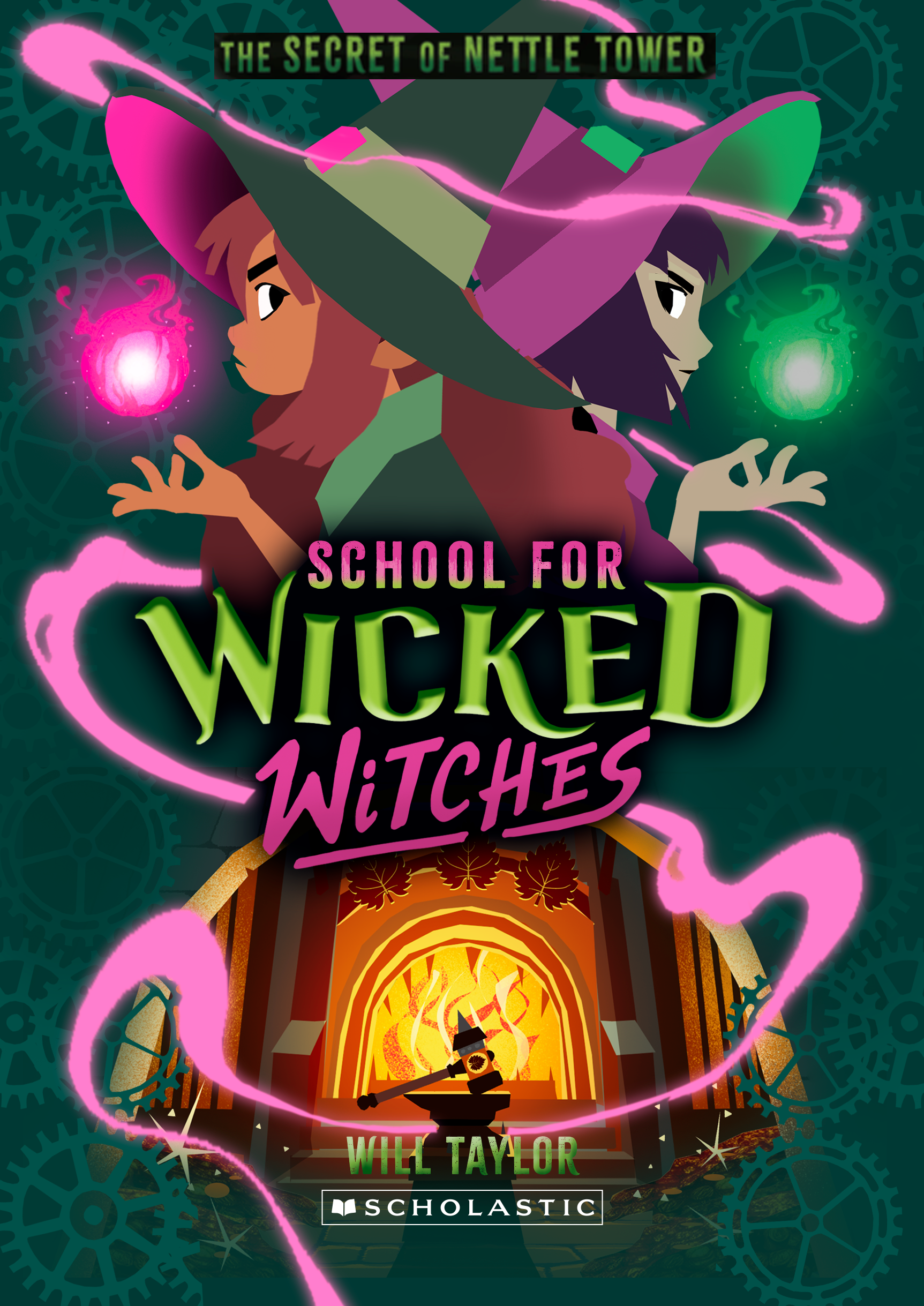
a more greenish background, not really a fan.
05 A & B
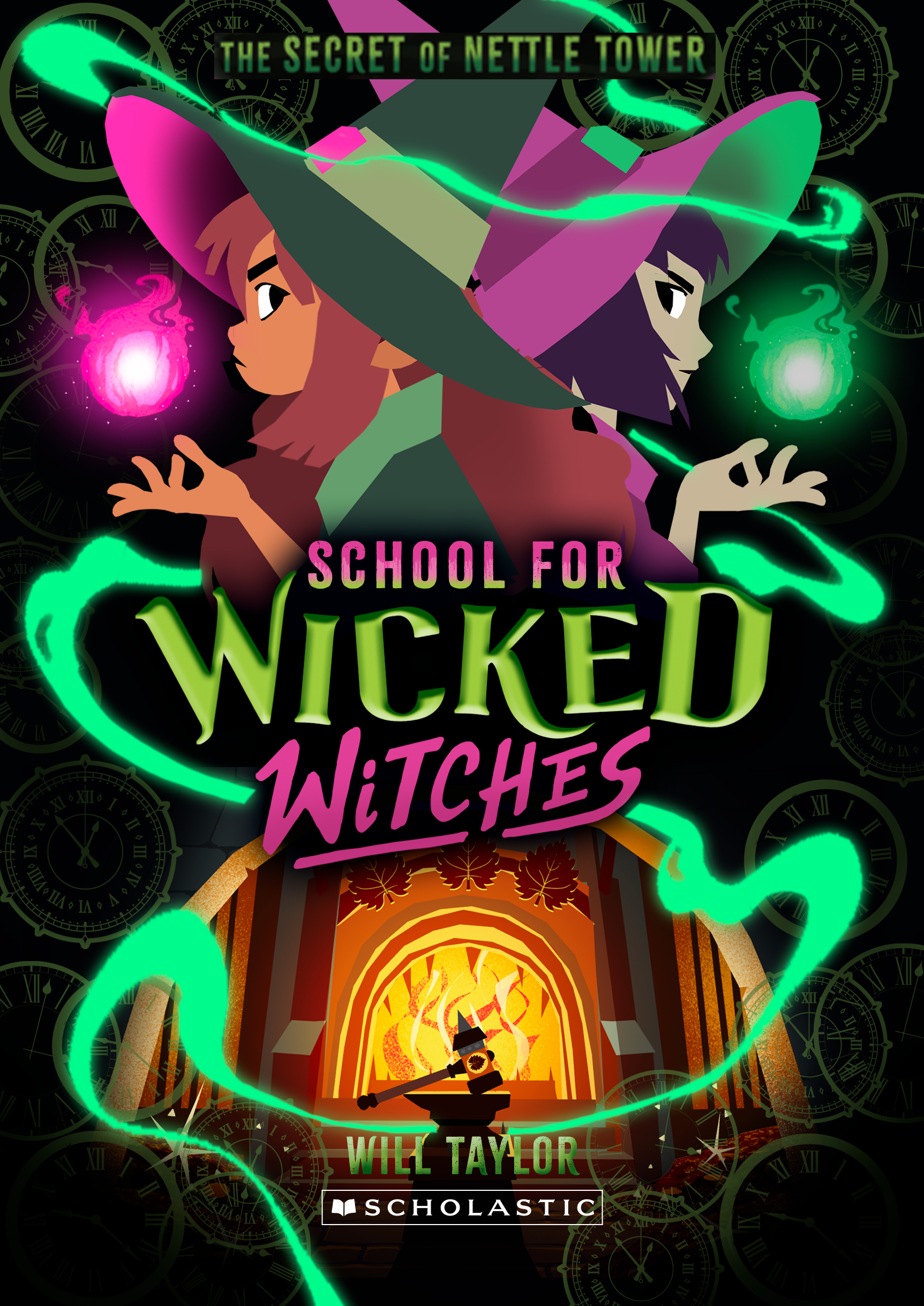
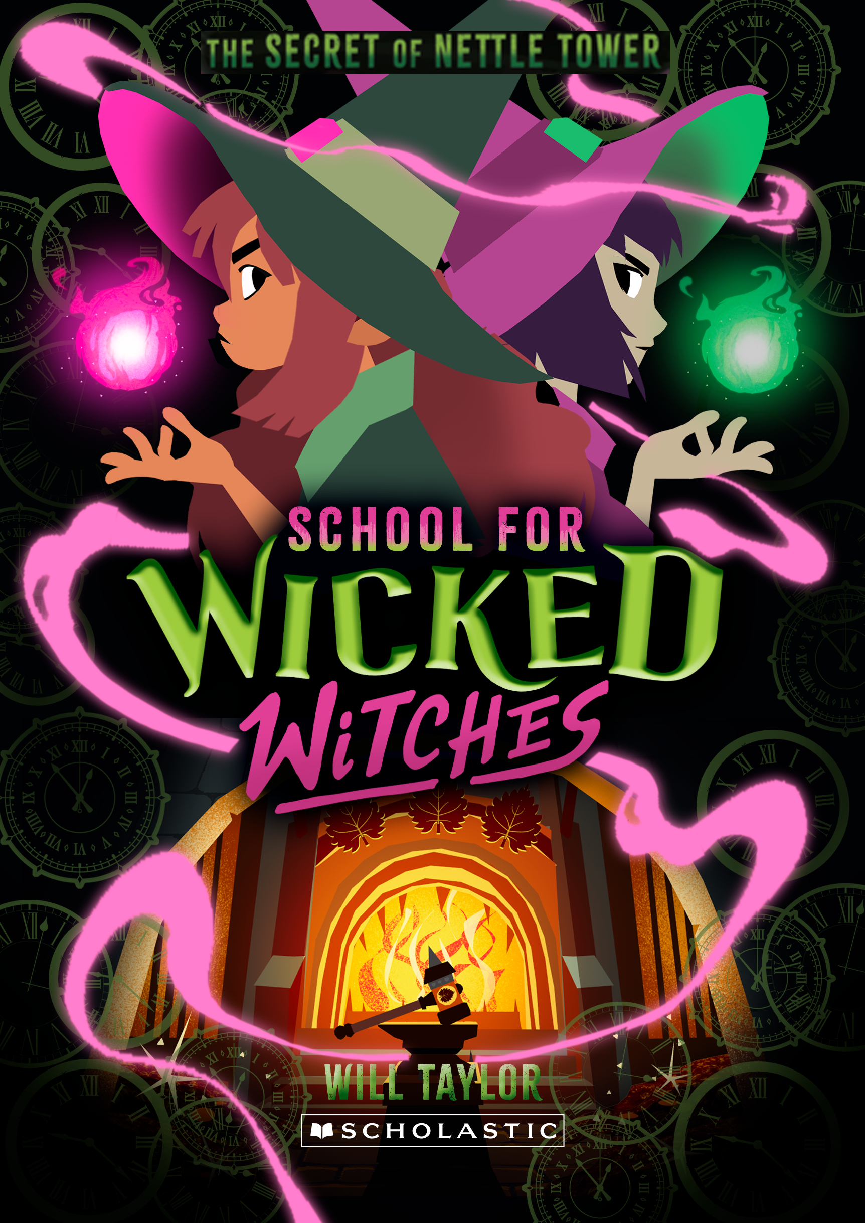
here are my favorite versions, but with clocks instead of cogs, I think having the clocks is a nice enough change and a nod to the story.
BONUS
as requested: the flipping of the scenes. it could work, but it's a shame the characters get relatively small.
COVER COMPARISON
here are the two black background covers side by side, so you can more easily judge if they're too similar/confusing.
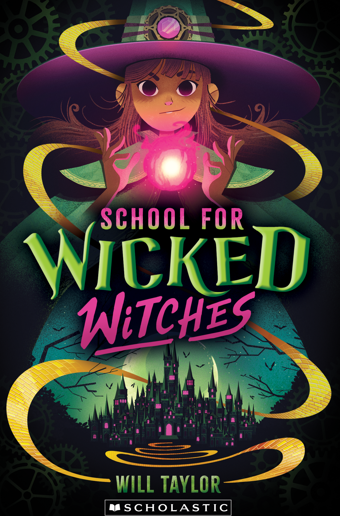

I think they're different enough, but i'll leave it up to you!
(I just now noticed that the forge has less space than the castle on book one, no worries though, I'll make sure they're more in line when I start rendering everything)
that's it for now!
(I just now noticed that the forge has less space than the castle on book one, no worries though, I'll make sure they're more in line when I start rendering everything)
that's it for now!
hey hey!
A new book: A new page :)
The sketches below are still pretty rough, but I think you have a clear idea now of what the end result might look like since we've already done a book before.
a couple of notes to start of:
A new book: A new page :)
The sketches below are still pretty rough, but I think you have a clear idea now of what the end result might look like since we've already done a book before.
a couple of notes to start of:
everything is still missing the cool lighting effects, adding those when I will start rendering the images will definitely add a spark of magic.
The character description for book one described Tinabella as having "Silvery skin", I'm not too sure what that means exactly (actual silver skin? or just a bit pale? etc), so she's a bit gray now, but we can easily fix that.
I don't know if the kids in the school all wear different outfits or if they're sort of witchy school uniforms, but I thought it would be nice to give Tinabella a different colored outfit. But that is also really easily tweaked if needed.
there are notes under each set of images.
let's go!
SET 1

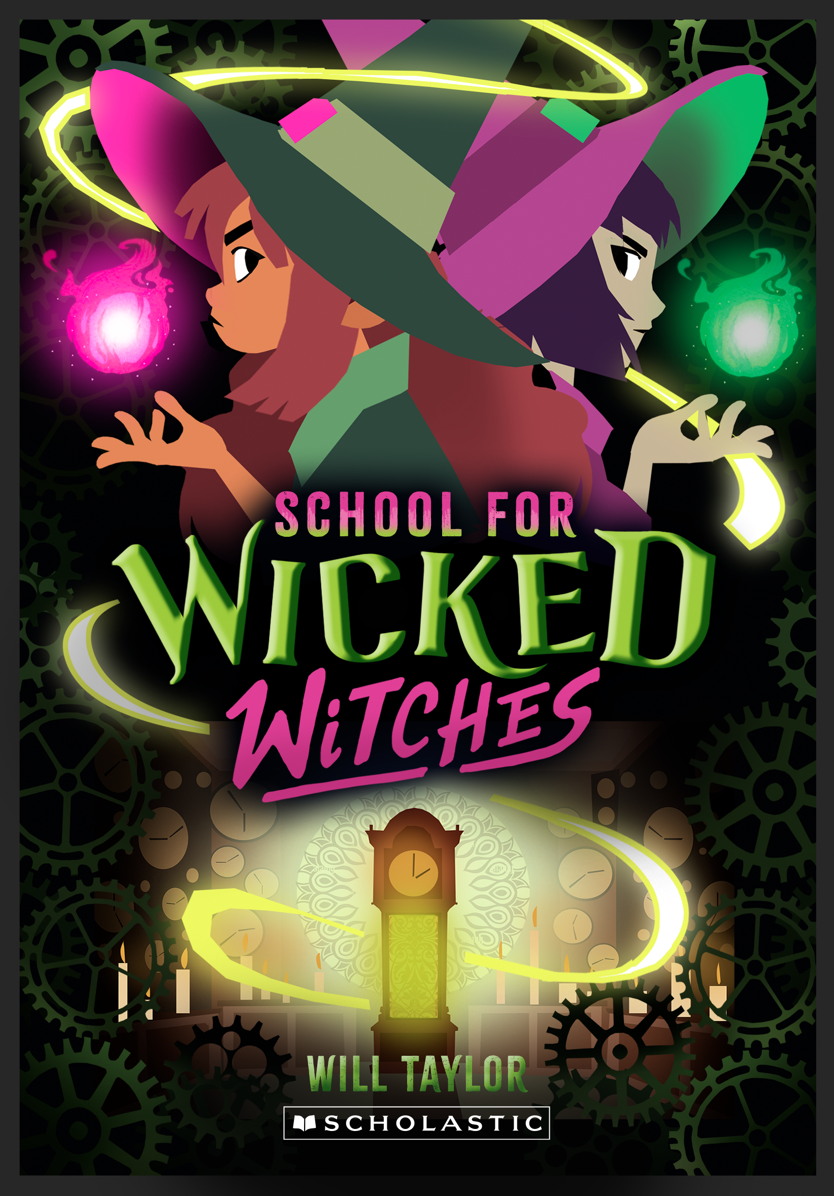
I thought it could be cool to play a bit with the color of the outfits / magic to emphasize the rivalry between the two girls.
I also think the magic swirls coming from the clock (instead of the yellow brick road on the cover of book one) works really well here and adds some nice movement to the image.
I also think the magic swirls coming from the clock (instead of the yellow brick road on the cover of book one) works really well here and adds some nice movement to the image.
SET 2
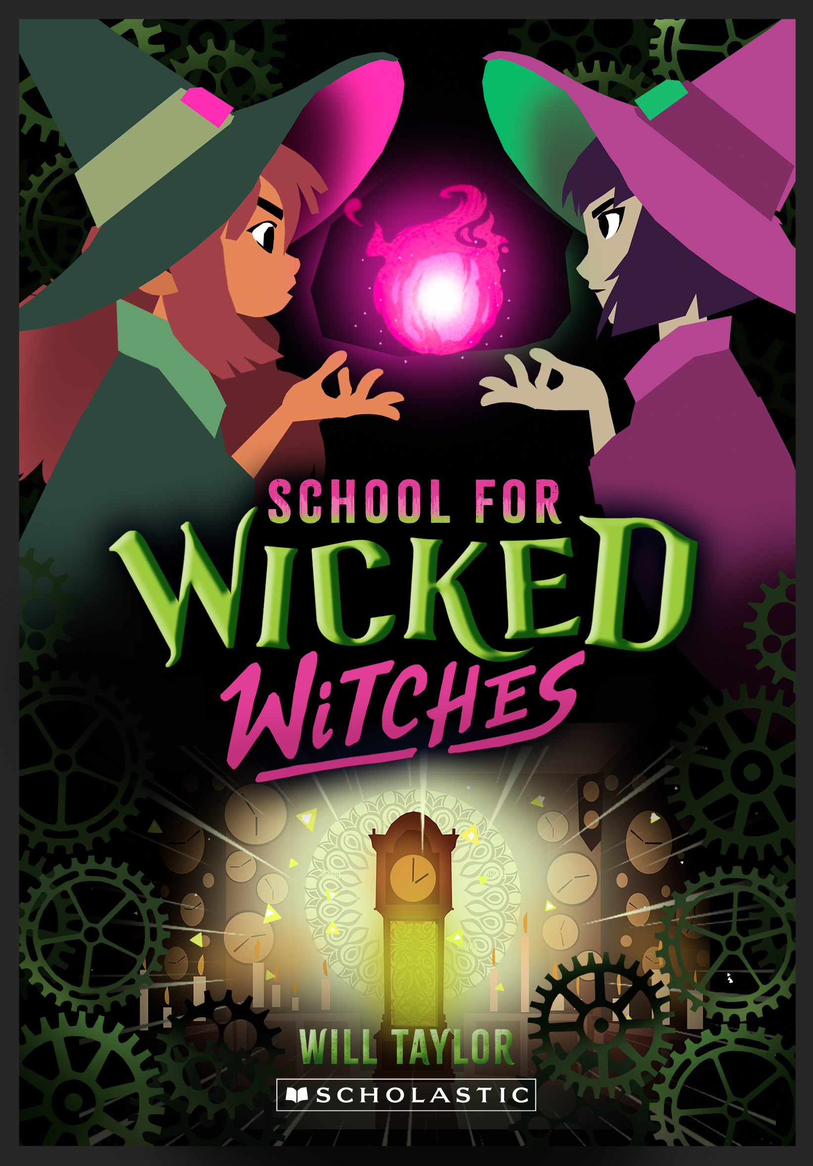
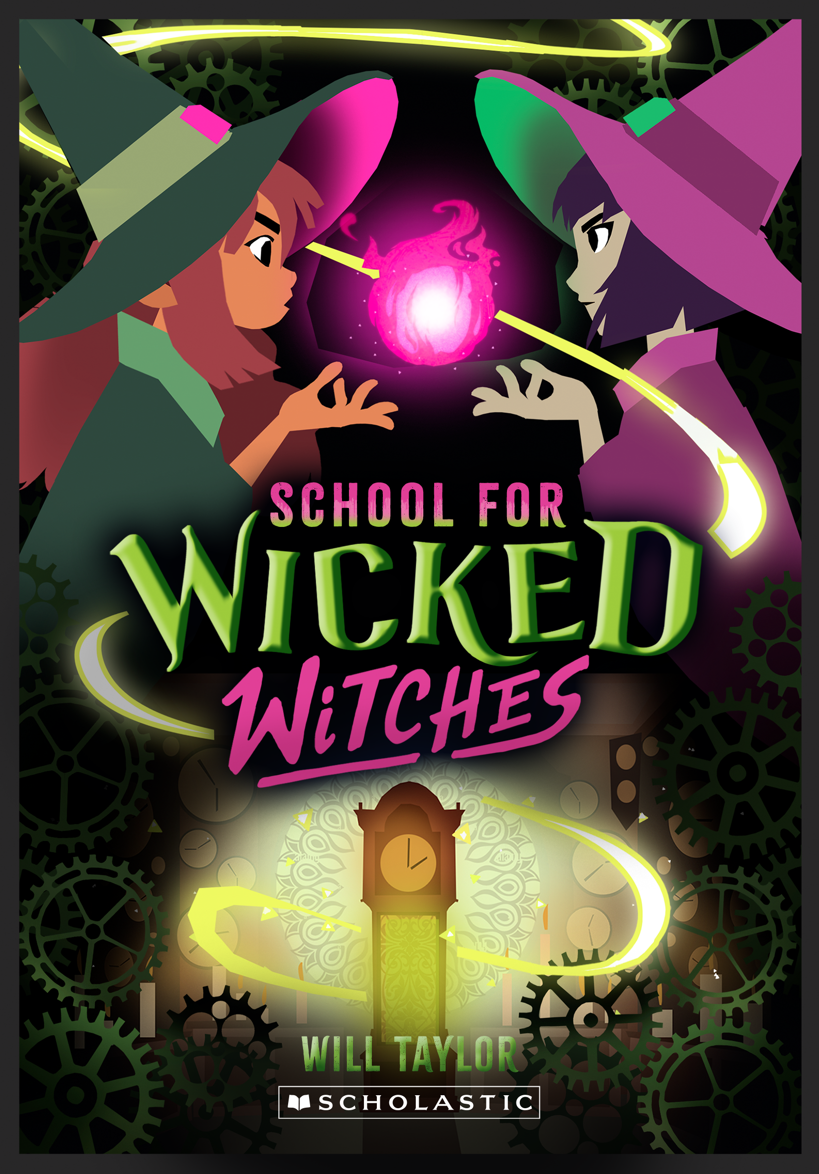
this works too but I think set 1 is more in line with book 1 (the sort of triangle composition we've got going on there).
we could have the magic ball in the middle be both pink and green (split in half or something), or we could even have some other magical object there.
we could have the magic ball in the middle be both pink and green (split in half or something), or we could even have some other magical object there.
SET 3 - BONUS
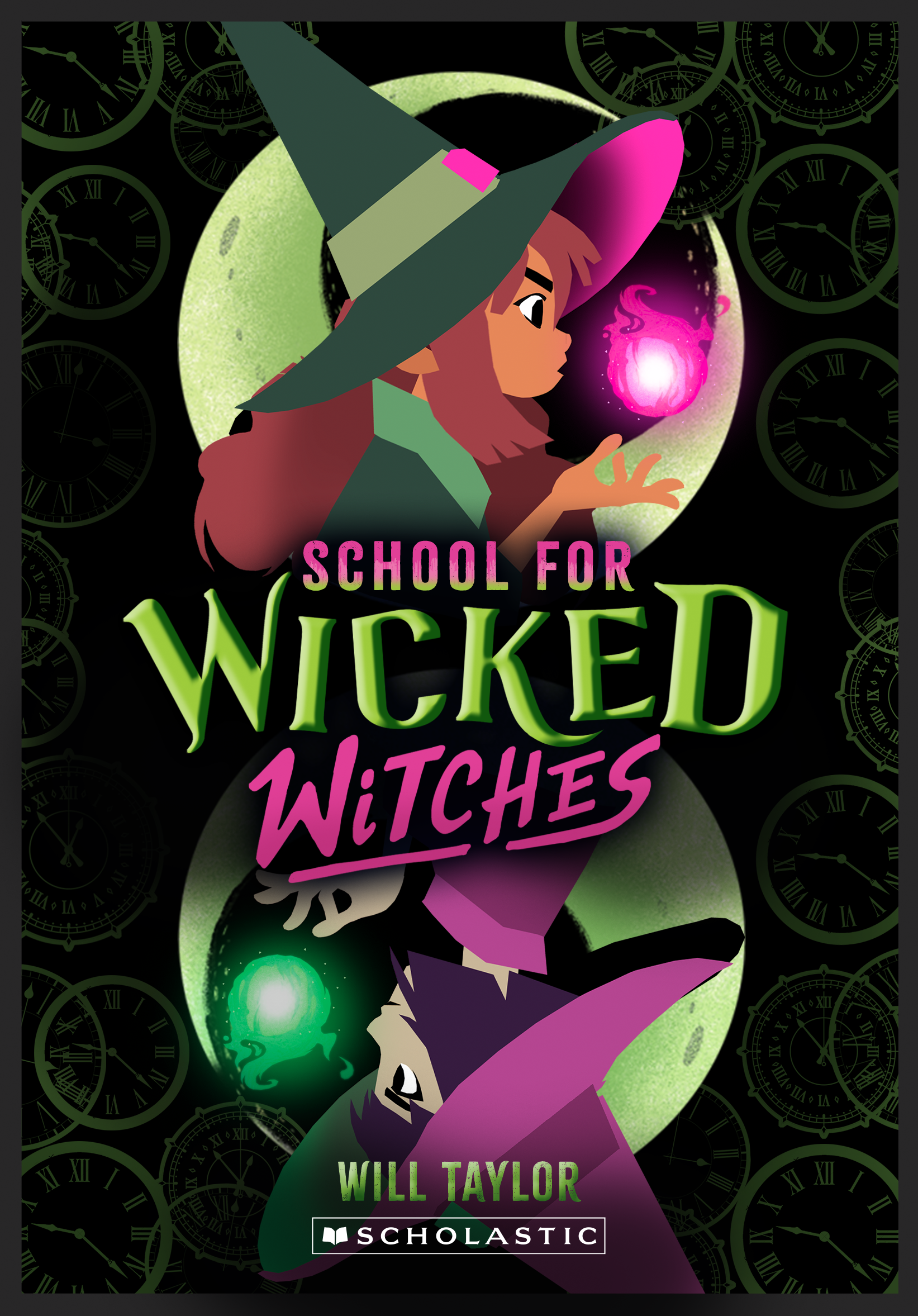

I think this is too far removed from the cover of book 1, but I wanted to include it anyway. I like how it emphasizes the rivalry between the girls a bit more.
instead of cogs this has clocks lining the edges, since there is no clock image on the bottom anymore. we could also use the clocks on the other covers, but I think the cogs keep everything a bit more in line.
I just slapped the moon from book one in the background here but we could have anything in the background (if it's not too detailed).
I just slapped the moon from book one in the background here but we could have anything in the background (if it's not too detailed).
that's it for now! I think my favorite is 01-B, but I'll leave it up to you!
