🗡️ PIRATE ACADEMY 3 🗡️
INTERIOR ILLUSTRATIONS
hey hey hey!
here are the final illustrations!
I tried to adjust everything according to Justin's wishes, but I couldn't reasonably do a couple of them, well I could have but I didn't think they'd make the illustrations/compositions better.
there are notes under the images where applicable :)
here are the final illustrations!
I tried to adjust everything according to Justin's wishes, but I couldn't reasonably do a couple of them, well I could have but I didn't think they'd make the illustrations/compositions better.
there are notes under the images where applicable :)
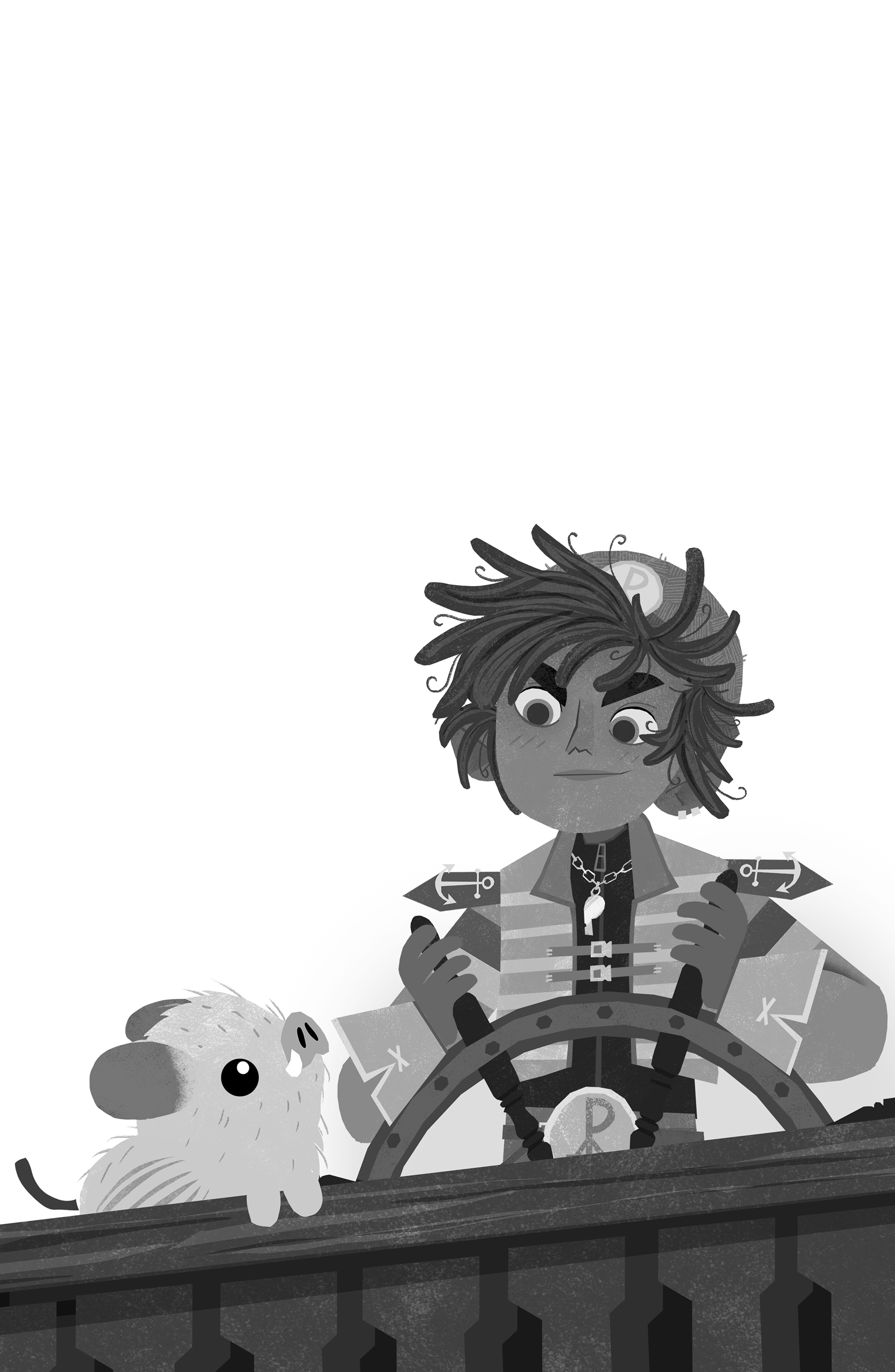

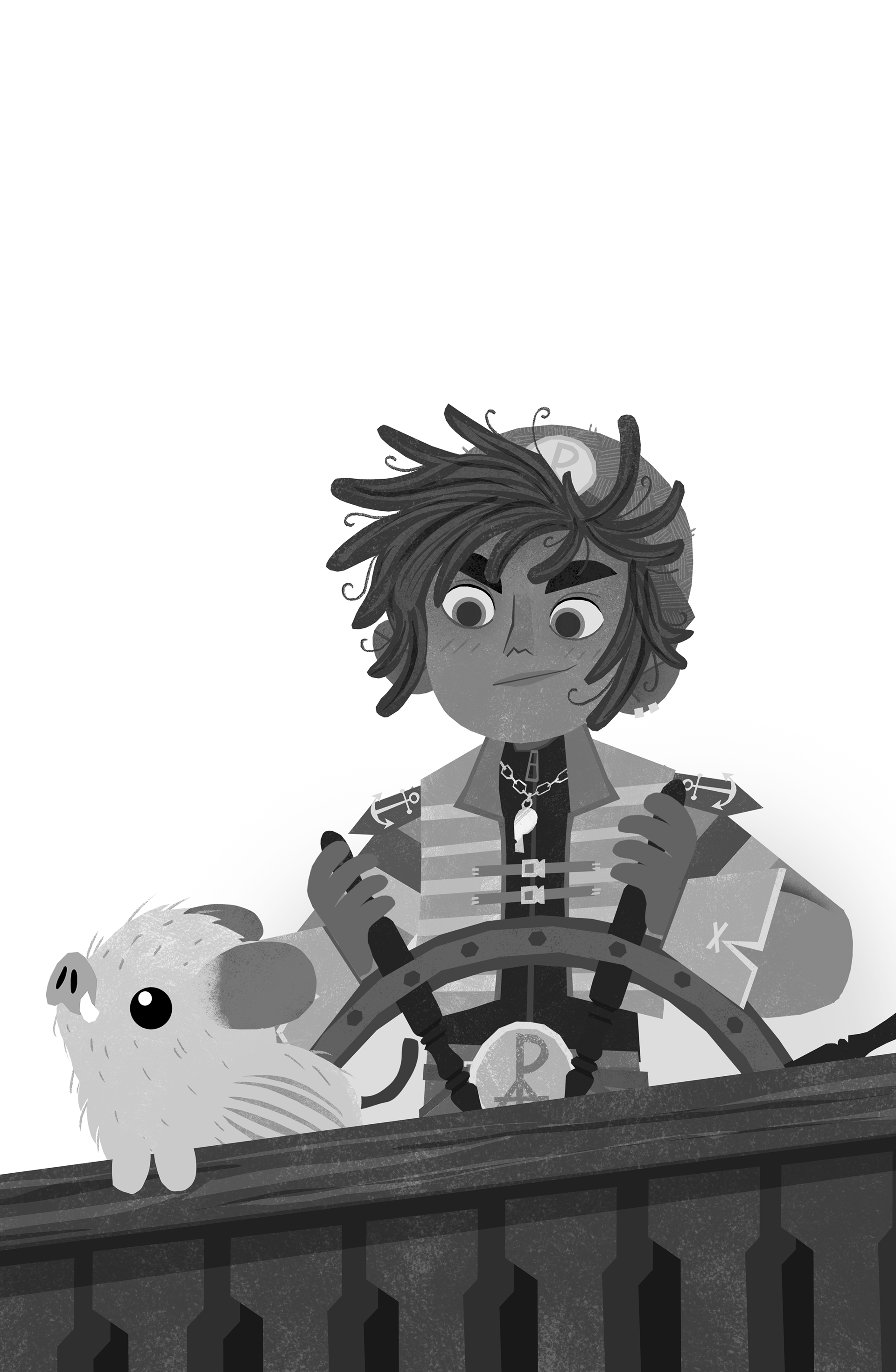
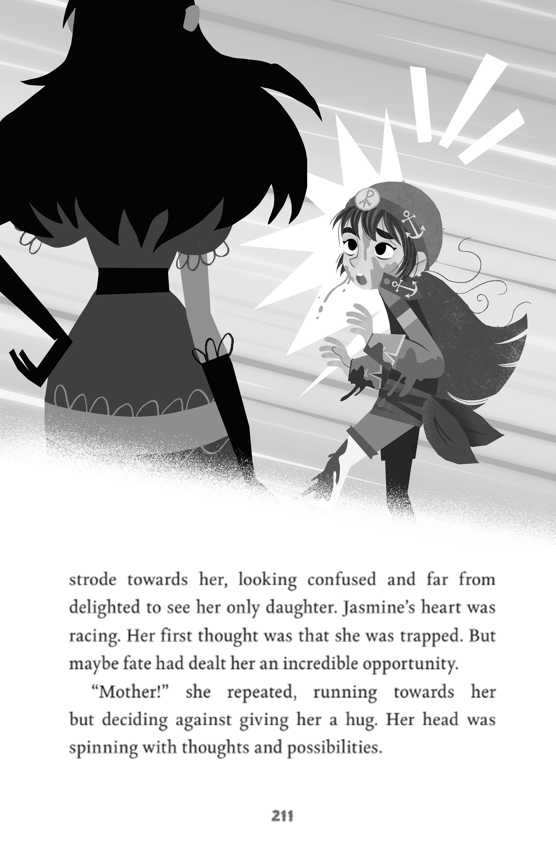
no notes

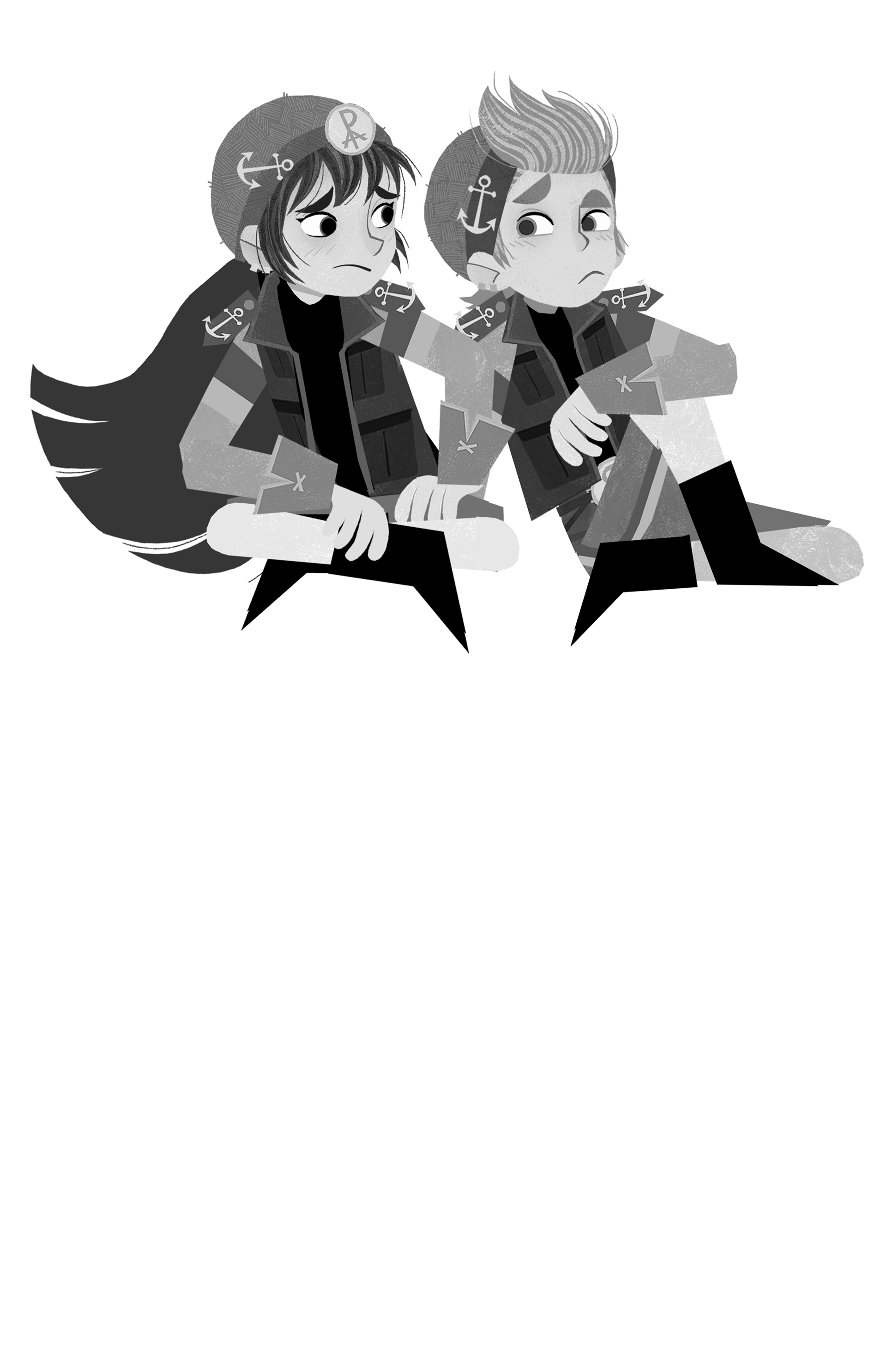
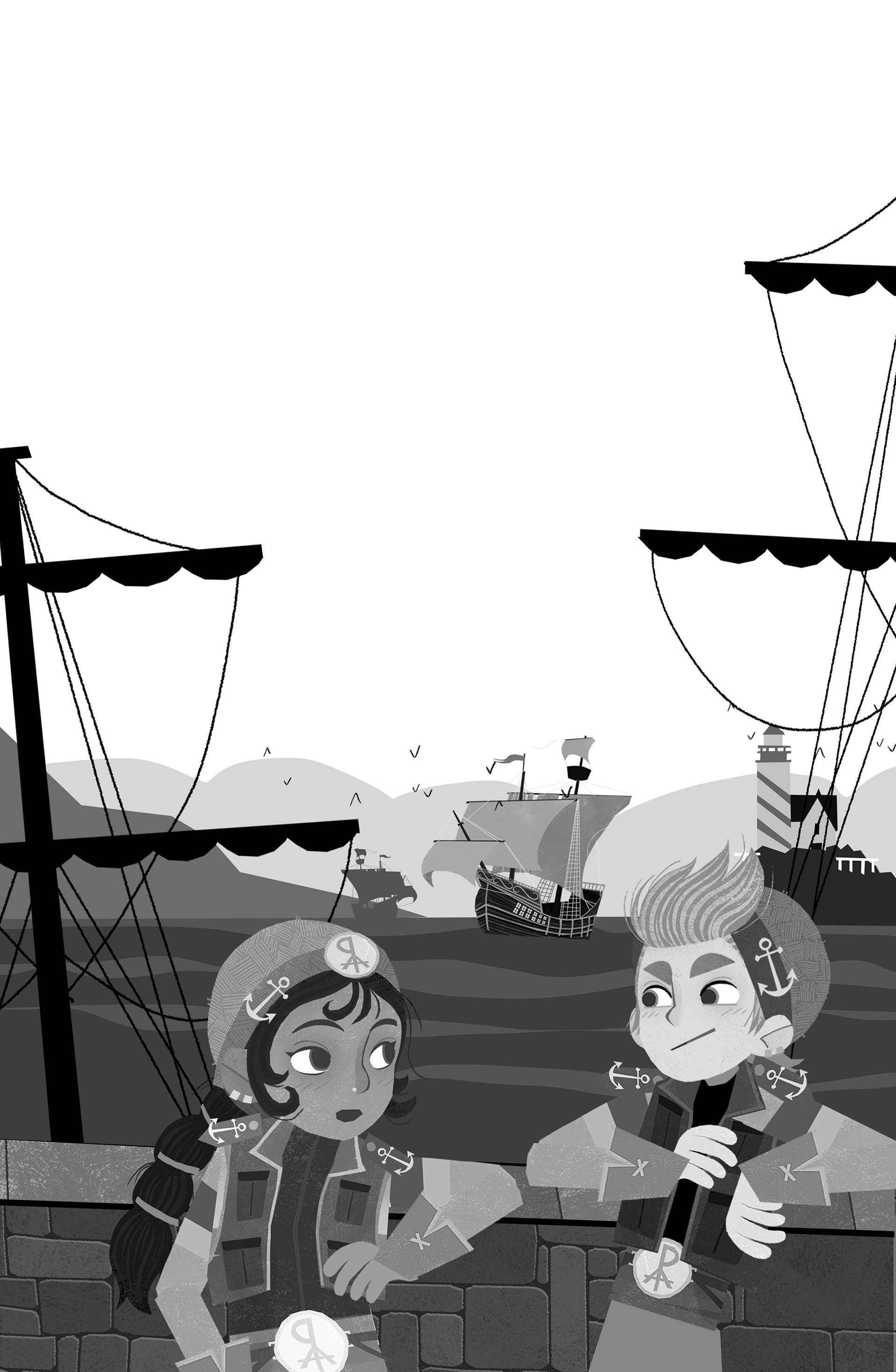
no tattoo in the neck, or at least not visible :D
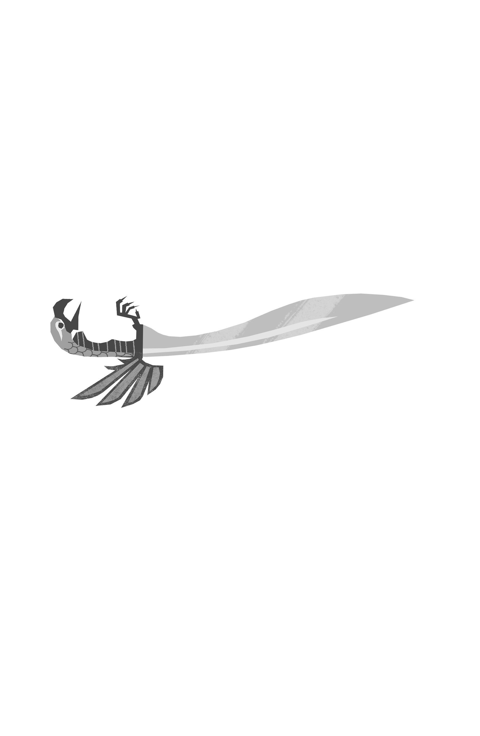
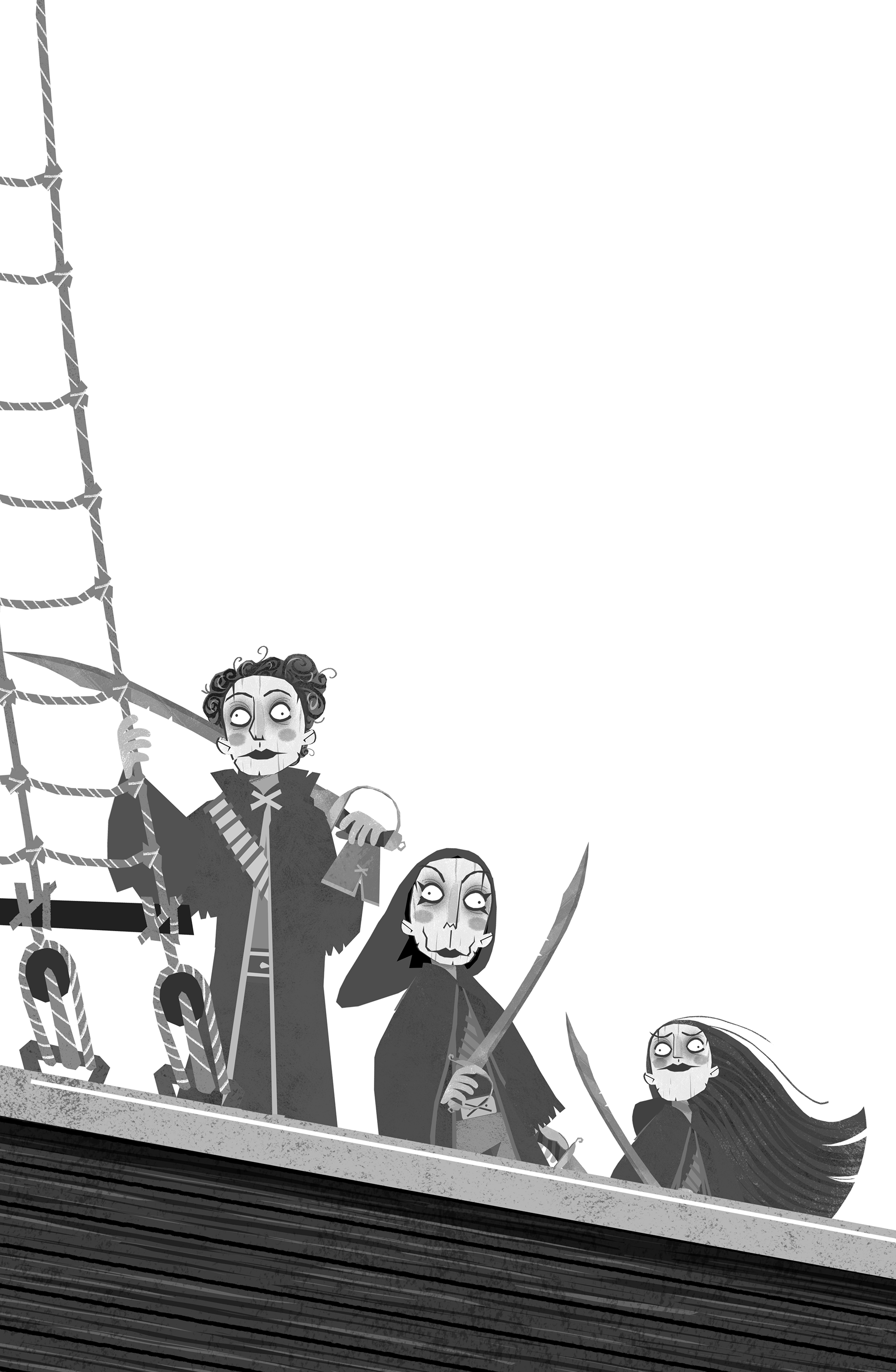
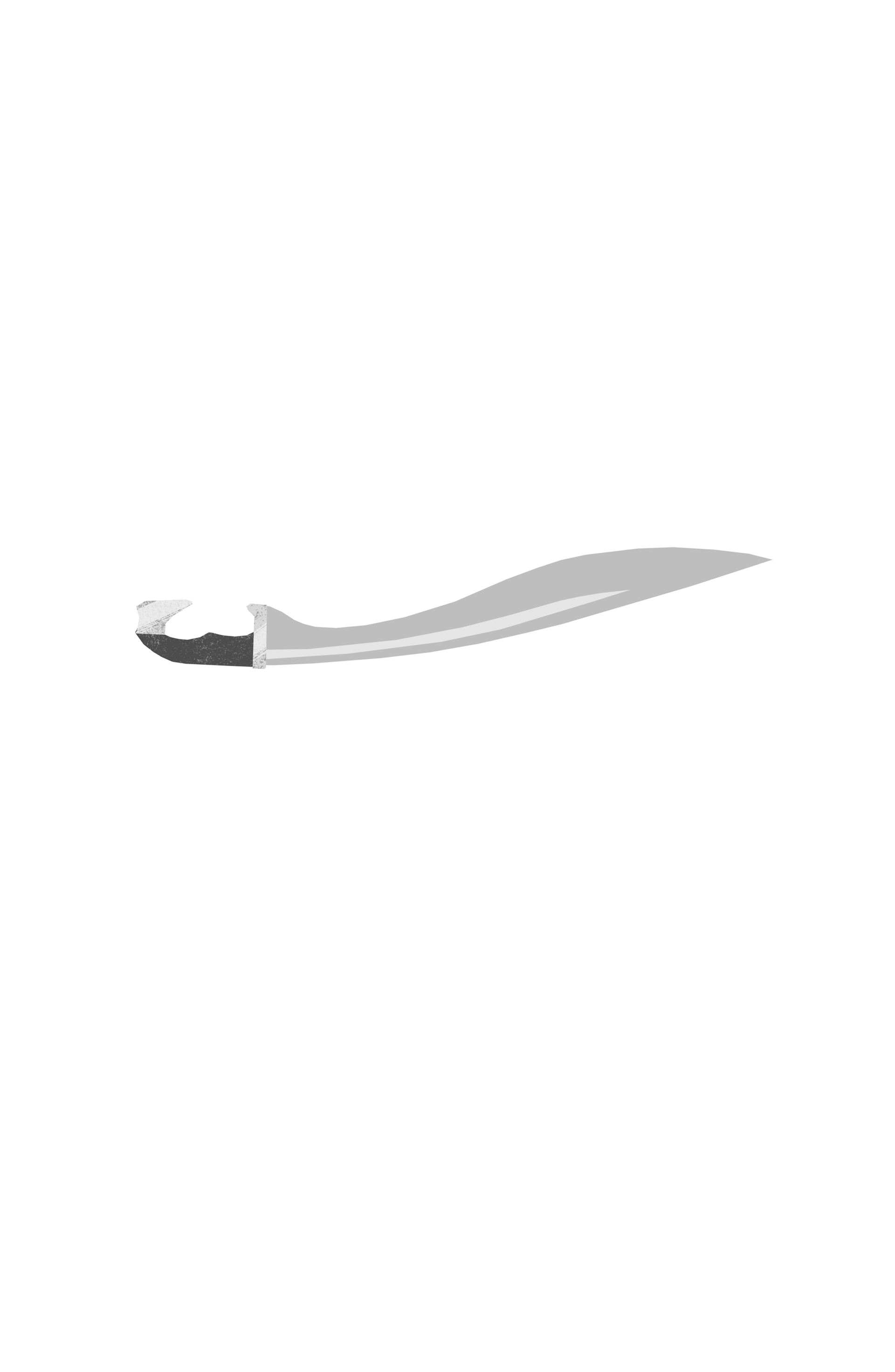
I think the sword looks pretty cool like this, are you sure we shouldn't add this sword to the cover too? It wouldn't take me too long to adjust, 20 minutes or so.

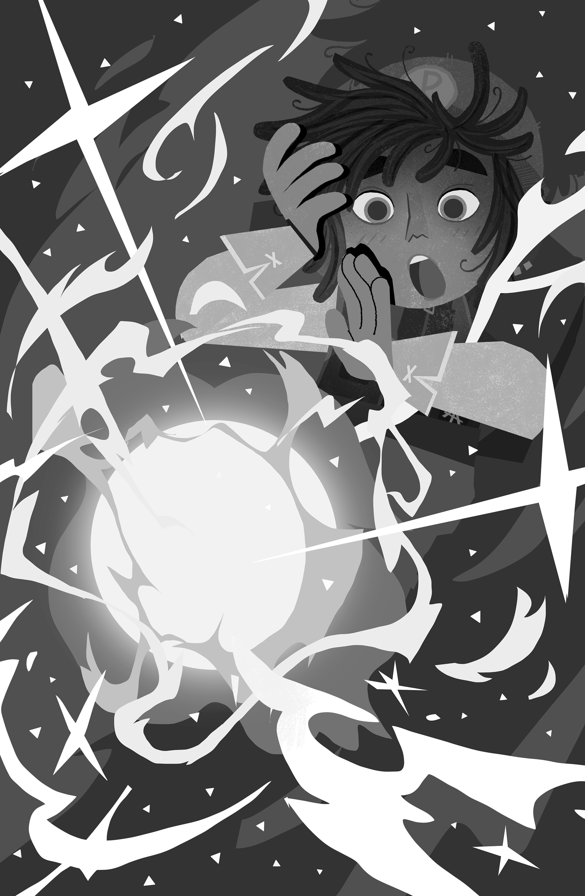
I tried my best to add the spinning sword in the background of the drawing on the right but it made everything pretty unclear, It's pretty difficult to clearly illustrate such extreme motion in a static black and white image :(

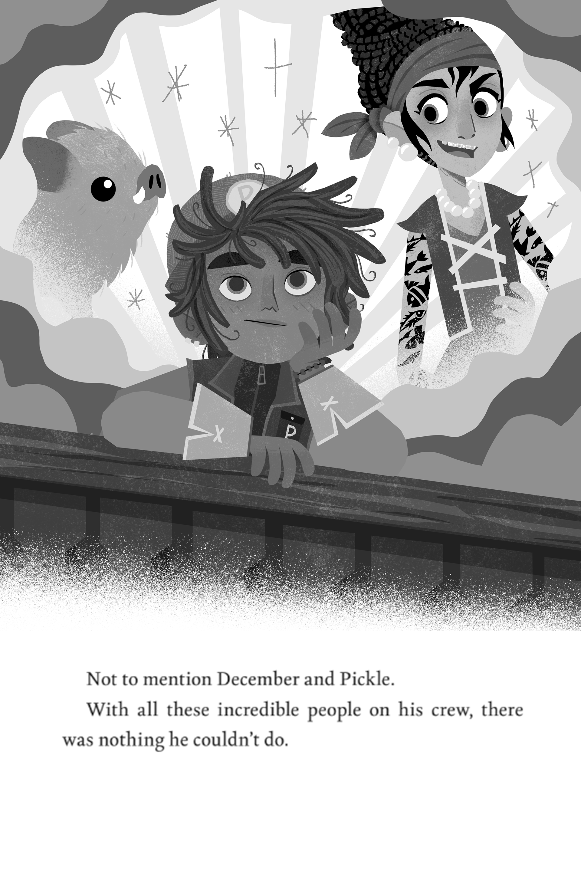
I'm really happy with how the illo on the right turned out! I did try to add the kids somewhere in the image, but since this has a pretty dense background I couldn't make it work without things blending in to each other.

I really like the one on the left.
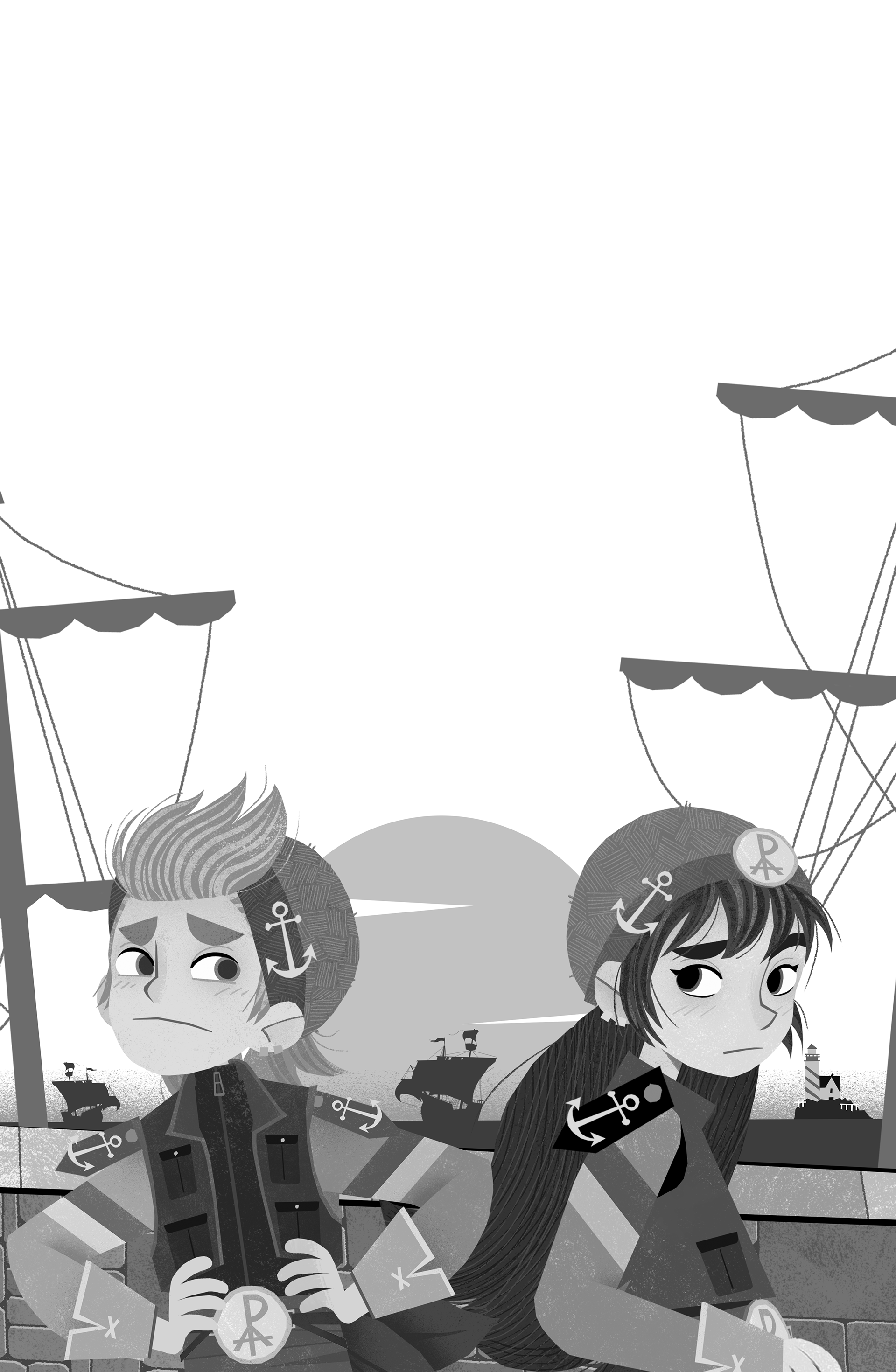
I adjusted the perspective a bit in the image on the right. I wasn't quite sure about the expressions the kids should have, but those are easily adjusted!
I adjusted the perspective a bit in the image on the right. I wasn't quite sure about the expressions the kids should have, but those are easily adjusted!
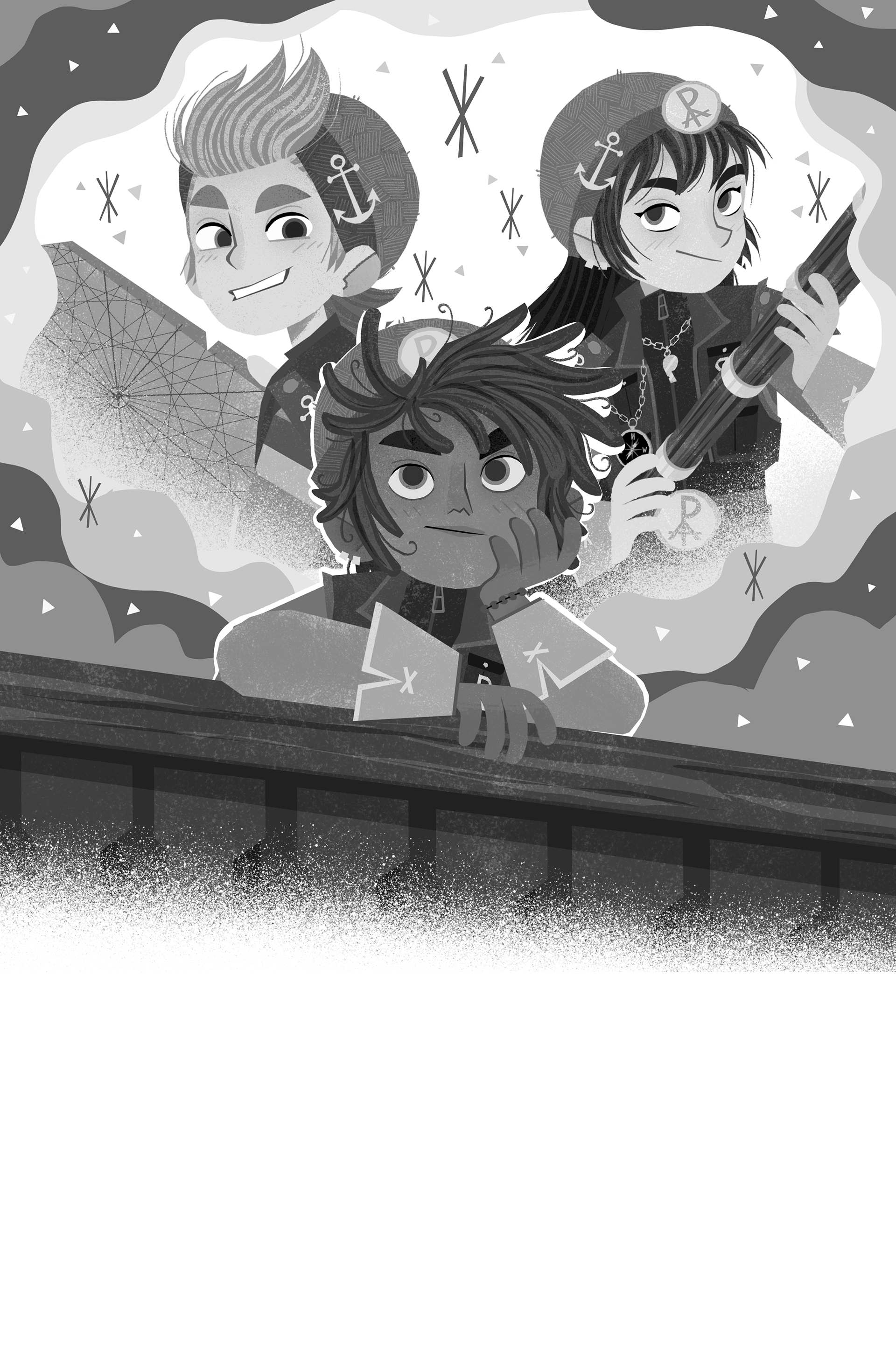
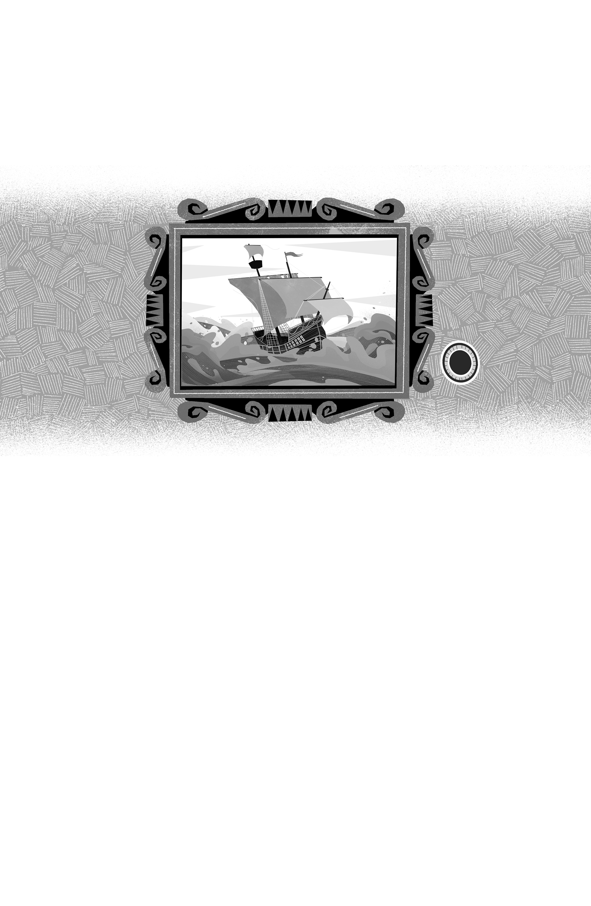
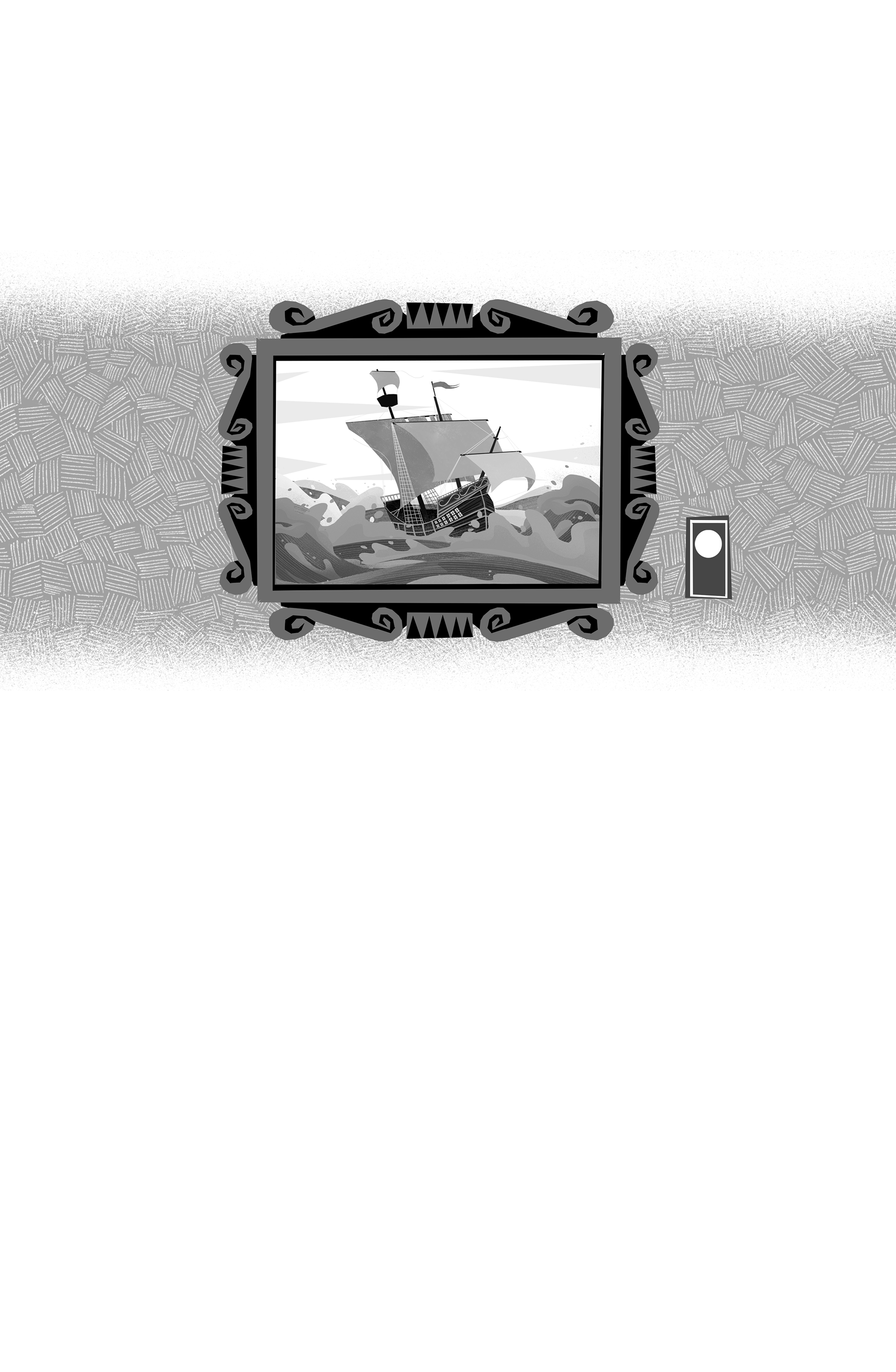
no notes, but a pretty cool image to end the book with!
and here is a zip with all the images:
👉 DOWNLOAD 👈
👇 PREVIOUS UPDATES 👇
INTERIOR SKETCHES
hey hey! here we go!
there are notes under each set of images (where applicable)
there are notes under each set of images (where applicable)

01: I added Pickle since he's described as being there in the text too
02: no notes, pretty straightforward
03 A + B: originally 1 illustration, but works better as 2 (because of the setup of the scene I can't show all characters from the front in one illustration).
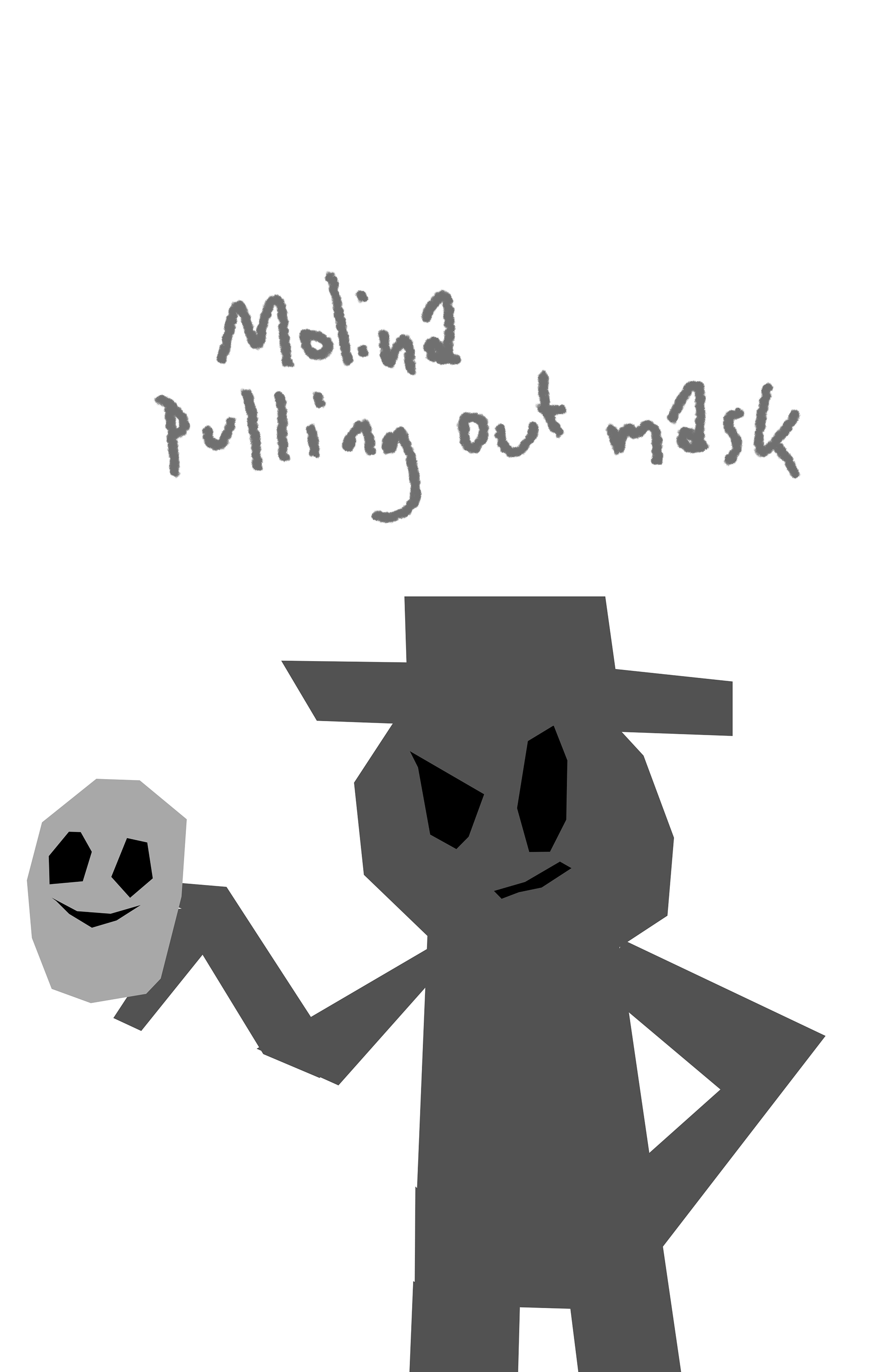
I tried looking for a description of Molina, but I couldn't find one. If Justin gets me a description I'll draw him when we finalize the illustrations :)
I tried looking for a description of Molina, but I couldn't find one. If Justin gets me a description I'll draw him when we finalize the illustrations :)
4 /5: no notes
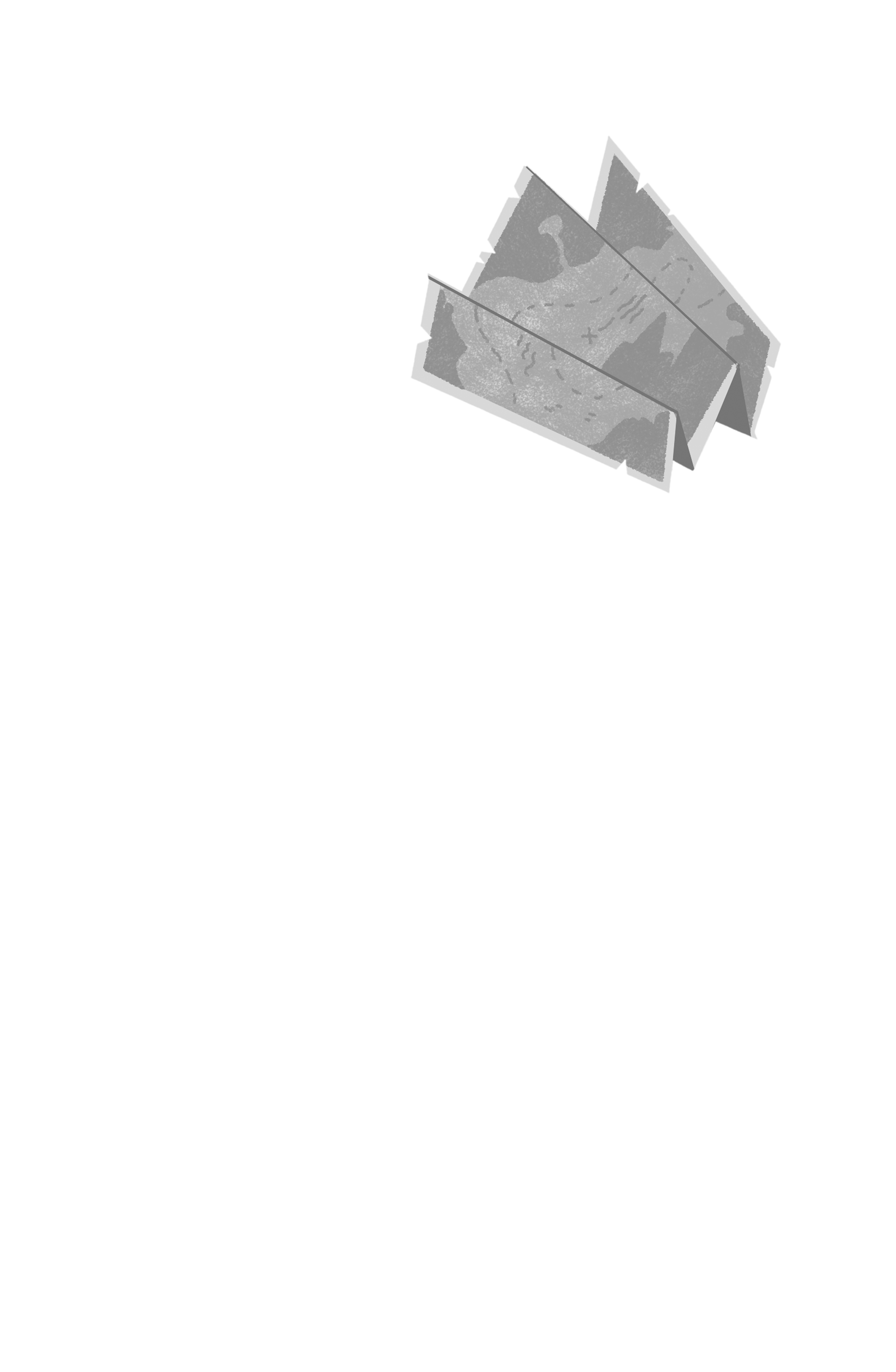
06: The mud map was not really described in the book, so I'm not sure if it should be just a regular map or something else. easy to adjust though if needed :)
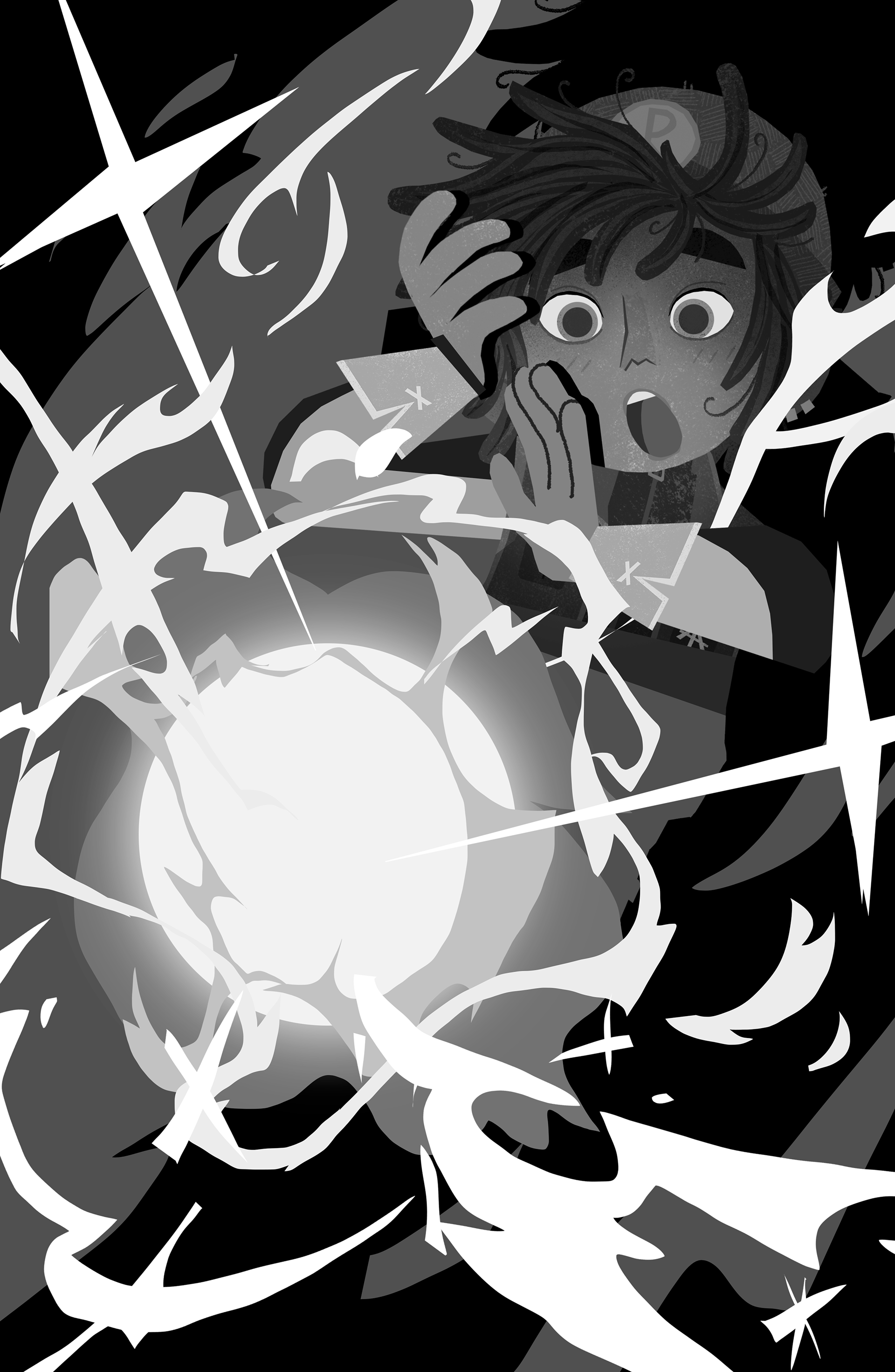
07: I can add some sort of vision in the glowing orb, but please temper Justins expectations, there's limited space and showing morphing scenes (or characters) is going to be almost impossible. I think this already works pretty well.

I love both of these sketches
08: no notes
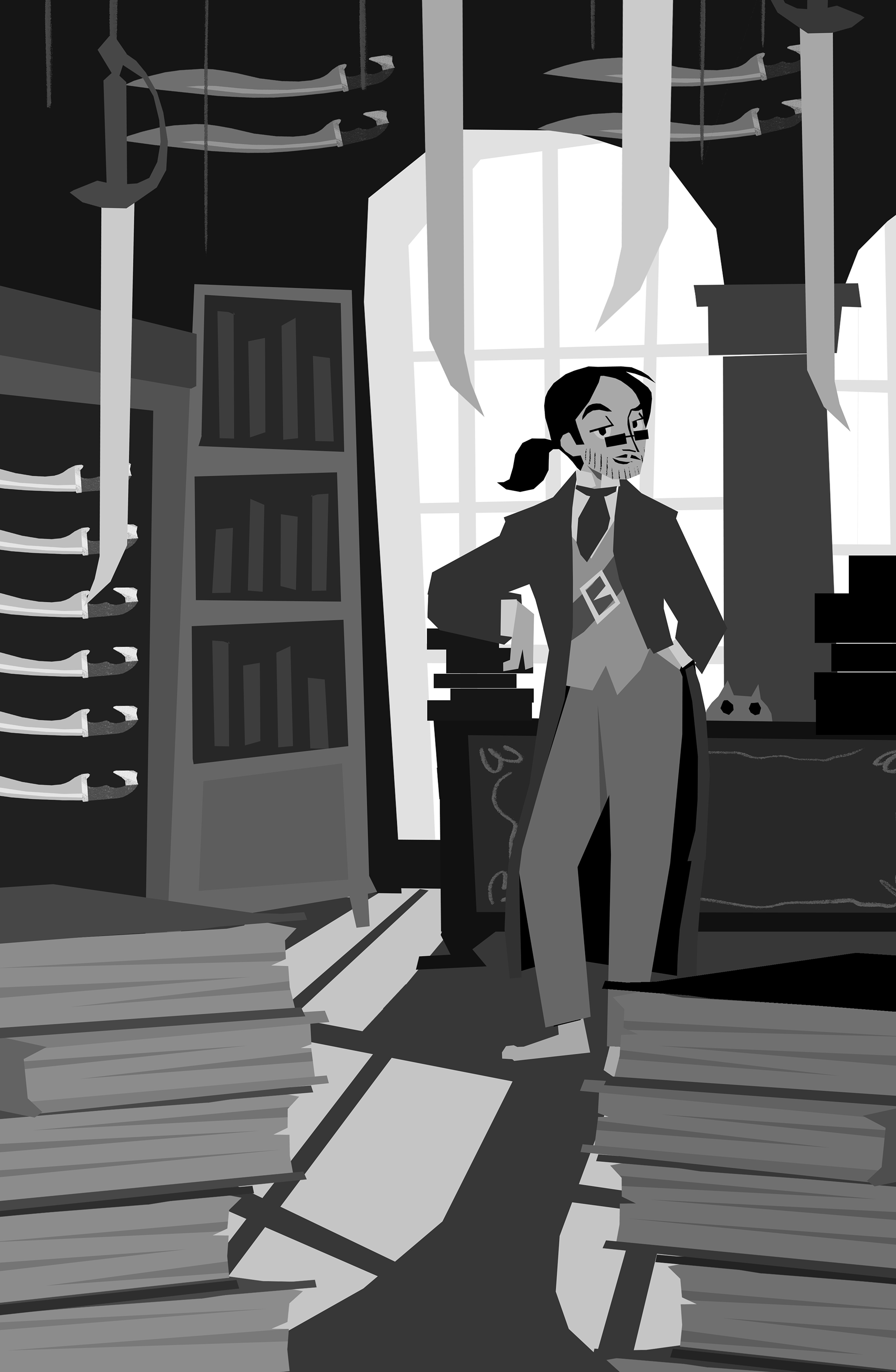
09: I think it's best to focus on the library of swords as a setting and Porfirio. due to the nature of my style it will be really difficult to show 4 characters + a background and make it look good.
the swords are just quickly copy pasted for sketch purposes, but they'll vary more when I start finalizing them.
the swords are just quickly copy pasted for sketch purposes, but they'll vary more when I start finalizing them.
nantucket is also there, see if you can find him :)
10: I really like this one. If justin has any more wishes for the clothing Jas' mom wears I'm open to suggestions.
11: no notes
We can show Jas and Jac here instead of December and Pickle. I don't know if I can work them all in. If space allows we could consider making this a full page illustration and I can see if I can add all characters then.
that's it for now!
that's it for now!
and to save you some clicks you can download all the images here
👇PREVIOUS UPDATES👇
hey hey hey!
here's a new version of the cover! on the left is the original RGB version and on the right is the CMYK version, adjusted to the best of my abilities (and the limitations of CMYK)
here's a new version of the cover! on the left is the original RGB version and on the right is the CMYK version, adjusted to the best of my abilities (and the limitations of CMYK)
apparently CMYK is a lot more limited, especially when it comes to vibrant colours. I'd suggest jut showing the CMYK version from now on, nobody will notice probably :D
and a last small note:
I added red lips to the mask at the top. but the masks as they were came straight from the book interiors of book 2. I think it's a bit weird to have the masks change from book to book, but I'll leave that up to you.
I've prepared a layered CMYK file for you so it's easier for you to put in the titles:
the magic is on it's own layer, so feel free to adjust them to get it a bit more vibrant.
👇PREVIOUS UPDATES👇
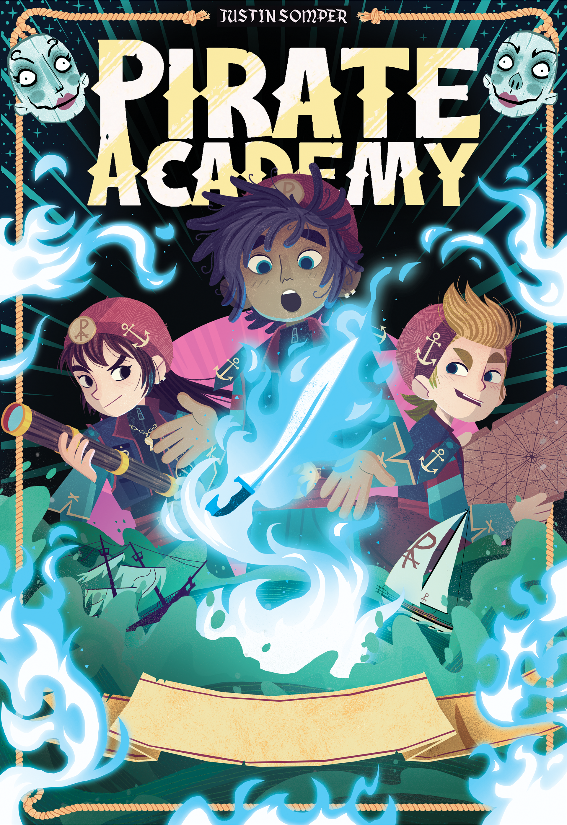
hey hey hey!
here's the cover for PA3
I actually have no notes! I think it's pretty dynamic and a great closer for the trilogy! (it's a trilogy right?) :D
here's the cover for PA3
I actually have no notes! I think it's pretty dynamic and a great closer for the trilogy! (it's a trilogy right?) :D

👇 PREVIOUS UPDATES 👇
hey hey!
here we go! the first sketch for book 3
here we go! the first sketch for book 3
and it's flamin' hot and magical.
there are notes under the image.
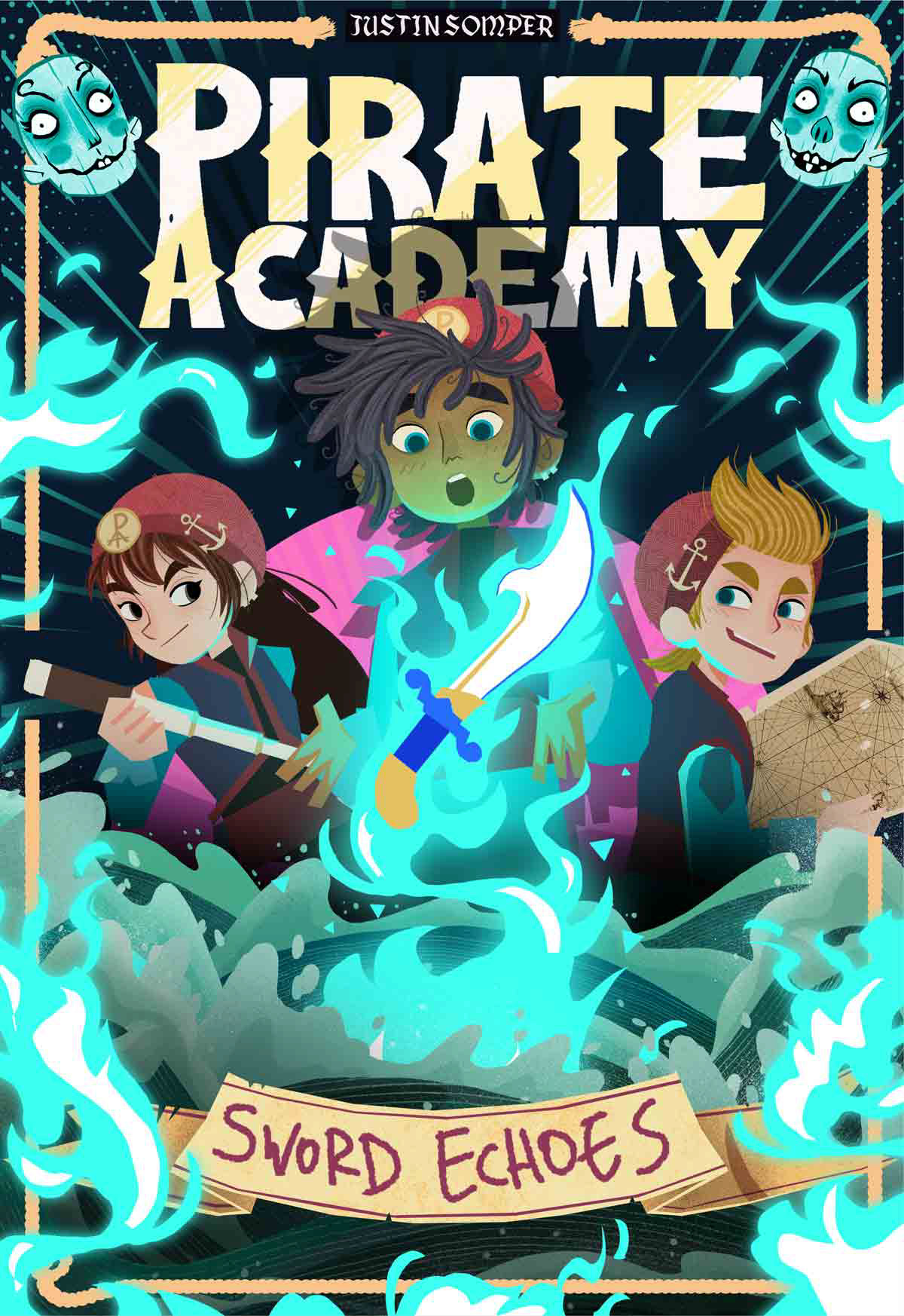
I thought it would be best to exaggerate the special powers of the sword a bit, both because it looks awesome and dynamic but also to make it seem a bit less aggressive (as requested). Neo is also not holding the sword but more so... receiving it? if that makes sense.
the lighting and shadow-work is still very rudimentary, but I think we can make it look really cool once I properly start working on it.
Not sure what expressions Jas and Jac should have, so I just gave them the standard smirks most characters have :D we can easily edit those.
I have a question: I thought it might be cool to have some of Neo's shadow fall on the title, it gives everything a bit of depth and it makes the magic seem extra magicy. however since the title will have gold foil I'm not sure if we can make that work? any idea's about that?
that's it for now!