🦇 ETHAN BLAKE 🦇
MINOR TWEAKS / FINAL
here you go!
The mist was a great call! I'll leave it up to you which version of Ethan you prefer. Both work, but I think I slightly prefer the original version. But most likely that's because I've been staring at it for hours.
The mist was a great call! I'll leave it up to you which version of Ethan you prefer. Both work, but I think I slightly prefer the original version. But most likely that's because I've been staring at it for hours.

👇PREVIOUS UPDATES👇
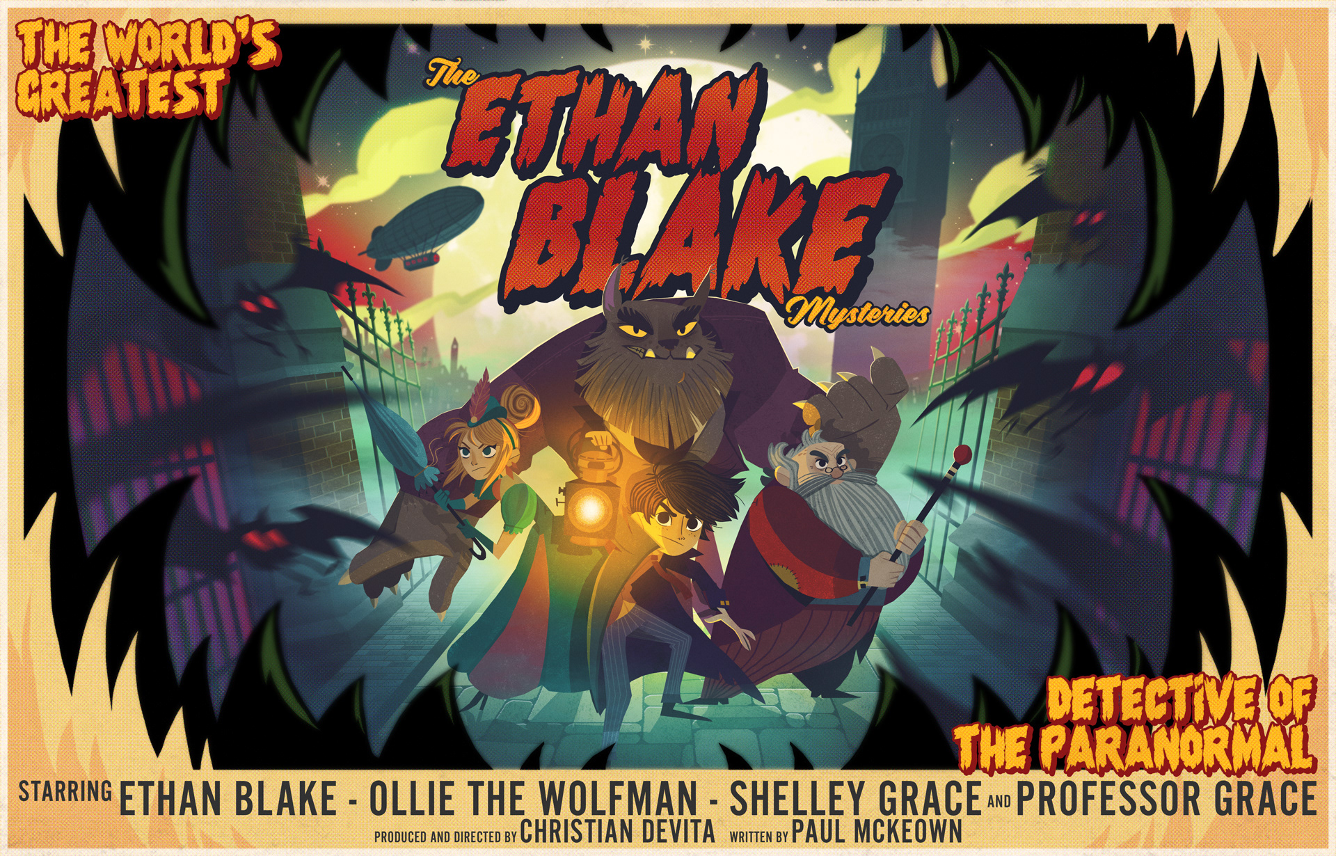
FINISHED POSTER
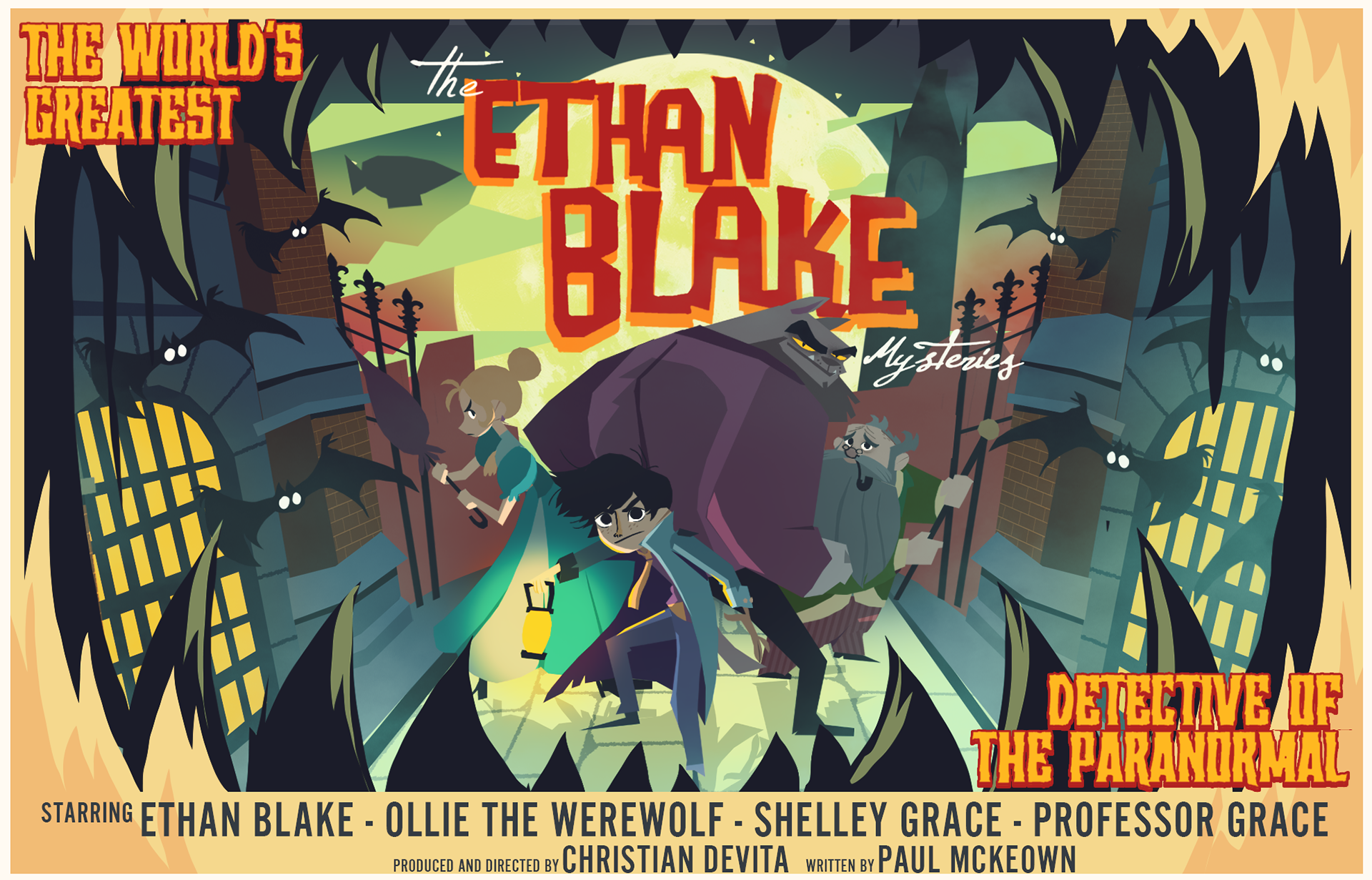
heeeey guys!
I've finished the poster! and truth be told I think it's one of the best things i've made this year.
there are some notes under the image, but it isn't much, I think everything speaks for itself :)
I've finished the poster! and truth be told I think it's one of the best things i've made this year.
there are some notes under the image, but it isn't much, I think everything speaks for itself :)

Most obviously I've changed the font for a little bit more of that vintage horror vibe and less of a 90's coffeeshop vibe. :D
I decorated Shelley a bit more since she felt a bit too bland compared to the other characters.
I decorated Shelley a bit more since she felt a bit too bland compared to the other characters.
this is a preview file, the actual image is a lot bigger (about A3 sized) in case you ever want to print it.
I also kept the characters in a rendered but unshaded file for you, might come in handy for presentations or whatnot
that's it! I hope you like it!
👇 PREVIOUS UPDATES 👇
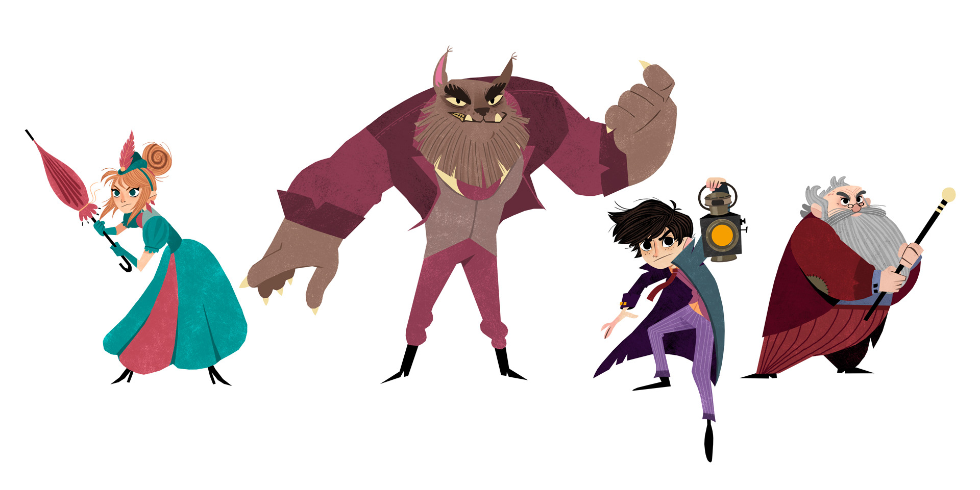
CHARACTER UPDATES
and heeere we go! I think i did everything you guys requested!
note: I just did some rough shading, when I start rendering everything I'll make sure everything reads well and the characters don't blend into each other, no worries there!
note: I just did some rough shading, when I start rendering everything I'll make sure everything reads well and the characters don't blend into each other, no worries there!
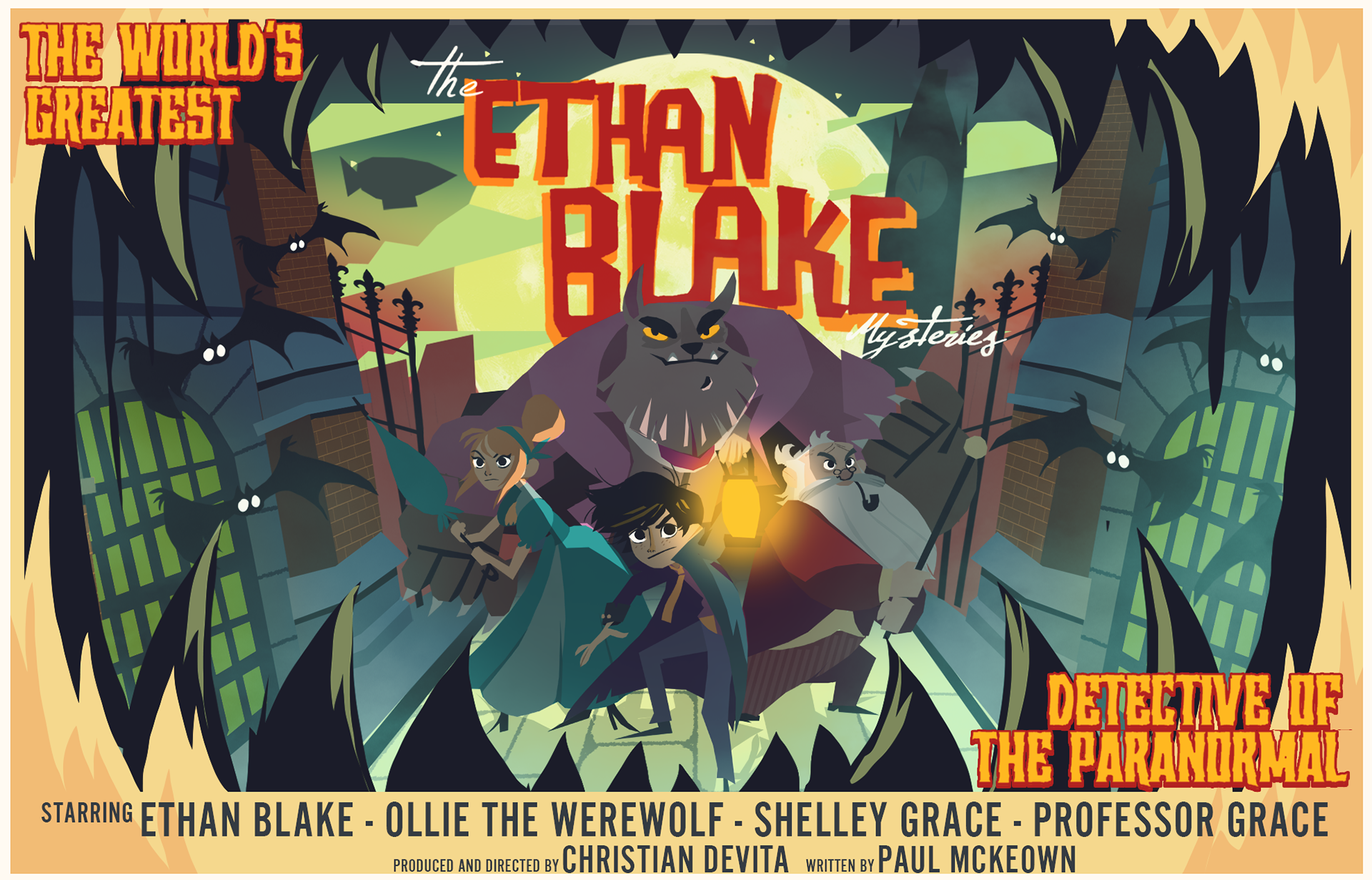
POSTER SKETCH
Hey hey! I've got a pretty cool sketch for you if I do say so myself!
there are some notes under the image. Let's GO!
there are some notes under the image. Let's GO!
I went with a classic horror movie poster look, when I start rendering everything I think we can make it look pretty horrory-vintage (while still keeping my usual moody atmosphere style). I thought it was cool to have them looking into the gaping mouth of a monster (without showing the monster).
it's not a movie poster without some cast/credits at the bottom, I just randomly added (what i think are) their names, and of course you guys' names, but please let me know if you'd like it to say something else.
everything is still messy and choppy, and some details are a bit difficult to read at the moment, but I'm pretty confident (and watchful) that everything will be clear once I start texturing/rendering everything!
oh, and the bats are just copy pasted for now, but they won't be in the final image
👇 PREVIOUS UPDATES👇
✏️ WORKFLOW ✏️
Heya!
I have a bit of an unorthodox workflow, especially when it comes to sketching, so I thought it would be a good idea to show you what I'll send over as sketches and what the final image eventually looks like :)
I don't really sketch in the traditional sense. I don't do the whole sketching with pencil thing. I usually go straight to shape, color and mood.
Here's some examples!
CHARACTER DESIGN
the first step is usually character design, here's an example of what to expect and what my roughs look like

as you can see I really don't worry about the finer details in the sketch phase. things like hands (which are pretty difficult to draw anyway) and other small things are not something I'm too concerned about at this stage.
colors are always subject to change, but you'll find that it's still pretty close to the original palette.
note: for this particular drawing there was no client to give approval for the sketch, so it's a bit rougher than usual.
colors are always subject to change, but you'll find that it's still pretty close to the original palette.
note: for this particular drawing there was no client to give approval for the sketch, so it's a bit rougher than usual.
ILLUSTRATIONS
here's a few examples of how I set up scenes, so you sort of know what to expect (and hopefully won't be too shocked by the choppy sketches)
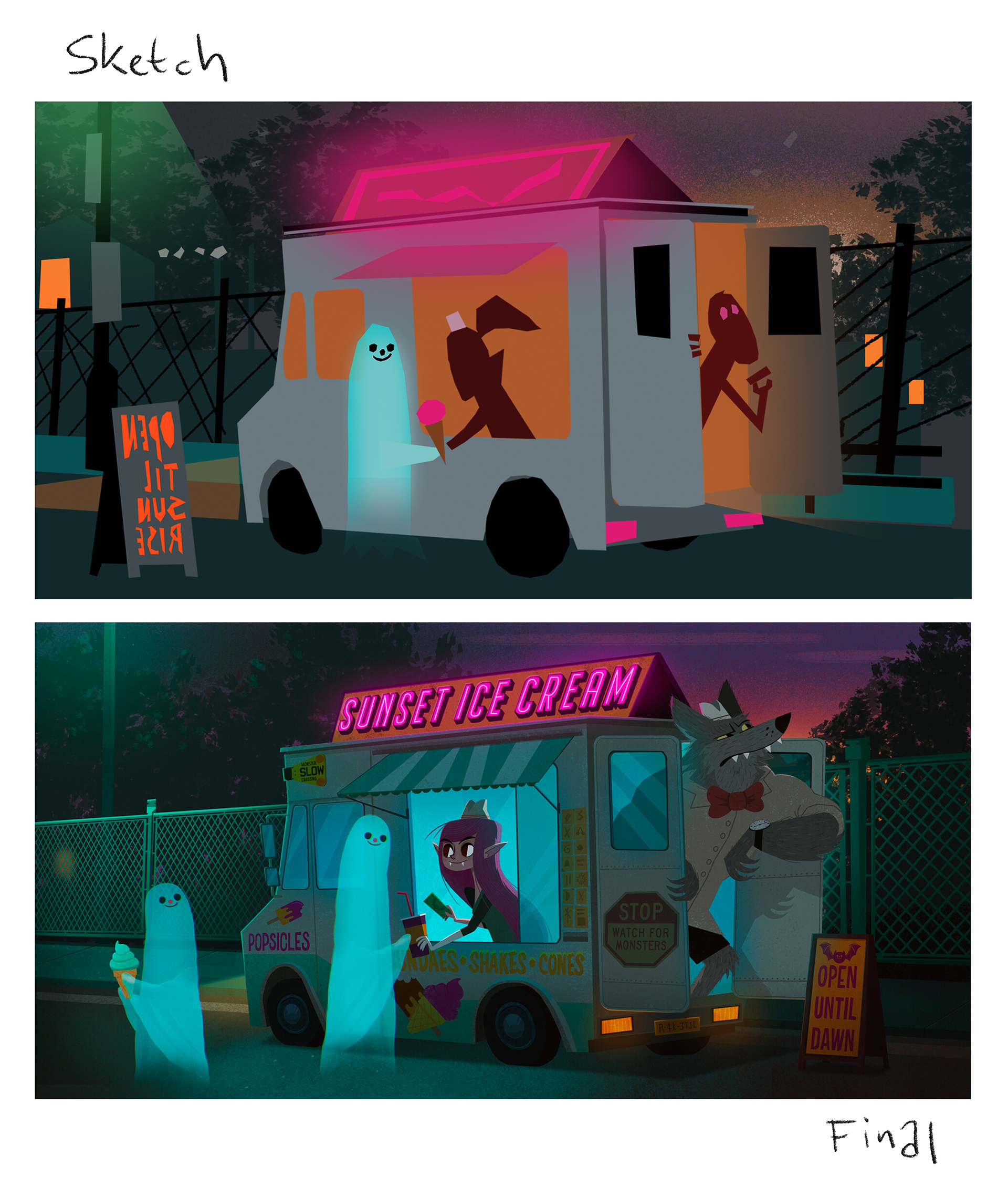
The image above is personal work and I designed the characters after coming up with the scene. If the characters are already designed before I sketch out the illustration I usually rough them in instead of using single color blobs.
so the scene pretty much stayed the same from sketch to finish, adding all the small details and lighting does bring it to life a lot more of course :)
so the scene pretty much stayed the same from sketch to finish, adding all the small details and lighting does bring it to life a lot more of course :)

sometimes I'll do a couple of variations on the same theme/composition before deciding what works best.
COVER EXAMPLES
here are a couple examples of book cover sketches and the finished illustrations

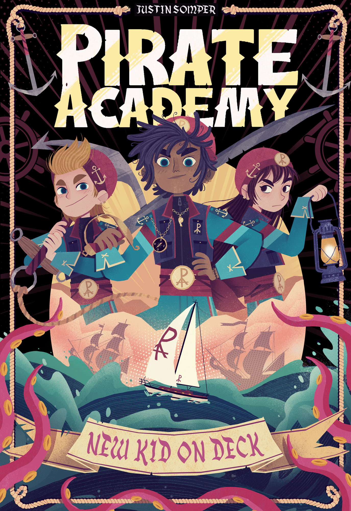
as you can see the sketch is still missing a lot of the cool little details and the characters still look pretty rough. I ended up changing the girl on the right completely since I really didn't like how she looked in the sketch.


here you can see how the sketch is still a bit flat and has a lot less contrast. I always try to make sure to make things as easily readable as possible and make certain things pop in the final version.
I also hand lettered the title for this cover.
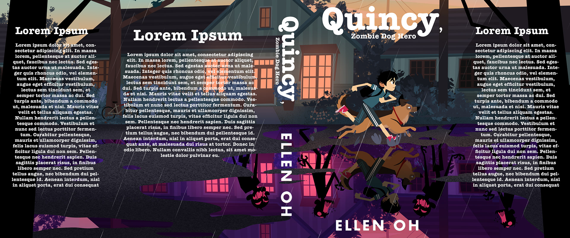

and here's an example of a full jacket illustration. again a good example of me making sure things pop.
so this is how I work! :)
I hope you've got a good idea of how things start out and end up, so you won't be too shocked about the choppy mess I'm about to show you :D
I hope you've got a good idea of how things start out and end up, so you won't be too shocked about the choppy mess I'm about to show you :D