🏴☠️ DEAD GOOD DETECTIVES 2 🏴☠️
hey hey hey!
I'm done :)
and honestly it came out way better than expected,
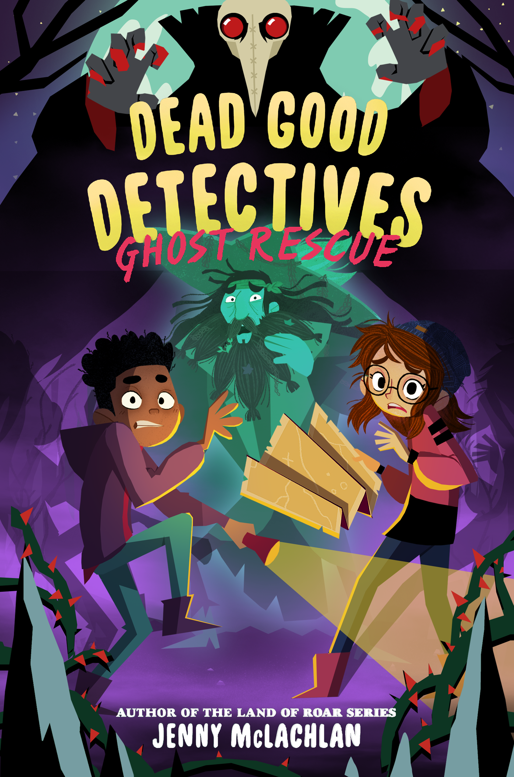
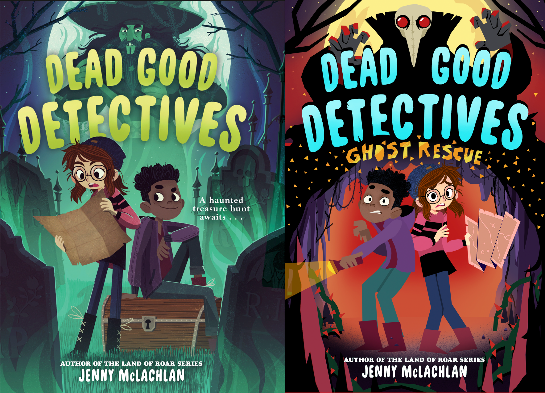
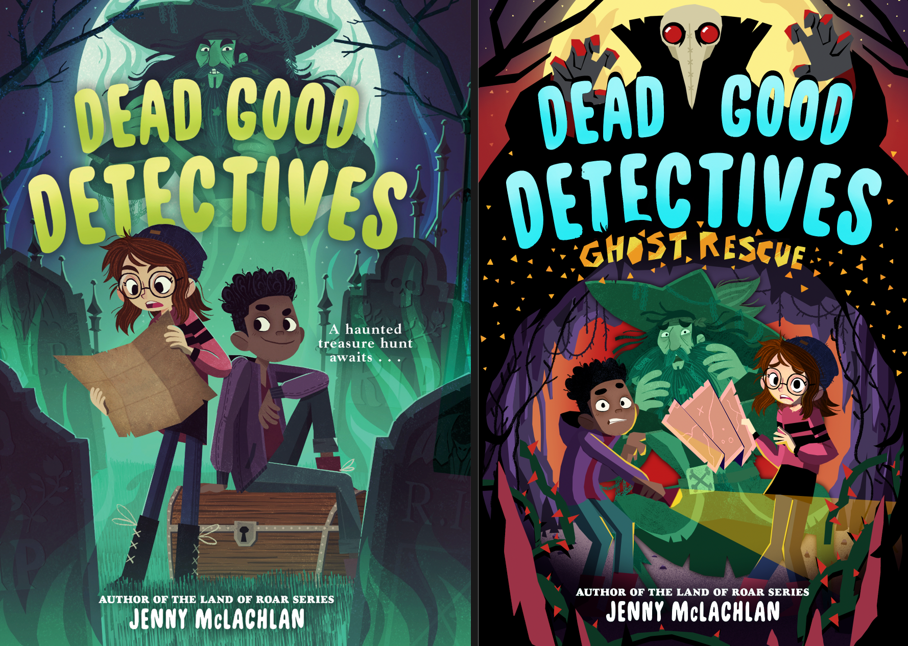
let's start with the front:
I'm done :)
and honestly it came out way better than expected,
let's start with the front:
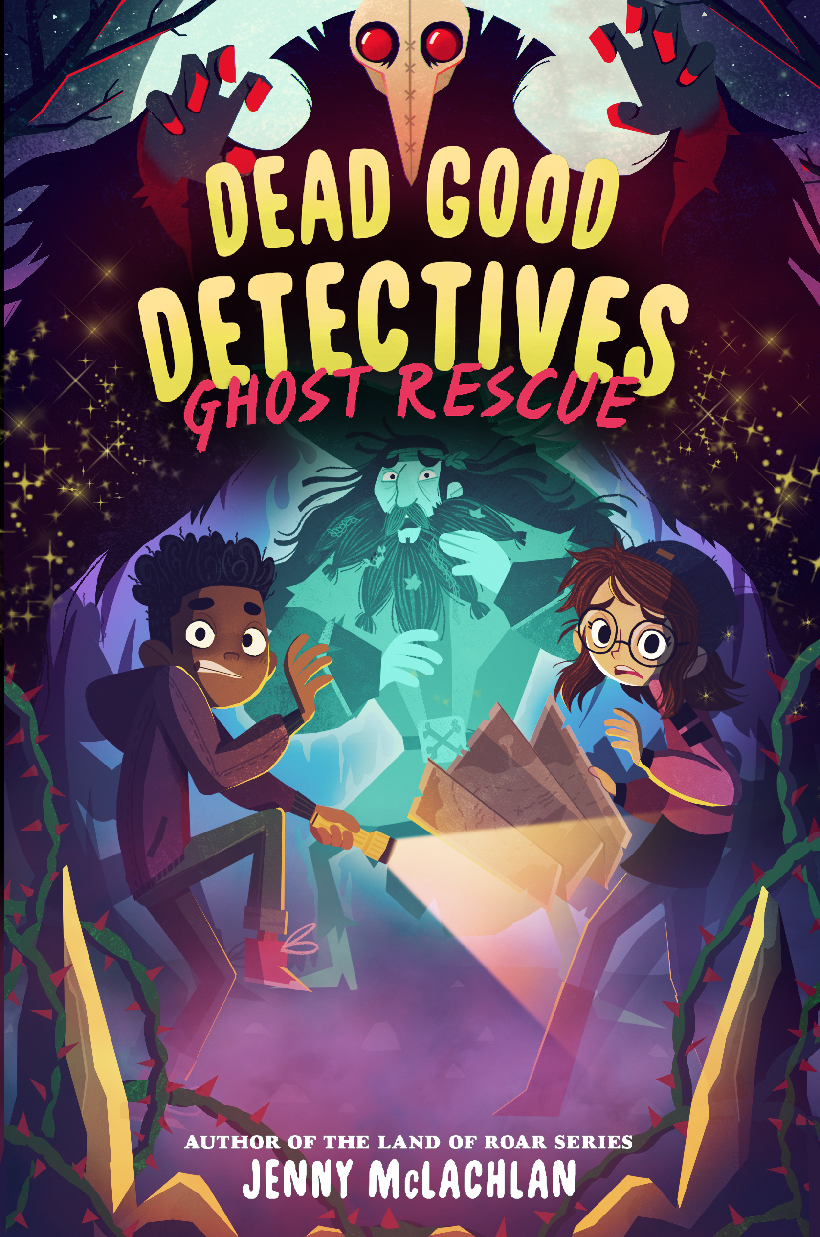
including gold dust! :D
I'm really happy with how moody the cover is, and that it's still pretty vibrant for what usually is a pretty dark setting.
I'm really happy with how moody the cover is, and that it's still pretty vibrant for what usually is a pretty dark setting.
and here's the full jacket:
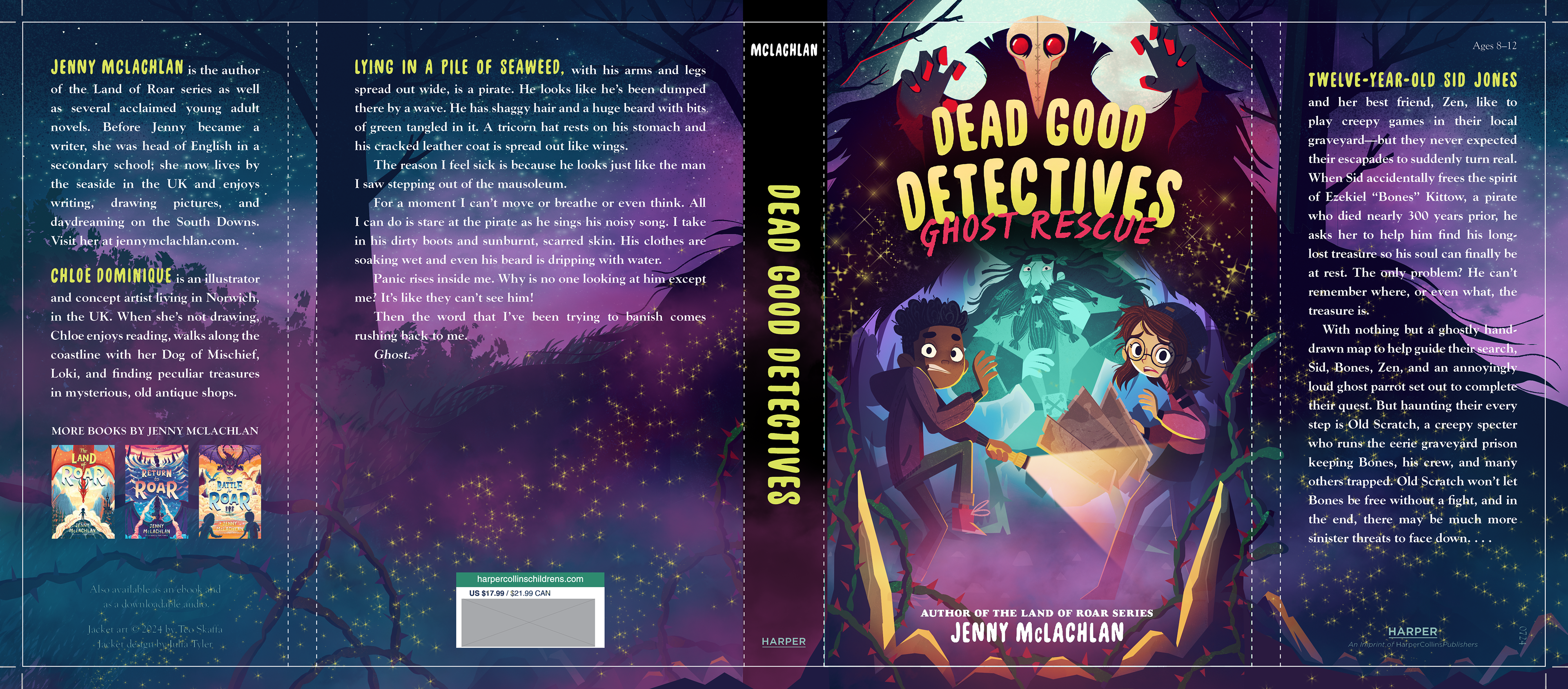
once we know the spine width and you've added the proper text on the spine I'd like to add a few sparkles on the spine too :)
here's the full jacket without the text so you can add the new copy
👇PREVIOUS UPDATES👇
SKETCH REDO
hey hey!
I have quite an update for you :)
I think this works pretty well and is a lot clearer than the previous sketches!
I have quite an update for you :)
I think this works pretty well and is a lot clearer than the previous sketches!
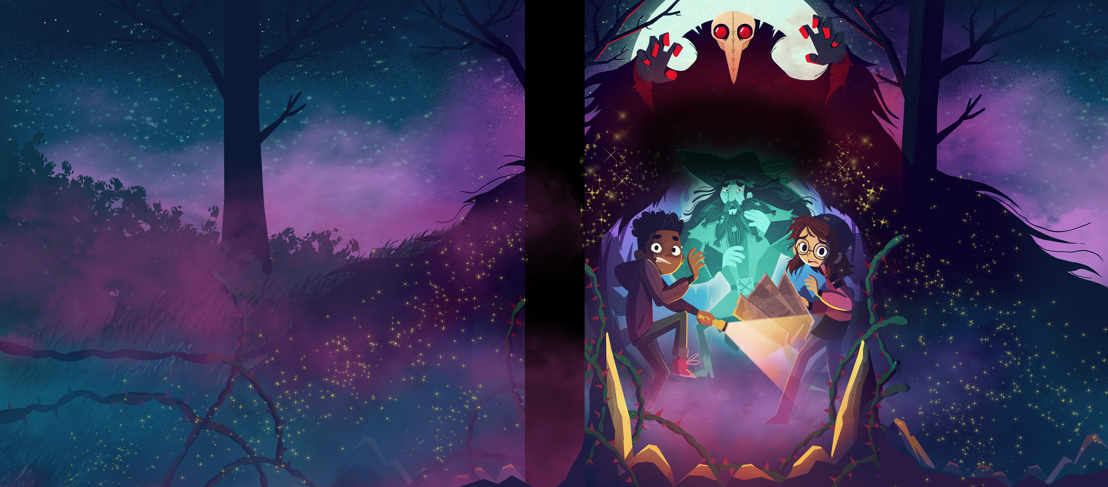
there are some notes under the image!
I adjusted the characters poses to make everything a bit more dynamic and to make sure that everything is easily readable.
to make the kids in the front pop a bit more I thought it would be a good idea to add some mist in the cave, which I think works wonderfully! Bones pops nicely now too without being in the way, which was the main problem!
I also added an indication of some cool lighting/shadow effects we can have on the cave walls (note: the cave walls will be more defined in the final version)
I'm pretty happy with this outcome and I think it will be on par with the first cover when it comes to atmosphere :)
👇 PREVIOUS UPDATES 👇
hey hey!
while I understand the feedback regarding the size of the characters I think there's not much room for adjustments here. Especially since Bones needs to be placed in the scene and since we're already missing some space because we need to accommodate space for the title of the book.
having the characters stand up straight will mean there's even less room for everything. this is why in my initial version the characters were cut off from the waist, to have them all be a bit bigger.
either they don't crouch but are a lot smaller than they are now (since we also need to keep in mind Bones is about twice their size) or they're all crouching so we can fit them in the scene.
I've made 3 possible versions for you so you can see what I mean.
this is the original version, just with all the other notes adjusted. The Innkeeper is the same size as Bones on cover one and I added more reds to the top and bottom.
I adjusted Zen's face a bit too to make him less zany.
don't worry about Bones just yet, He'll look the same as on cover one. (small note: I believe he's not transparent on the UK covers? not sure if that's important story wise)
the golden flakes will not be triangles and they'll be more subtle, don't worry. I suggested maybe having some cool shiny print magic for the sub-title and gold dust, not sure if the budget allows for that though!
here's a version with the characters scaled up so they're closer to the size of book 1. it's already getting pretty crammed and I feel the balance is pretty off-kilter now with the in-keeper being smaller at the top.
we're also losing a lot of the cave like this.
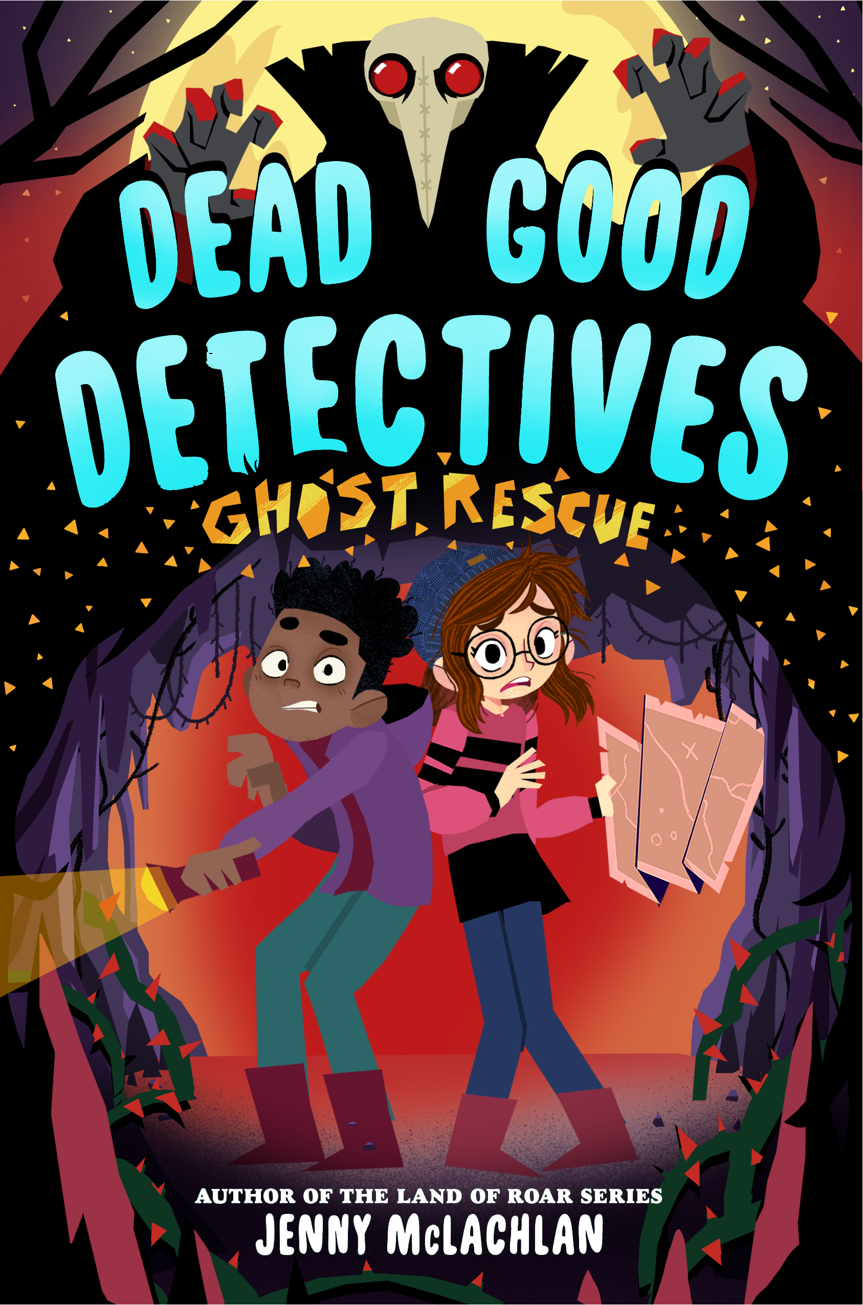
The only way to have the characters standing straight is to remove bones all together. They're not standing straight in this sketch, but just to give you an idea.
I completely understand wanting to have a strong visual identity, but I feel like the size of the characters doesn't matter so much and to be honest it just makes it less strong.
if this is important to marketing however we could do something like this:
this is closest to cover one, but keep in mind that the straighter the characters stand up the smaller they'll be, since we need to leave space for the Ghost Rescue title.
this version also leaves room for some extra text like on book one, which we probably can't fit on the other covers.
I think this works equally well too though.
this version also leaves room for some extra text like on book one, which we probably can't fit on the other covers.
I think this works equally well too though.
I don't think anyone is going to look at the cover on the right and will go: "wow this looks so different, I think this is a completely different book series." I think it's still recognisable yet different enough to set it apart from book one.
however I'm not a marketeer, If I was i wouldn't need an agent ;)
I'll leave it up to you to decide how to go forward, but I hope you can see we don't have much options regarding character size.
however I'm not a marketeer, If I was i wouldn't need an agent ;)
I'll leave it up to you to decide how to go forward, but I hope you can see we don't have much options regarding character size.
👇 PREVIOUS UPDATES 👇
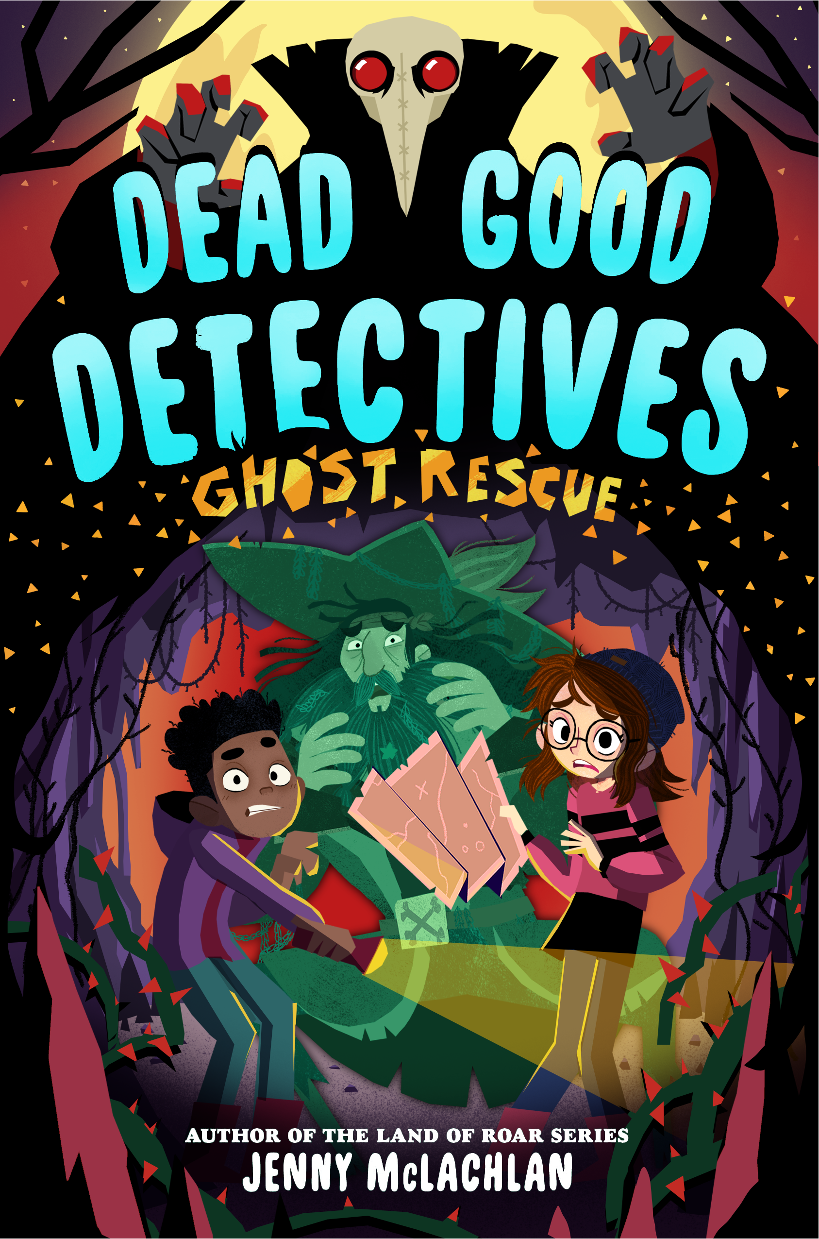
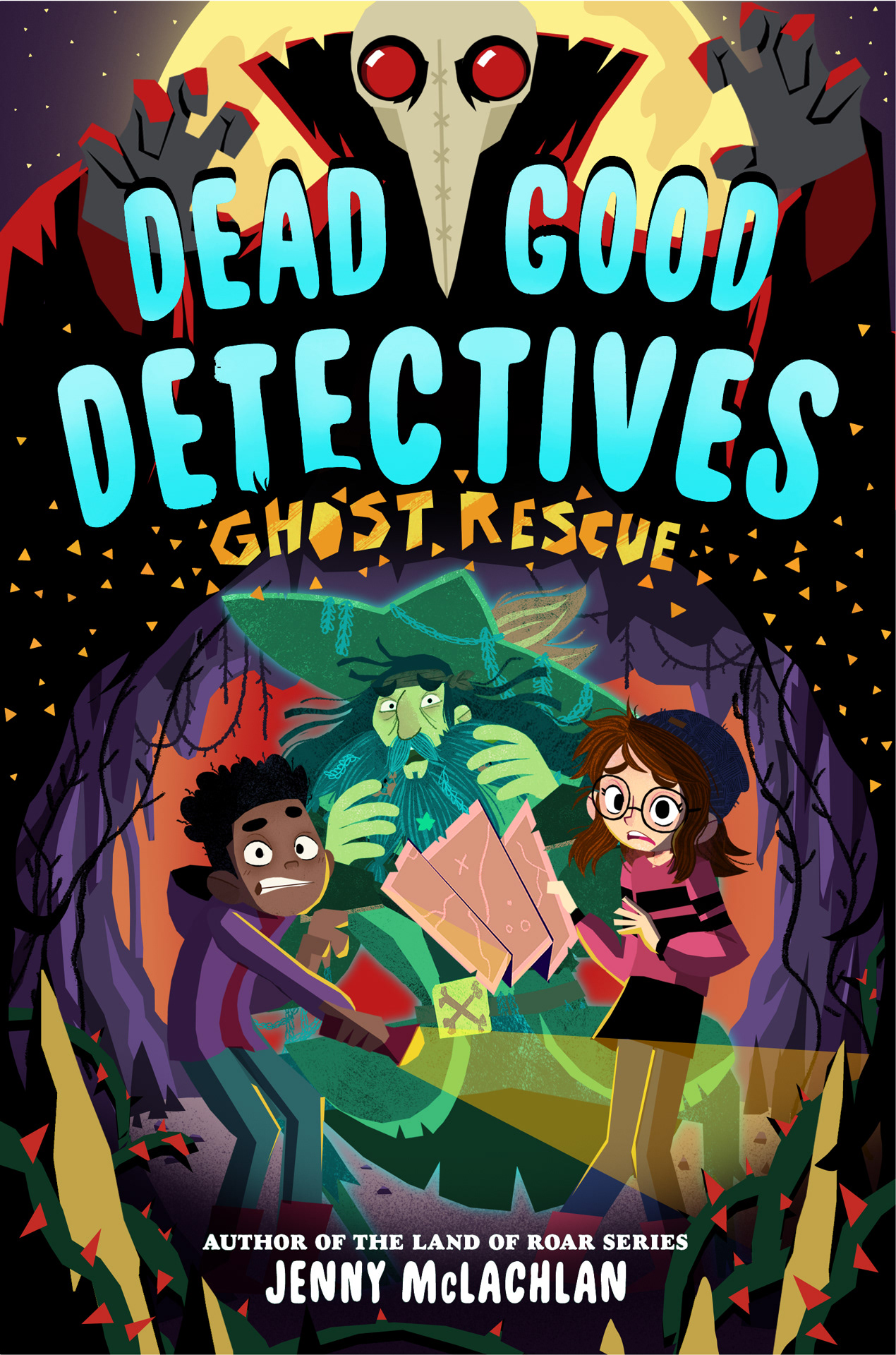
hey hey hey! here's the edited version of the sketch! I think you were right on all counts and this works a lot better : )
there are some notes under the image!
there are some notes under the image!
to answer this question from your mail:
"Will the palette get more cohesive as you develop the lighting? We love the more cohesive palette of book 1 and how atmospheric it feels, but also understand this is just a sketch."
"Will the palette get more cohesive as you develop the lighting? We love the more cohesive palette of book 1 and how atmospheric it feels, but also understand this is just a sketch."
absolutely! no worries there. all the shading and lighting now is more an indication than the actual final thing. It's usually the last step in my workflow process.
I did however switched up the palette a tiny bit here and there already to give it some more cohesion. I really liked the ominous red lighting on the masked dude at the top, so I brought some more reds to the bottom part as well.
another thing I thought would be cool to add is some of the prickly vines in the foreground, it gives everything a bit more depth and it will be nice to have them a bit more detailed too (there's only so much I can do with the detail of the vines on the cave wall)
I believe I got all the other requests done too, but let me know if I missed something!
👇 PREVIOUS UPDATES 👇
hey hey hey!
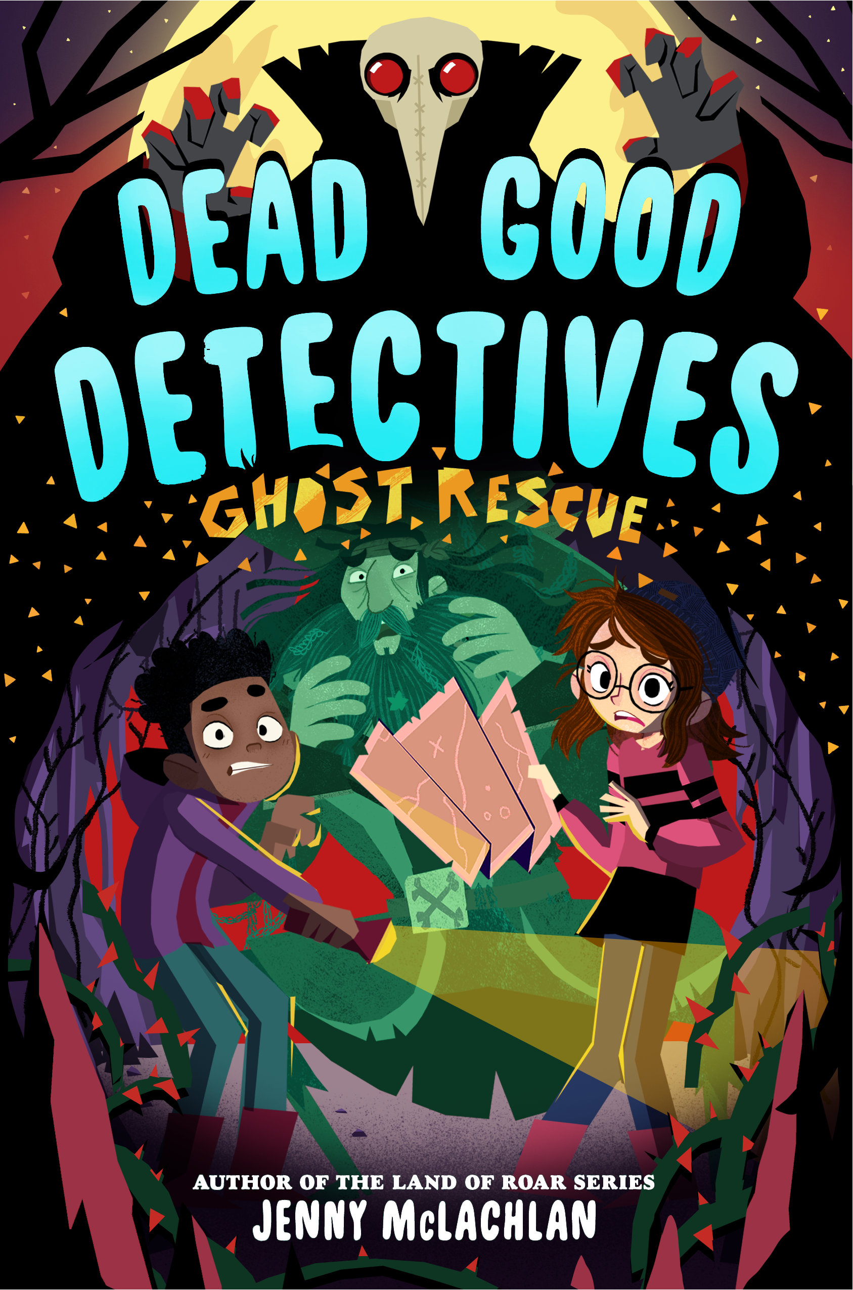
I've mocked up a sketch for book 2! since we already have the base composition down I put a bit of extra effort in the characters poses and expressions (usually they're way messier).
it's still missing all the cool lighting effects, but I think you get the idea.
there are some further notes under the image
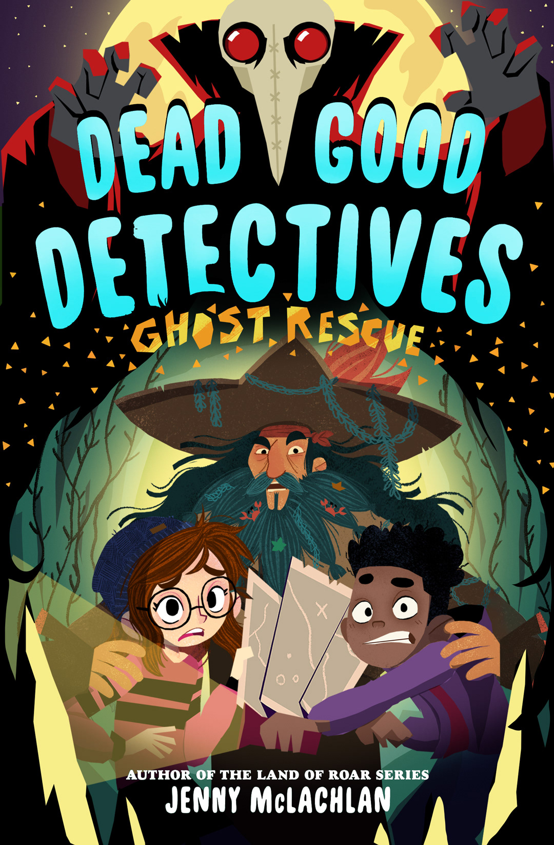
I went for a sort of shocked/scared expression on the cast, as if they're looking at something scary off-screen. I also particularly like how the cloak of the innkeeper sort of frames the bottom part of the image (which adds to the cave feeling I think)
the innkeeper looks pretty creepy too I think (which is good because I love creepy things)
the innkeeper looks pretty creepy too I think (which is good because I love creepy things)
the color of the title (and the book title) are placeholder, I'll leave that up to you!
so I thought it would be cool to maybe have the "ghost rescue" part be sort of golden/sparkly, to show a bit of the gold dust that's important to the story. If we could have some cool effects with an ink-treatment (if the budget allows) that would be even cooler of course!
and a note about the title: I put a bit of extra space between "dead" and "good" so that the plague mask fits nicely in between.
I really like this layout and it makes me want to redo book cover one all over again :D
feel free to give me any notes you may have!