TITLE
✏️ WORKFLOW ✏️
Heya!
I have a bit of an unorthodox workflow, especially when it comes to sketching, so I thought it would be a good idea to show you what I'll send over as sketches and what the final image eventually looks like :)
I don't really sketch in the traditional sense. I don't do the whole sketching with pencil thing. I usually go straight to shape, color and mood.
Here are some examples!
CHARACTER DESIGN
the first step is usually character design, here's an example of what to expect and what my roughs look like
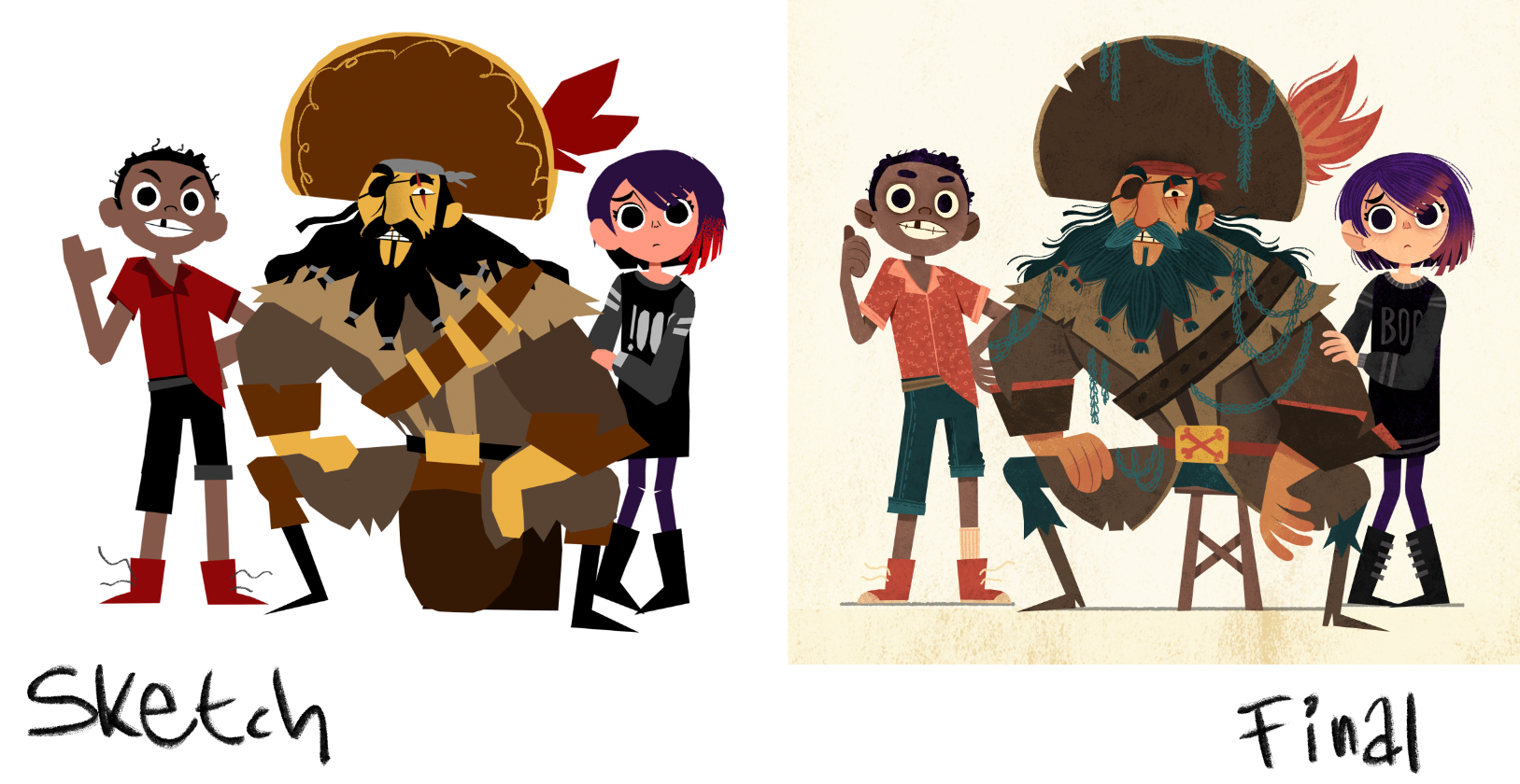
as you can see I really don't worry about the finer details in the sketch phase. things like hands (which are pretty difficult to draw anyway) and other small things are not something I'm too concerned about at this stage.
colors are always subject to change, but you'll find that it's still pretty close to the original palette.
here are some more examples of more character centric illustrations
colors are always subject to change, but you'll find that it's still pretty close to the original palette.
here are some more examples of more character centric illustrations
So as you can see I refine everything as I go along.
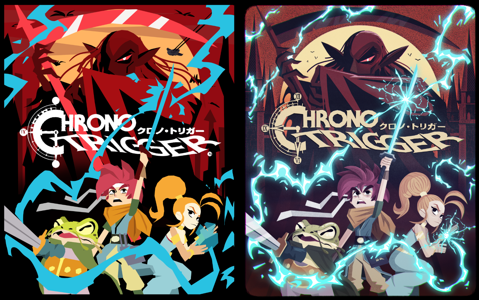
ILLUSTRATIONS
here's a few examples of how I set up scenes, so you sort of know what to expect (and hopefully won't be too shocked by the choppy sketches)
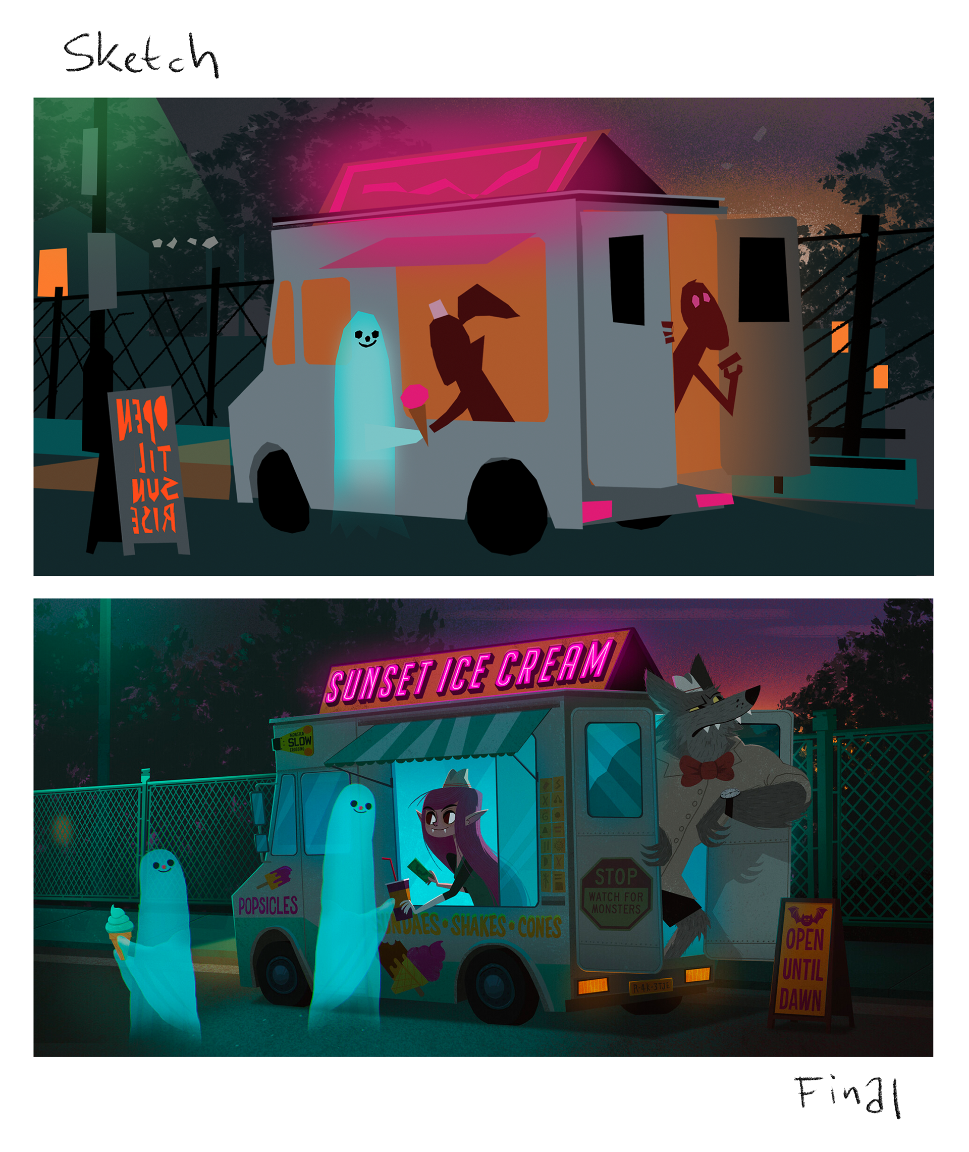
The image above is personal work and I designed the characters after coming up with the scene. If the characters are already designed before I sketch out the illustration I usually rough them in instead of using single color blobs.
so the scene pretty much stayed the same from sketch to finish, adding all the small details and lighting does bring it to life a lot more of course :)
so the scene pretty much stayed the same from sketch to finish, adding all the small details and lighting does bring it to life a lot more of course :)
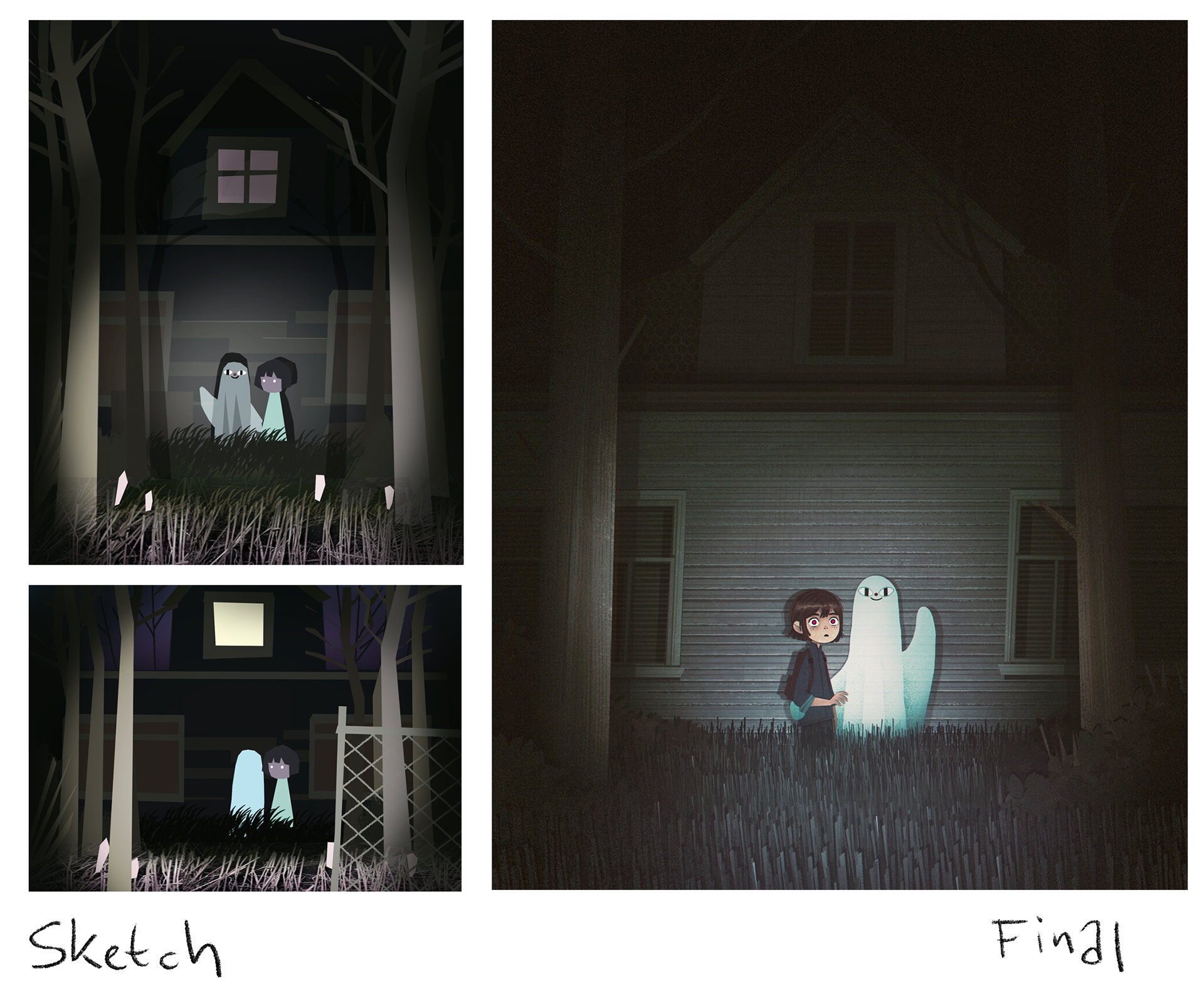
sometimes I'll do a couple of variations on the same theme/composition before deciding what works best.
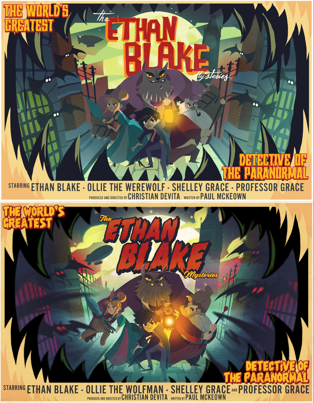
COVER EXAMPLES
here are a couple examples of book cover sketches and the finished illustrations
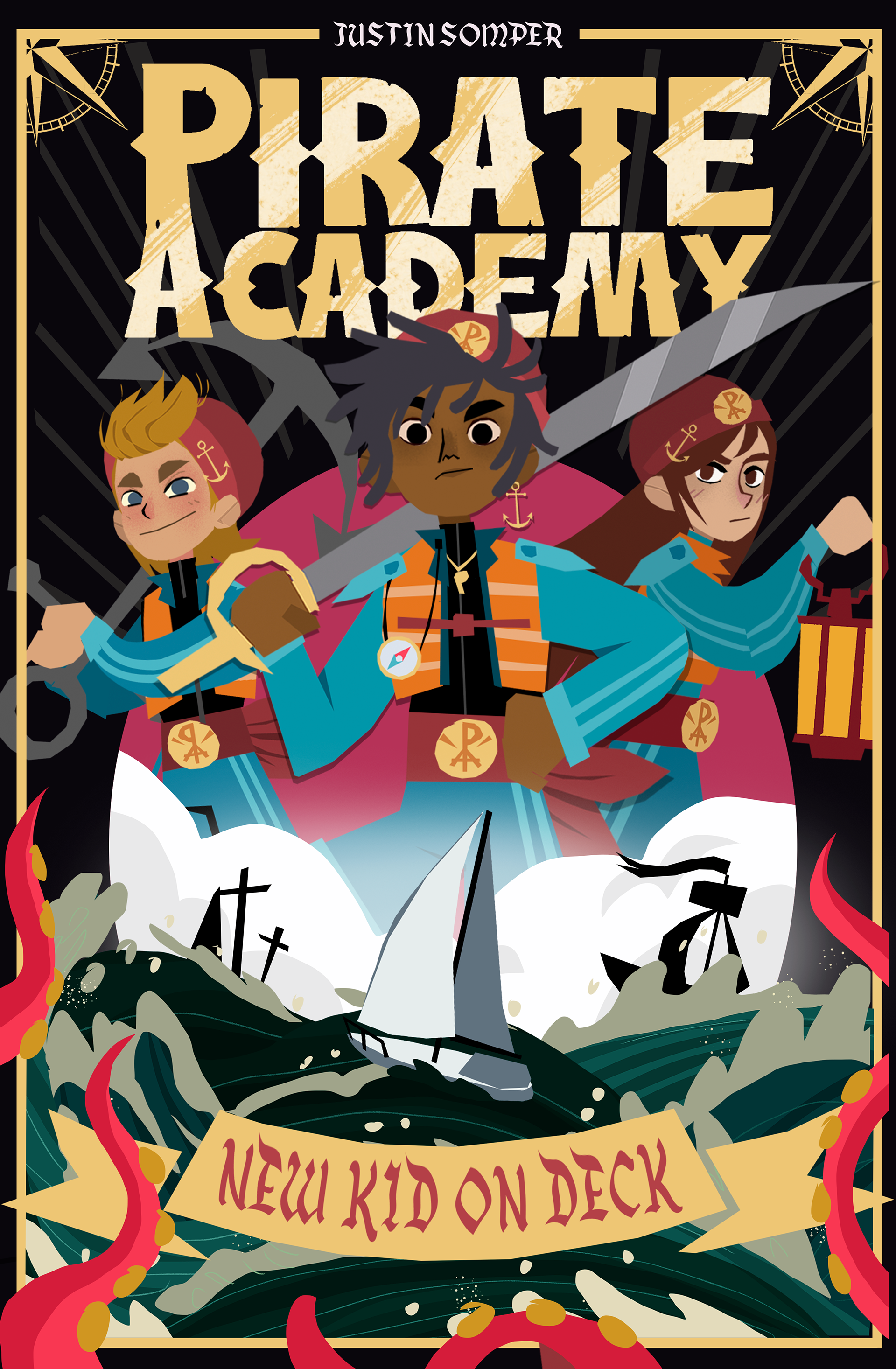

as you can see the sketch is still missing a lot of the cool little details and the characters still look pretty rough. I ended up changing the girl on the right completely since I really didn't like how she looked in the sketch.
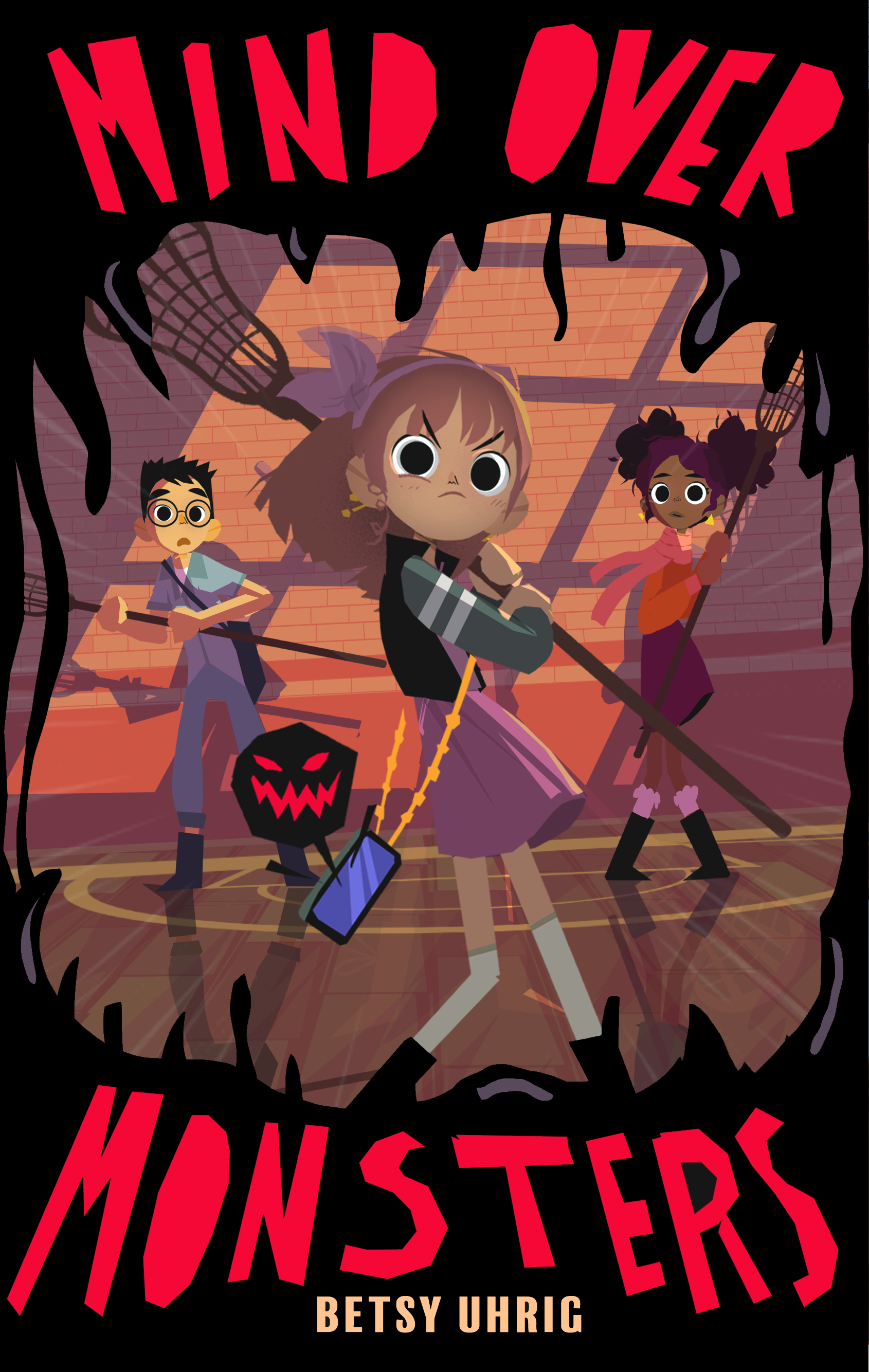
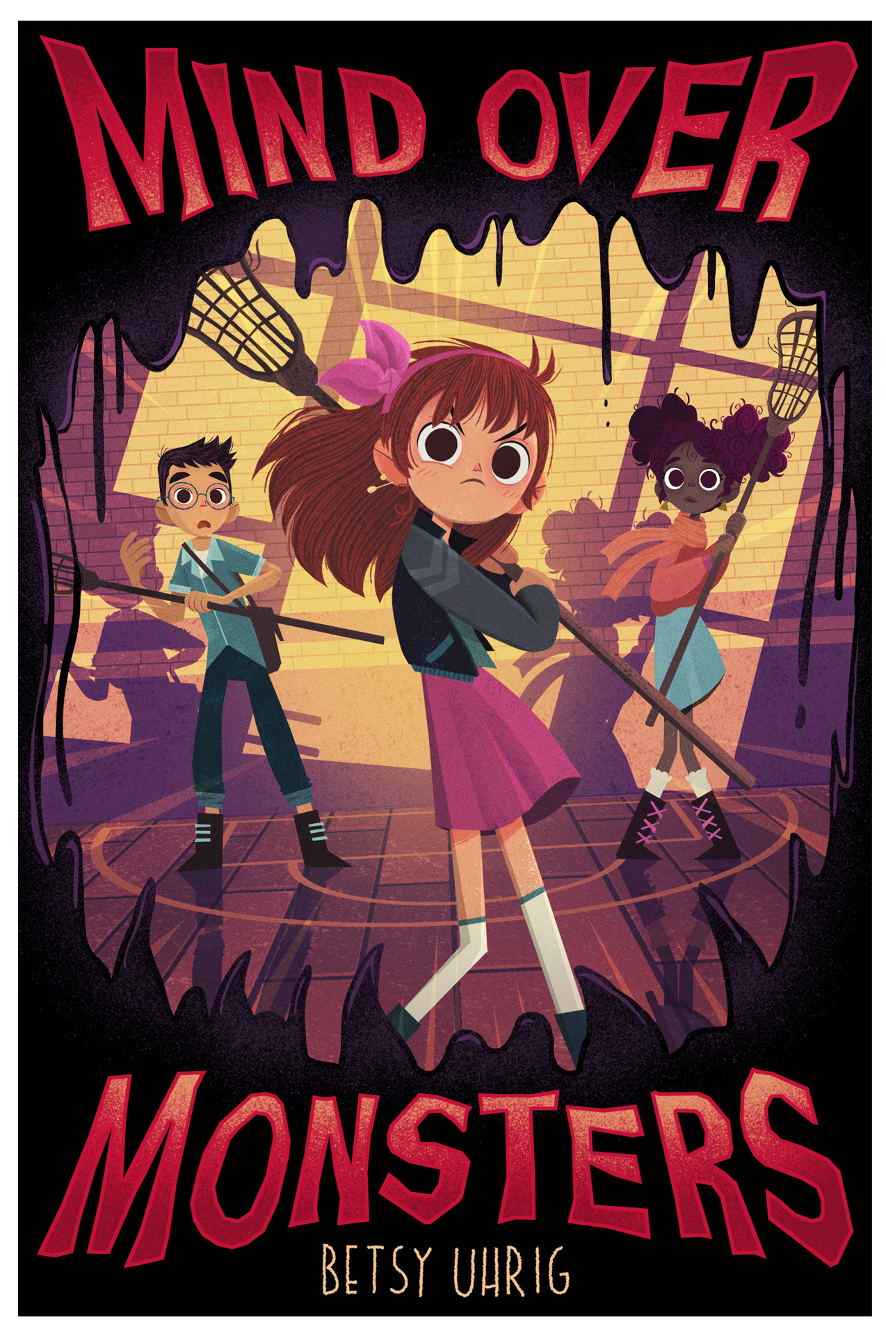
here you can see how the sketch is still a bit flat and has a lot less contrast. I always try to make sure to make things as easily readable as possible and make certain things pop in the final version.
I also hand lettered the title for this cover.
so this is how I work! :)
I hope you've got a good idea of how things start out and end up, so you won't be too shocked about the choppy mess I'm about to show you :D
I hope you've got a good idea of how things start out and end up, so you won't be too shocked about the choppy mess I'm about to show you :D